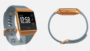
Fitbit’s new smartwatch is what the Blaze should have been
Fitbit tried their hand at their first smartwatch-esque wearable with the Fitbit Blaze. Its color e-paper display was supposed to change the game for the company, though it ended be being little more than a needless luxury.
But beyond that, the thing was just plain weird. The display unit was removable from its holding bay, which you would think is cool if you think about the potential to swap out wrist bands. The problem is there were barely any wristbands available, and the only reason to ever take the display out was to charge it in what proved to be an annoying dedicated charging clasp.
Mechanically speaking, it was just cumbersome. And we’re not going to get started on those razer sharp corners.
It looks like they don’t want to repeat the same mistakes, though, if Wareable’s leak holds up accurate. The device pictured looks Blaze-ish, but it seems to be one fully cohesive unit this time around like we’ve become used to from Fitbit.
We’re not noticing any major hints of the Pebble mark that we thought we’d see after that company was snapped up by Fitbit, though we’ve always suspected that purchase was more for Pebble’s software and platform chops. Whether this new Fitbit watch will offer the same level of ingenuity as Pebble’s Timeline OS remains to be determined. We should be hearing more later this year.