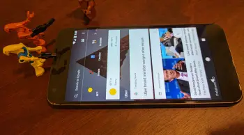
Google is testing a new transparent Google Now screen
The Google Now page has been around for a while now and it has seen numerous design changes. The latest change appears to be pretty significant. A Reddit user noticed a brand new Google Now screen on their Pixel XL after a reboot. Check out the screenshots below.
The screenshots are from version 7.3 of the Google app. The main change is the transparent background. You can see the wallpaper underneath the shortcuts and cards. The Google logo is gone and the search bar has been moved to the top. Next to Search is the “Upcoming” icon. The Upcoming page is basically the same, but the Pixel has the new tabbed Feed.
So far, only one user has reported these design changes. As with all tests, this could be exactly that: just a test. Or it could be a new design that we see in the future. Do you think this is a better design than the current app?