Dear Google: Please don’t put the Pixel Launcher’s Search bar below the app dock
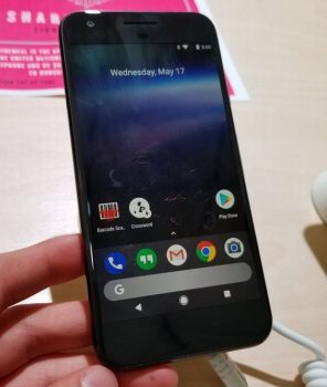
We’re not sure why, but a random Pixel device at Google I/O is on display and it has a launcher setup quite unlike any other. The Google Search bar is fixated near the bottom, just between the navigation buttons and the quick launch dock.
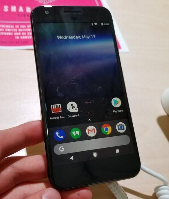
I’m just going to come out and say it: this looks rather disgusting. It takes up an ungodly amount of room, makes Google far too “in your face,” and for lack of any other better criticisms, it’s just not cool, man.
Maybe I’m alone in this, and that’s fine. Opinions, and all. But is the current configuration really so confusing that you had to shove your search bar right in my face as I try and work my way to the apps I need or simply press the recent apps button?
I’m hoping this little Frankenstein experiment is just the work of a bored Googler who forgot to restore their Pixel device to its more natural state. How would you feel about this change?
[via Twitter]