Android O will bring a new UI to Android TV
Android O is coming to Android TV devices later this, and with it will come a number of big new things. Google Assistant will finally arrive along with a shiny new home screen interface. The new UI is a complete rethinking of what a TV UI should look like.
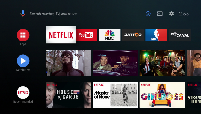
As it is right now, the Android TV home screen is nothing more than an app launcher with some recommended content. The new UI is completely different. At the top is your favorite apps, not all apps, just your favorites. Underneath that is “Watch Next,” which keeps track of things you’re currently watching and things you want to watch in the future. You can add stuff to “Watch Next” from the home screen.
Under those first two rows is what Google is calling “channels.” These are rows dedicated to a single app or even a section of an app. For example, the Netflix row displays recommended shows and the thumbnails can even start playing the video so you can quickly jump right in. With channels, you’re seeing content from the app on the home screen so you can jump straight to what you want to watch.
Coming along with the new UI is Google Assistant. It works pretty much how you’d expect. Say “Ok Google” to play shows, check the weather, do a search, or control smart home appliances. Android TV is finally getting some love. It’s nice to see Google taking a hard look at Android TV and making some big improvements. What do you think about the changes?


