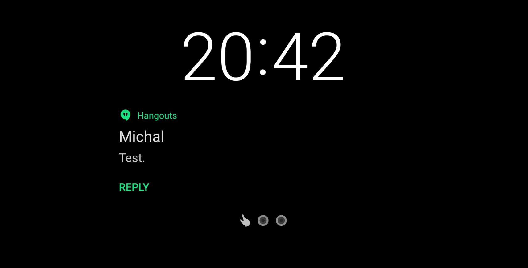
Ambient Display was one of those badly needed features that debuted back in Android 6.0 Marshmallow and finally brought the Android lockscreen up to speed with iOS’s. By being able to see your notifications on your lockscreen at-a-glance, you could easily decide whether or not to act on them as they arrived. Simply put, it was far more convenient than having a blank lockscreen that showed you nothing but the time and we’ve been loving Ambient Display ever since.
In previous versions of Android, Ambient Display was essentially just a black and white version of the lockscreen you see when you press the power button, only with a pure black background. By eliminating color, it helped minimize the impact on battery life, but still allowed you to see the notifications coming through and worked fine. Double tapping the notification would either unlock the device or if it was password/pattern protected, you’d be prompted to unlock the device before being brought inside the applicable app.
Along with a handful of new features in Android O, it seems Ambient Display is finally getting re-worked as well. This time around Ambient Display has a much more more minimal look, similar to what we’ve seen on Moto devices. Despite early reports that only the app icon is being displayed, notification content does, in fact, appear on the lockscreen — just not with every app. We’re guessing it’s something developers will have to enable inside their apps to get it working properly. Case in point, most Google apps are displaying notification content just fine with the new Ambient Display feature, while other apps — which have yet to add Android O support — do not.
For apps that have a quick reply action, the tapping on the option will immediately pull up the expanded notification inside the notification panel. Pretty much works how you’d expect, but if you want to see Android O’s new Ambient Display in action, check out the video above.


Comments