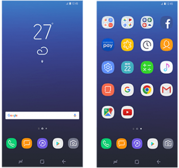
Have a look at the new launcher and icons for the Samsung Galaxy S8
As much as we’ve seen of the hardware, there haven’t been a ton of leaks regarding the software on the Samsung Galaxy S8. Scratch that as of today.
Supposed Galaxy S8 screenshots have been pulled from the latest version of Samsung’s Smart Switch app that shows us a pretty clear look at the new design traits Samsung is pulling out for 2017.
Starting with the launcher, it looks like we’re getting not only a new look, but new functionality, too. It appears Samsung ditched an apps tray shortcut for a more Google-esque setup where you swipe to the far left in order to access all your apps. To the immediate right of that is your default home screen, and then further beyond that are any additional pages you want to add.
Beyond that, we can see a collection of app icons with rounded shapes to house wire-style designs. It’s flat, clean, and playful, but most importantly, it’s consistent.
Of course, that’s all subject to personal preference and with a theme store sure to be loaded onto the phone — plus the ability to use third-party launchers and app icons — you can go with whatever best matches your own taste. Have a look at more icons at the jump.
[via SamMobile]