
Uber’s new redesigned app is pretty slick for frequent commuters
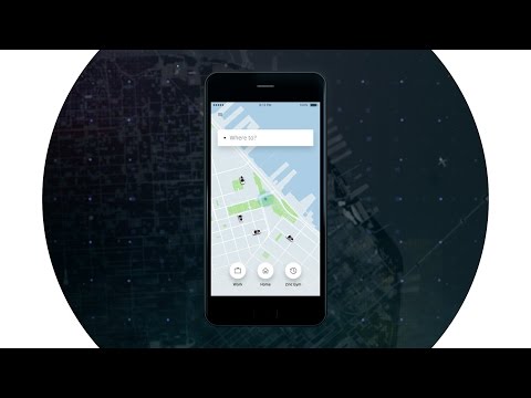
Uber has established itself as a great way to get around in the cities where it’s available, but let’s be honest the app was pretty cluttered and hard to use for people who are only occasionally acquainted with the ride-sharing service. But thankfully those problems have been addressed, as today Uber announced a completely redesigned app that makes common destinations easier and more intuitive to access from the get go.
The last time we saw an update to the app was back in 2012 and in those four years the app showed its age. Uber’s newly redesigned app centers around the question, “Where to?” The company says it learns from your common routines, so if you take certain routes you’ll see shortcuts that are offered in an effort to predict where you might be headed. Uber also mentions that soon you’ll be able to integrate the app with your calendar, so all your meetings and appointments will show up as shortcuts, too.

Additionally, the app will sync with your contacts so you can set your destination to a person, rather than a place. Then all you have to do is type their name in the search bar. With a quick location share, you’ll be on your way to meet them.
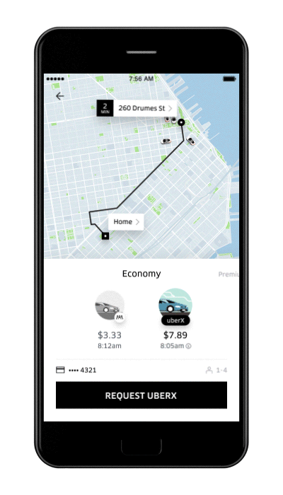
Choosing which Uber is right for you is easier than ever in the new app, too. You’ll see Economy and Premium rides and their costs with a quick swipe, so you can make a decision without wondering how much it’ll cost you. The UberPOOL and UberX options will also show your expected arrival time, so you can factor that into your decision-making on the fly.
Overall it’s a pretty nifty update that should please long-time Uber users and newcomers alike, since the information is presented in a much more simplified manner and with usability in mind for busy commuters.