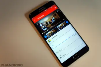
YouTube is rolling out a redesigned description box with fancy animation
The YouTube app is one of those things Google likes to constantly tweak. The next design change is focused on the description area under videos. Currently, you can see the thumbs up/down buttons and the share button before expanding the description. The new design takes away the thumbs down button but shows more when you expand the description.
In the new design, the expand button opens with a fancy animation. More importantly, you have access to more buttons. Thumbs up/down, Share, and Add to list. The Add to button has previously been stuck in the video overlay along with the redundant share button. We’re not sure if the overlay buttons will be removed. One thing that still needs to be fixed is the Share button icon. YouTube is literally the only app with arrow icon instead of the traditional Android share icon.
[via AndroidPolice]