Let’s face it, smartphones are getting a bit stale. Sure, we always see a new design, or a new way for users to interact with the fingerprint scanner, but we’ve reached a point where the market is a bit boring. LG attempted to shake things up with the modular design on the LG G5, but that device has mostly flopped, leaving the door for another manufacturer to step in and show everyone how it’s done.
When Lenovo and Motorola unveiled the Motorola Moto Z and Motorola Moto Z Force, everyone’s heads these. With these being the first Motorola devices produced by Lenovo, everyone wondered what would happen to the oh-so-popular Moto X lineup of devices. We started hearing rumblings early on that Lenovo was going to nix the Moto X moniker in favor of the new Moto Z moniker and that’s what we were introduced to at Lenovo Tech World 2016.
Motorola suffered disappointing sales from its Moto X 2015 lineup of devices, so something needed to be changed, and this was their chance. Did Motorola capitalize on the opportunity with the Moto Z? Let’s find out.
Design & Hardware
Since the original Moto X, Motorola has focused on delivering devices that are comfortable to hold, decent specs, and a near-stock Android experience. Up until this year, the Moto X lineup (and Nexus 6) featured curved backs, the iconic dimple on the rear, and an overall premium build without breaking the bank.
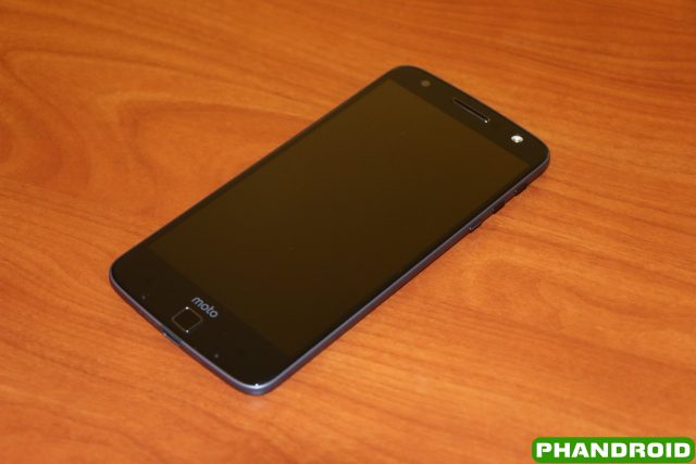
Lenovo threw all that out the window with the Moto Z and Moto Z Force, choosing to bring a completely new design for users. When you unbox the Moto Z Droid for the first time, you won’t really notice anything game-changing. It’s not until you actually take the device out of the box that you see what is so amazing about this device.
Motorola Moto Z Droid Specs
Display 5.5-inch AMOLED Processor Qualcomm Snapdragon 820 RAM 4GB Camera Rear: 13MP, f/1.8 aperture, laser autofocus, OIS
Front: 5MP Front, f/2.2 apertureBattery 2,600mAh Dimensions 6.11 x 2.96 x 0.20 inches Weight 4.7 oz
Looking at the front, you’ll find the home-button/fingerprint scanner that’s not really a home button, front camera, single ear-piece speaker and front-facing flash. There are no chamfers on the front or sides of the device, instead you’ll just be met with the metal frame with the various buttons and port on the sides. Speaking of which, you’ll find the USB Type-C charging port on the bottom of the device, with the power and volume buttons on the right side, and the sim card/microSD card tray located on the top.

This brings us to my first major annoyance with the Moto Z Droid: the placement of the power and volume buttons. Although the device is smaller than my Nexus 6P, the placement of these buttons feels a bit too high. Motorola could have opted to move the volume buttons to the other side, and a little further down, but instead all three are located on the right side.
The power button is machined with ridges to make it easier to recognize when trying to turn the Moto Z Droid off. Meanwhile, the device doesn’t feature a volume rocker, instead, including two different buttons for the volume. All three buttons are the same size, but the volume buttons don’t feature any ridges, which help you to differentiate from the others.
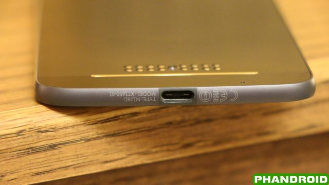
We’ll get into the charging capabilities of the Moto Z Droid later on, but for now, let’s take a look at the charging port itself. Motorola has moved away from microUSB charging ports with its latest devices, favoring the USB Type-C charger. Slowly, this is becoming the new standard, and will more than likely be found on just about every new device released within the next year or so.
This move allows Motorola to stay ahead of the curve, as well as bring more capabilities to the Moto Z and Moto Z Force. For example, when looking around this device, you won’t find a 3.5mm headphone jack. While this isn’t the first device in the world to do so, this is a first for a device released in the U.S. Instead, Motorola is hoping that users take advantage of either Bluetooth headphones, or use a tiny adapter that turns your USB Type-C charging port into a 3.5mm headphone jack. This is less than ideal for those who want to charge the device while listening to music, but at least Motorola thought ahead and gave everyone the adapter.

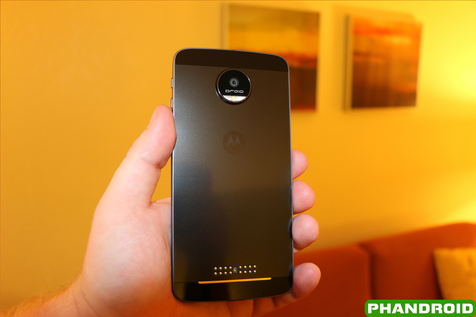
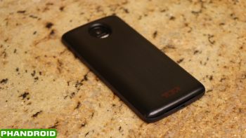
Now for the back of the device. In order to manufacture the thinnest flagship smartphone on the market, Motorola opted to rethink the camera design, in addition to the device itself. As soon as you look at the Moto Z Droid from the side or back, you’ll see the chamfer-edged camera bump. All of the camera modules for the rear-camera are housed in this bump, and is an interesting design choice.
Moving further down we get to the fun part. Below the Motorola logo in the middle of the device, we find the 16-pogo pins that are vital to attaching various modules to this device. Motorola and Lenovo opted for a “hot-swap” train of thought for the different modules, which is quite different from what we saw with the LG G5. These pogo pins contain powerful magnets that make swapping between modules a snap. Other than how thin and light this device, the story behind what makes the Moto Z Droid so amazing, is found within these magnets. More on that below.
Overall, Moto Z Droid feels extremely light and comfortable in the hand. Coming from the Nexus 6P, it feels a bit odd to be hold a device that doesn’t have a curved back, as Motorola opted for a slightly curved frame and flat back. However, once you hold the device for a little while, you don’t notice the difference anymore.
Since the Moto Z Droid measures in at 5.5-inches, it feels like a sweet spot for size. It’s not overly massive, and it’s not too small. I have medium-sized hands, so reaching across to the top corners still requires some finagling of the device, but I don’t feel as though I’m struggling with the size.
The second biggest complaint that comes with the design of the Moto Z Droid is that its a fingerprint magnet. This will leave you wiping the device of fingerprints throughout the day, or will give you the feeling to leave one of the Moto Mods attached to it.
Moto Mods
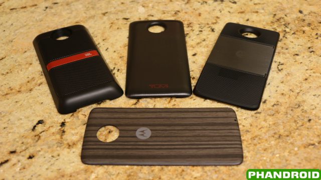
When Lenovo took the wraps off the Moto Z, we were a bit awestruck to see the company’s take on modularity, especially after we’ve seen progress in Google’s Project Ara and the release of the LG G5. The LG G5 was an interesting take on a modular design, but there were enough flaws to turn people away. Project Ara will hopefully turn into a true modular device, but the Moto Z Droid seems to fall right in the middle.
You won’t be able to change out the camera, or replace the processor, but you will be able to add battery life to the device and add extra functionality depending upon the Moto Mods that are purchased. The functionality doesn’t come without compromise, however.
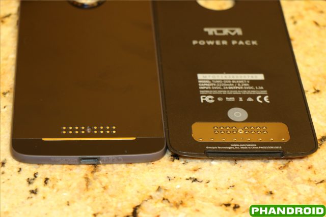
Earlier, we described the Pogo Pins that are found on the rear of the device, which is how the different Moto Mods attach to the devices themselves. There are magnets located within the pins, as well as the mods that when put in the right place, snap together without anything extra needed to be done. Adding battery life can now be done in a snap, and you can keep rolling through your day, not needing to worry about trying to get back home to charge up your device.
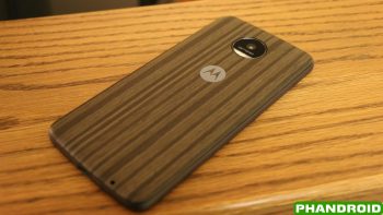
In our time with the Moto Z Droid, we were able to experiment with three different Moto Mods (battery, projector, speaker), as well as one of the upcoming Style Cover Mods. When we went hands-on with the device, I reserved judgement about how well these Mods would stay in place, but I have been pleasantly surprised.
Once attached, the Mods are practically stuck in place but do wiggle around a bit. This is expected, but between the pogo pins and camera bump, you won’t have to worry about any of the mods falling off during use, or while taking the device in and out of pockets. As for swapping between the different mods, the three Moto Mods that we received for this review include a gap at the bottom to easily detach them from the device. The Style cover doesn’t include a gap, but can easily be pried off using your fingernail.
In order to provide an overall great experience, Motorola has integrated software features that will help users interact and view different pieces of information regarding the compatible Moto Mods. When you first attach a compatible Moto Mod, there will be a small notification that pops up showing the remaining battery life.

There is also a persistent notification within the notification drawer that shows how much battery life is remaining. Once tapped, you will be navigated to the Moto Mods panel which is found within the Settings application.
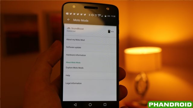
From here, you can view different pieces of information regarding whichever Moto Mod is attached to the device. At the top, you can see the name of the Moto Mod attached, as well as the battery life remaining within the Moto Mod. There is even a section for software updates, which will allow manufacturers or Motorola to send specific software updates to the Mod itself.
There are going to be quite a few different Moto Mods released once the Moto Z Droid is made available, so we can only imagine what could be in the woodworks. Once the Moto Z Droid and Moto Z Force Droid are released, here are the different Moto Mods that can be purchased at release:
- Incipio offGRID Power Pack
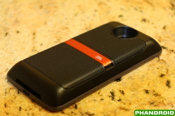
- JBL Soundboost
- Moto Insta-Share Projector
- Kate Spade New York Power Pack
- TUMI Power Pack
- Motorola Style Mods
Motorola has also introduced Moto Mods Developer Kit for those who want to create something new and unique for the world to enjoy with the Moto Z Droid and Moto Z Force Droid. These are still the early days of the Moto Z Droid and Moto Z Force Droid , so we can expect to see more creations come out of the woodworks in the coming months. Hopefully, we’ll see innovation and increased capabilities for two devices that are already on the brink of something great.
Display
When you’re looking for a new flagship device, the display is one of the most important aspects. You could have a monster device in every other aspect, but a subpar display can negatively affect your experience and force you to look elsewhere. With the Moto Z Droid and the Moto Z Force Droid, the devices feature spectacular displays that rival those of the Samsung Galaxy S7 and Samsung Galaxy S7 Edge.
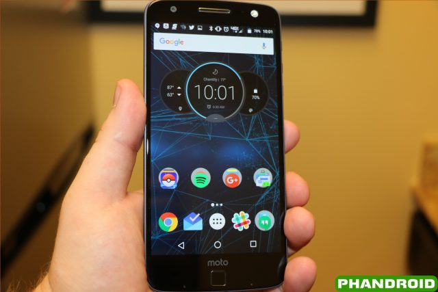
The Moto Z Droid includes a 5.5-inch Quad HD AMOLED display with Corning Gorilla Glass 4, bringing a gorgeous display to this device. The colors are really vivid and vibrant and make looking at this device an enjoyment all of the time. I’m not sure if I would say that the display on the Moto Z Droid is as good or better than that of the Samsung Galaxy S7, but considering they are both AMOLED displays, the Moto Z Droid comes close.
Moto Display
One of the best features of Motorola devices since the inception of the Moto X has been Moto Display. This feature allows you to take a quick glimpse at any notifications that come in, as well as the time, date, and battery level all with just a wave. When Active Display was introduced with the Moto X, the promise was there to help users save battery life.
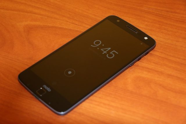
With the two proximity sensors found on either side of the fingerprint scanner, Motorola has improved upon its Moto Display features with the Moto Z Droid. Users will still be able to wave their hand over the display to get a quick summary of any missed notifications. Once activated, you can press and hold one of the appropriate icons to actually view the notification, and then either open or dismiss it.
In order to open a notification, you will need to press down on the icon and drag upwards. You will be prompted to unlock the device with either the pin code/pattern, or the fingerprint scanner. Swiping the icon downwards will dismiss the notification and remove it from your status bar notifications.
There is a limit to how many notifications can be viewed at once, so once you’ve met your quota, Moto Display will show an icon with “…” in it. Pressing this icon will give you a brief overview of all your notifications, giving you the ability to make sure you’re not missing out on anything super important. However, you will not be able to simply dismiss the overview of notifications.
With the help of the Moto application (formerly Moto Assist) users can customize the following aspects of Moto Display:
- Block Apps
- Select how much detail shows for notifications
- Select a specific time frame to keep the screen dark
- Vibrate on touch
Users will also be able to turn Moto Display off or on, depending upon your preference.
Performance & Battery
As with every other major flagship to be released in 2016 so far, the Moto Z Droid is powered by the Qualcomm Snapdragon 820 processor coupled with 4GB of RAM. This configuration seems to be the most popular among manufacturers, aside from the OnePlus 3, and offers a snappy experience.
While you’re setting the Moto Z Droid up, you’ll probably feel like the animations are slow and even stutter a bit, but that’s just the way that Android has been designed. You can change this within the Developer Options once the device is set up, and will definitely help show off just how fast the device can be. Navigating the various areas of the device was quick and snappy and switching between applications felt seamless.
As for storage, the Moto Z Droid comes with 32GB or 64GB of storage, but includes a microSD card slot with support up to 2 TERABYTES of extra storage. As of right now, there isn’t a 2TB microSD Card available, so you’ll have to “settle” for a 200GB version, but Motorola has attempted to “future-proof” this device, making it compatible with future storage options with the help of MicroSD cards.
Fingerprint Scanner
Although the Moto G4 Plus introduced the fingerprint scanner to Motorola users first, the Moto Z Droid includes the same scanner on the front of the device. Located on a rather large bottom chin, below the display, the fingerprint scanner found on the Moto Z Droid is located in the perfect place.
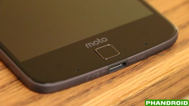
Setting up the fingerprint scanner is quick and painless, and I have yet to experience a denial while trying to unlock the device. Usually on devices with fingerprint scanners, I have to set up two different fingerprint profiles for each finger that I use, but that hasn’t been the case with the Moto Z Droid. The fingerprint scanner is accurate, and man, is it fast. Testing it against my Nexus 6P showed that the Moto Z Droid may be just a bit faster, which is great to see.
As much as my brain kept telling me to use it, the fingerprint scanner is NOT capable of being used as a home button. Motorola opted to keep the on-screen navigation bar, rendering the fingerprint scanner just about useless for anything else. We did find a pretty nifty feature that allows you to turn the display off while holding the fingerprint scanner. I’ve come to use this feature more and more as I tend to forget to turn off my devices after taking using them for periods of time.
The question that I keep asking myself about the inclusion of the fingerprint scanner is why Motorola decided to keep the on-screen navigation buttons. If you remove the Moto logo above the fingerprint scanner, move the fingerprint scanner up a bit, then add capacitive buttons on either side, users would have more screen real estate. This may be a bit of a stretch for a device that’s already so thin, but it would have looked better than throwing some more branding on the Moto Z Droid.
Speaker
Located on the front of the Moto Z Droid, there is only one speaker. This is the earpiece for phone calls, as well as the speaker to play any media. Motorola definitely didn’t think too much about sound quality on the device, which is evident in not only the speaker quality, but the announcement of the JBL SoundBoost Speaker Moto Mod, which will be available at launch.
Battery
Even with the greatest devices, there are still flaws. The biggest flaw with the Moto Z Droid is the battery. Motorola opted to include a tiny 2,600mAh battery, which will send people looking for a power outlet quick. Through regular usage, we were able to get about 3 or 4 hours of screen-on time, which included work related usage, as well as some Pokemon GO playing, in addition to my regular text messaging and Reddit browsing.
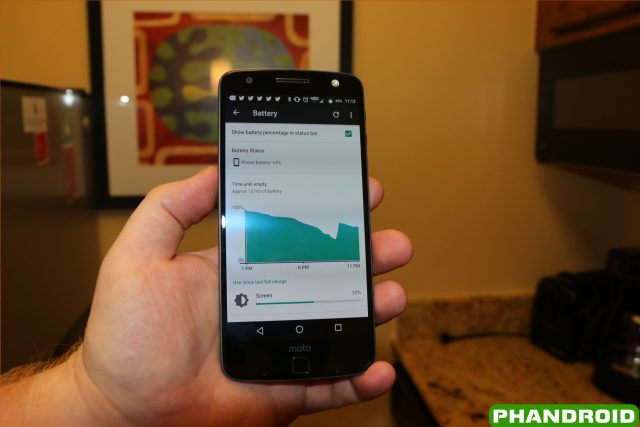
In order to provide the thinnest flagship device, Motorola needed to cut corners somewhere, and the battery met the meat cleaver. Luckily, the Moto Z Droid includes a Turbo Power 15 charging brick, which Motorola claimed to get you an extra 8 hours of battery life in 15 minutes. In our testing, we found that the device would charge up almost 25% in the 15 minutes while using the Turbo Charger 15 power block.
Again, while we understand why Motorola opted for a smaller battery, we still wish they would have put something a bit larger in the device. My usage is rather heavy throughout the day, so mileage may vary for those with less usage, but it’s tough to get through a full 12-14 hours without needing to charge up the Moto Z Droid again.
This is the biggest reason why the Moto Mods come in so useful. There will be three different battery pack Moto Mods at launch, and you’ll definitely want to think about picking one up if you want to be able to make it through a full day.
Camera
Housed within the huge bump on the rear of the device, is a 13MP camera which hopes to be adequate enough for your day to day shots. Motorola opted to move away from the 21MP shooter in the Moto X Style, and chose the a 13MP camera for the Moto Z Droid.
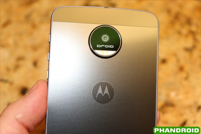
The camera interface is simple enough, and Motorola has installed its own camera application on the device. Although there are a few differences between this camera application and Google’s own camera application, there’s not enough difference to really notice.
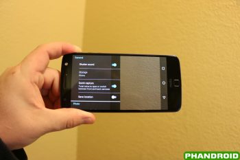
Upon opening the camera for the first time, you will be walked through a quick tutorial where you will be shown how to change the focus and exposure, get more (or less) light in your pictures using the slider, as well as the notifying you that you can use the Quick Capture motion to quickly open or switch between the front and back cameras.
This camera app also lets you change how to take photos; with an on screen shutter button, or by tapping anywhere on the display. Finally, Motorola has a built-in QR and barcode scanner, and when scanned, you will be able to search for which ever item was scanned.
Once the tutorial is completed, the camera app will show a few different options. In the middle is the focus icon that will be the point of focus for whichever pictures you’re taking. On the left hand side, there are icons for the Timer, Flash, and HDR Mode, and if you swipe in from this side, you will be presented with more features to tinker with. On the right hand side, there are icons to manually switch between the front and rear-facing cameras, as well as a few more video/photo taking options such as switching from pictures to videos, panorama mode, professional mode, and slow motion mode.
Once you have your camera set up for your liking, you can start snapping away. In addition to being able to flick your wrist twice to activate the camera, you can also set the power button to open the camera app when pressed twice.
As for speed, we found that the camera was very snappy and responsive. If you want to change your point of focus, you may not want to use the option to tap anywhere on the display, as it won’t always change. However, Motorola thought ahead and allows you to take pictures and videos using the volume up and down buttons, just be sure to keep the device steady when using this option.
While the camera is definitely adequate for taking quick picture throughout the day, this may not be the best option for more professional feeling photos. The Moto Z Droid definitely can’t run with the big dogs like the Samsung Galaxy S7 Edge or HTC 10, but it’ll do just fine for most.
Camera Samples:

Software
Motorola’s take on software changed when the original Moto X was released, as the company began taking a more stock Android approach, with a few enhancements. The Moto Z Droid keeps the premise as its predecessors, offering a stock feel without too many adjustments.
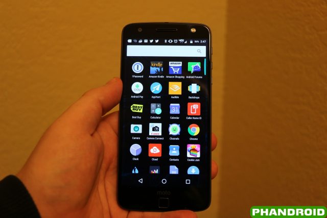
When you power the device on for the first time, you’re introduced to a modified version of Google’s Now Launcher. The page layout is the same, as well as the app drawer, but there’s no Google Now page to be found. There’s not much customization that can be done to the stock launcher, aside from allowing for screen rotation in the launcher, and toggling a Google Search bar on the top of the home screen.
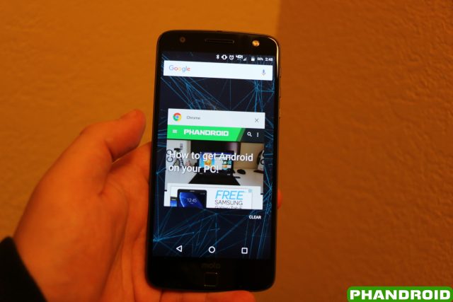
As for switching between apps, this is one of the places were Motorola decided to improve the general experience. If you want to clear out all your recent apps, scroll to the bottom of the list and hit the small “CLEAR” button, and you’ll be ready to go. This feature will be coming in Android Nougat to devices, but isn’t available in stock Android Marshmallow, so it was nice to see Motorola add this.
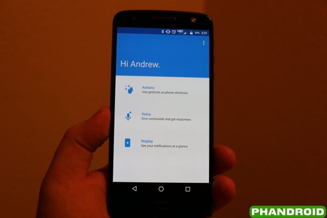
Preloaded on the Moto Z Droid was the Moto App, formerly known as Moto Assist. From here, users can get increased software functionality with their devices, starting with Actions and Voice Commands down to the aforementioned Moto Display features.
Within the Actions panel in the Moto App, there are quite a few actions that can be enabled or disabled. The ability to twist your wrist to quickly open the camera has returned, and so has the ability to make a chopping motion twice to activate the flashlight. Here are the other options that can be found within the Actions panel:
- Approach for Moto Display – Reach for your device to trigger Moto Display
- Attentive Display – Keeps screen on while you’re looking at it
- Flip for Do Not Disturb – Place the phone face down to silence notifications and calls
- Pick up to stop ringing – Life the phone when it rings to immediately switch it to vibrate
- Swipe to shrink screen – Swipe up from the bottom of the phone to make the screen smaller for one-handed use
With devices becoming larger and larger, being able to make everything on the display accessible is a feature that is being added by more manufacturers. Motorola has added the same functionality within the Moto application, and is easily turned on or off from here. Once turned on, all you will need to do is swipe up from the bottom of the phone.
After swiping up from the bottom, you will be greeted with a miniature screen. It almost feels as if you’re looking at “picture-in-picture”, even though the other picture is just a black space. You will be able to interact with all aspects of the device still, just in a shrunken down fashion. Tapping the black space which surrounds the new home screen will revert the device back to normal, making everything big again.
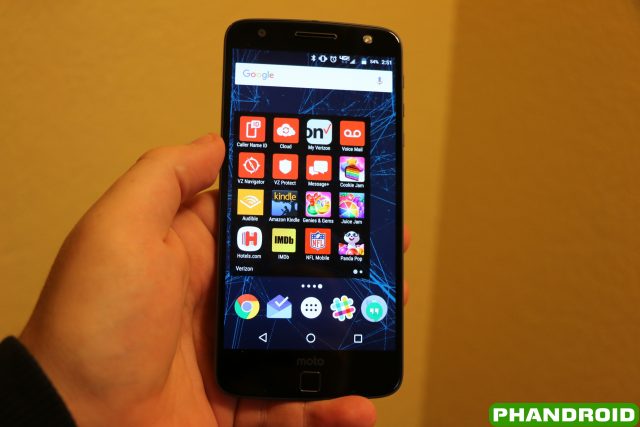
With the review device that we received, this device is carrier locked to Verizon, and as everyone already knows, that means bloatware. On our Moto Z Droid, we found 18 different pre-loaded applications with ties to Verizon and the pre-loaded Moto application. With a device that has 32GB of storage, 18 pre-loaded apps is absolutely unacceptable and unnecessary.
Within those 18 applications, 5 of which were games that we’ve never heard of, 2 were audio applications (Slacker Radio/Audible), and the rest were just part of Verizon’s gigantic suite of useless apps. Now, you can go down the list and either disable or uninstall these apps, but the fact that you have to think about doing so is just absurd.
The tweaks and changes that have been made to the software on the Moto Z Droid offer a minimal look at Android, without all the bells and whistles found within the likes of Samsung’s TouchWiz or LG’s interface overlay. From the Moto application to the Google-esque feeling of the launcher, Motorola knocks the software out of the park yet again. Just keep in mind to ignore all the bloat that has been pre-loaded on the device thanks to Verizon.
Conclusion
The Moto Z Droid aims to rethink the possibilities of a modular design, all within a sleek and sexy body. Even with its downfalls, the device has just set the bar for what other manufacturers will need to overcome in the future. Additionally, much of the Moto Z Droid’s capabilities are hinged on what different modules will come out of the woodworks once the device is launched.
Looking at what the Moto Z Droid is capable out of the box, we are blown away. From the ridiculously thin form-factor, the decent camera, and the ability to attach modules to the device with a snap, Motorola definitely seems to have a winner on its hands.
Motorola Moto Z DroidRating: star_fullstar_fullstar_fullstar_fullstar_empty (4/5)
The Good
- Premium design and build quality
- Incredibly thin
- Switching Mods is a breeze
- Great fingerprint sensor
- Stock Android feel
The Bad
- Camera is mediocre
- Fingerprint magnet
- Battery life is meh
The Bottom Line
The Moto Z Droid aims to rethink the possibilities of a modular design, all within a sleek and sexy body. Even with its downfalls, the device has just set the bar for modular smartphones. Additionally, much of the Moto Z Droid’s capabilities are hinged on what modules may come out in the future, and the possibilities are endless.








Comments