When Google introduced Now On Tap alongside Android Marshmallow, the feature left many people scratching their heads. Why was Google Now removed when you held down the home button and replaced with a feature that really didn’t make things easier? Well, it seems that may be changing soon with Now On Tap getting more useful.

Image courtesy of Android Police
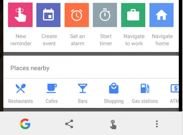
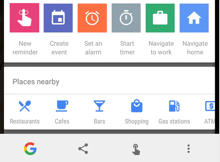
A few users have noticed Now On Tap with an updated UI and a few more options than what was available before. The update turns Now On Tap into more than just an awkward way to search anything on your screen.
As you can see in the screenshot above, the updated Now On Tap gives you two different boxes, with various selections in each. Users will be able to create reminders, navigate to work or home, or find the best places to go.
We’ll have to wait and see if this actually improves the experience of Now On Tap, but I’m not holding my breath.
[via Android Police]


Comments