Material Design was introduced in 2014 alongside the release of Android Lollipop. Google has implemented a set of guidelines that many of our favorite apps and websites (like PHANDROID) have started to follow. Many of Google’s websites have already made the transition to its Material Design guidelines. However, there are two major pages that are still sitting in 2014; Google Search and YouTube.
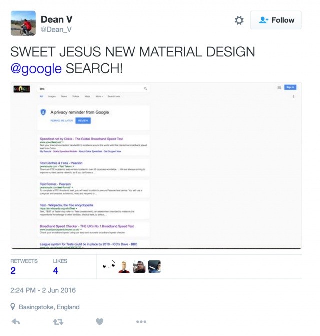
While Google has started implementing changes to YouTube for some users, the Search page still has yet to receive any love, that is, until the last couple of days. A few users have reported to Twitter and Reddit that they are starting to see Material Design guidelines implemented into their searches.
The changes are subtle, and that’s not completely uncommon, for example, last month we saw Google start changing the color of links in the Search page from the traditional blue, to black. Some of the changes users are seeing include a new icon for the magnifying glass within the search box, as well as a different colored background for the general search page.
Have you started seeing these changes roll out within your Google searches? Drop us a line and let us know.
[via Engadget]






Comments