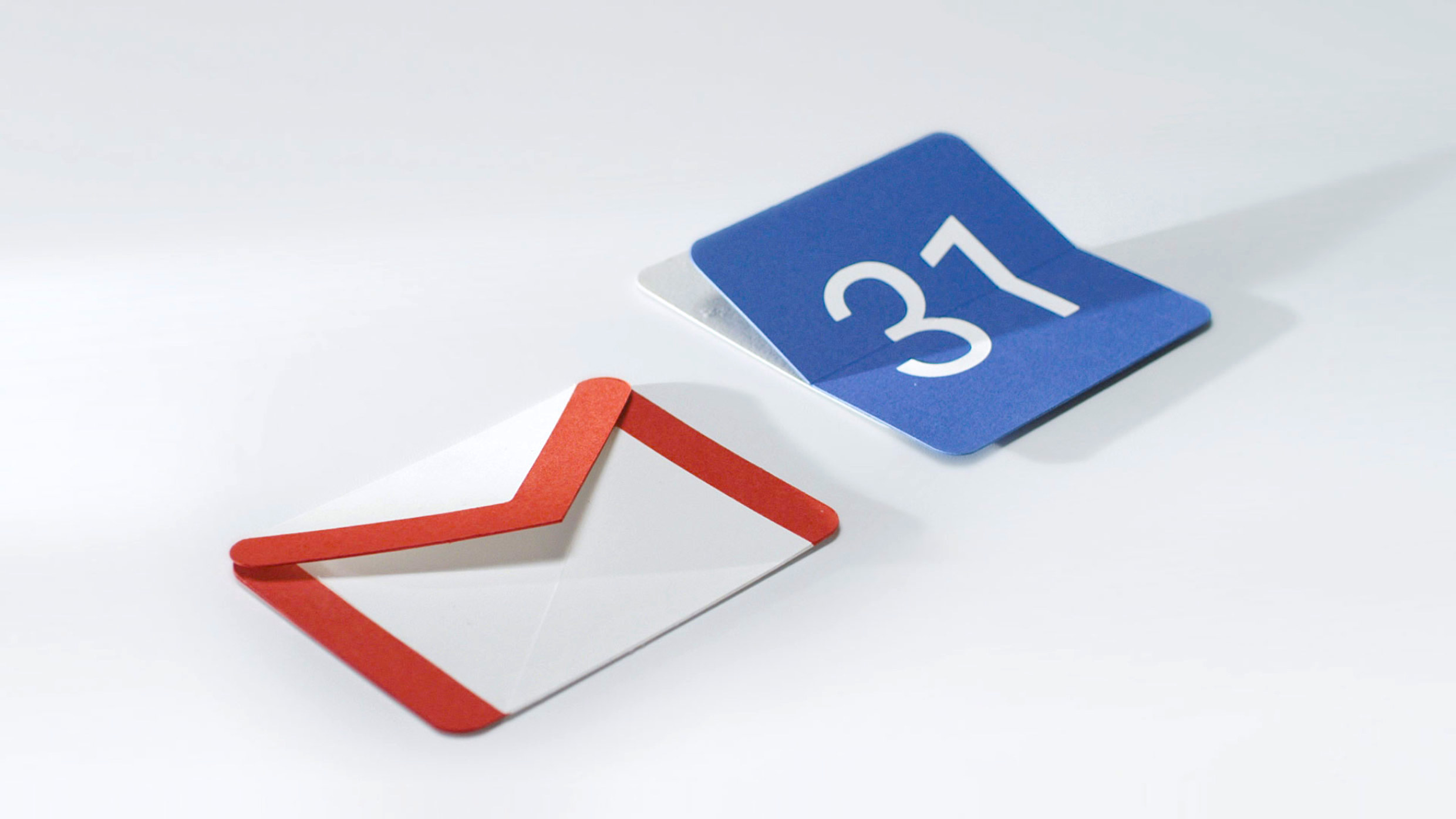
More and more Android apps are finally adopting the Material Design guidelines that were put in place with the release of Android 5.0 Lollipop. These guidelines have been tweaked plenty of times since then and only recently made their way to smartwatches with the release of Material Design guidelines for Android Wear 2.0.
During Google I/O 2016, Google announced that there are now over 1 million apps in the Play Store that adhere to the Material Design guidelines. Matias Duarte, the man who started out his work with Holo UI introduced in Honeycomb/Ice Cream Sandwich, reminded us on Twitter of the milestone, a part he played in bringing Android UI into the 21st century.
The more apps are updated to follow Google’s new guidelines, the better experience users will have with a clean, single uniform UI. If you want to take a look at some of the best Android apps and games (some of which are shining examples of Material Design), be sure to check out our Best Of lists below.
- 100 Best Android Apps
- Best Android Games for 2 Players
- Best Android Games for Killing Time
- Most Addictive Android Games of 2015
- Reader-voted best apps
Know of any recently released apps that show off Material Design in all its glory? Let us know some of your favorites down below.







Comments