
Instagram update makes the UI black and white to let your photos pop
Instagram today officially revealed their new design for their mobile apps. For starters, we’re getting a new flat icon — yay! It’s a gradient of purple, blue, orange and red. Seems to cover the spectrum well enough, and it does look quite pleasing to my eye. Others may disagree.
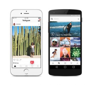
![]()
As you can see, Instagram applied the new style to some of their other creative apps such as Layout, Boomerang and Hyperlapse. Beyond that, though, is a new user interface for the app. Instagram didn’t make any huge changes here — we still have that same tabbed UI they love, only now the UI is greyscale.

The idea is to cut out the distractions so you can enjoy those beautiful photos and videos even more. To go along with that, the bottom navigation bar is much less profound and not as “in your face” as it was in the previous design.
But it’s still the same Instagram you’ve become used to otherwise. Head to Google Play for the download.
[via Instagram]