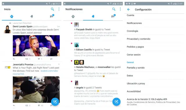
It’s pretty safe to say Twitter’s Android app looks more like a retooled version of their iOS app than anything. It’s not to say it’s bad, it could just use a little updating, that’s all. As part of a new alpha rolling out to testers, Twitter is getting ready to infuse the app with a fresh new Material Design update, with a UI much better suited for Android.
According to leaked photos, the app has that FAB (floating action button) we’ve seen make its way to so many other apps, as well beautifully subtle animations throughout. Moving between home, Moments, notifications, and messages can now be done just be swiping left or right, much easier than trying to reach your finger across your 5.5-inch+ smartphone to reach the buttons.
The updated UI seems to be a server side switch, something only those who are officially enrolled in the alpha testing program are seeing. In other words, installing the alpha wont actually show the new UI unless you’re an official, so don’t even bother. For now, we’ll just have to wait for the updated UI to roll across beta channels, where it will eventually make it’s way to the stable version on Google Play (if it even makes it that far). No telling how long that could take.
New Twitter is dope af pic.twitter.com/NGv9t85eNB
— Juan Mata (@juaninamilli) April 11, 2016
Thanks, Juan and Hernan!







Comments