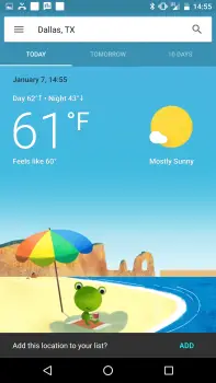
Google seems to be testing a beautiful new weather interface
Don’t look now (OK, maybe you can), but Google is testing a new weather card. Several users have reported seeing the change when they look up their local weather in Google. Before, the search result was presented in plain white and black, with just a splash of color being seen in the different icons illustrating weather conditions.
But Google’s new redesign introduces a blast of color that would make us eager to check the weather every morning we wake up. The main “today” view on the card serves up a brief look at the daily weather conditions, with a nice cartoon graphic to give you a more visual representation of what’s in store for the day.
The “tomorrow” view doesn’t seem to show such a graphic, but it does display a colorful gradient that may vary between blue, gray and anything in between to match the mood of the day. Lastly, the 10-day tab seems to bring up a more traditional looking list of what’s to come in the days ahead.
It’s worth clarifying that this is not a new Google Now card, but the view that comes up after you tap a Google Now weather card. It looks pretty great and we can’t wait to see it rolled out to everyone, but knowing Google that might not even happen until weeks or months down the line. What do you think?
[via Reddit]