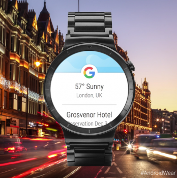
Google Now’s new, more consolidated look for Android Wear is finally rolling out to everyone
It was about a month ago that Google seemed to be testing refreshed Google Now cards for Android Wear, but it’s only today the update is now finally ready for the masses. Highlighting the newly updated UI is Google’s very own Android social media accounts, showing off the new features in a quick video.
The new Google Now interface is now more like a list, combining all of your cards into one place for easy navigation. Interaction is improved too, with the ability to dive into a card for more info. It’s much more intuitive than having to scroll past all your other Android Wear notifications in order to find a single Google Now card on your smartwatch. Now everything is in one place.
We don’t have the update quite yet on our Moto 360 (2nd Gen), but here’s to hoping it’ll arrive for everyone soon enough.
[Google+]