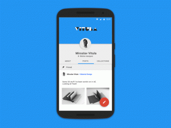
This is what a Material Design rotation animation would look like on Android
While it’s true Android Lollipop brought some pretty cool new software features, it was the Google’s all new Material Design that had us foaming at the mouth. Seen as the biggest UI change to Android since Honeycomb/Ice Cream Sandwich, it wasn’t so much the minimal look that made us moist, but the promise of an OS that came to life through the use of slick animations throughout. Unfortunately, it seems this was never fully realized in Lollipop, not even inside Google’s own apps where Material Design is often little more than a thick app bar and floating action button.
Click to play GIF (mesmerizing, isn’t it?)
It’s probably not something you’ve thought about, but we haven’t seen an update to Android’s rotation animation in countless updates but now one designer is showing us how it could look with a little Material inspiration. Created by Miroslav Vitula, his idea for a slick new rotation animation actually isn’t too unlike the one found in iOS, only more visually appealing with all the little UI pieces dynamically resizing and moving to fit the new orientation. It’s such a smooth animation thanks to something Google calls “authentic motion” on their Material design site. We can only hope Android design lead Matias Duarte is taking note.
Thanks, @qbking77!