A little more than a month after Google released the Android M Developer Preview they have released their first update. We already showed you all the new features in the first preview of Android M, but now there are a few more things to check out. The changelog is much shorter this time, but there are some new features and changes that we think you’ll like. Let’s take a look.
The App Drawer Has Been Fixed
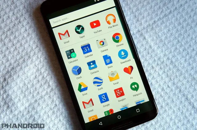
The new app drawer in the first Android M preview was met with much criticism. Google replaced the horizontal scrolling pages from Lollipop with a vertical list. The icons were huge, and the alphabetical organization system had a lot of wasted space. Thankfully, they’ve fixed it in the 2nd preview.
It’s still a vertical scrolling list, but now the icons are smaller and fit in a compact grid. You can still use the search bar to find apps, and the four most recently used apps are still listed across the top. This is a much nicer implementation. Now the app drawer and widget picker work the same, and the app drawer requires a lot less scrolling.
Delete Screenshots from the Notifications!
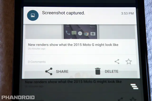
Okay, so this isn’t a revolutionary feature, but it’s certainly handy. When you take a screenshot it always appears in the notifications with the option to “Share.” Now there is a new option next to “Share” that allows you to delete the screenshot. You don’t have to waste time going into the gallery to delete a bad screenshot.
Bye Bye, Dark Theme
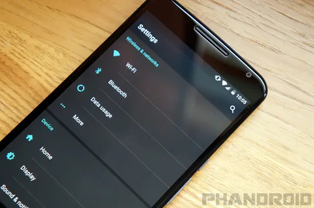
Google can add features, but they can also remove them. One of the coolest hidden features of the first Android M preview was a dark theme mode. It only put the settings into a dark theme, but we were hoping it was the beginning of full theme support in stock Android. Unfortunately, the dark theme mode is no longer available. We’re sure we’ll see this feature again some time in the future.
Remove Icons from the Status Bar
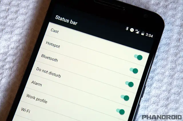
The first Android M preview included the ability to customize the toggles that show up in the Quick Settings. Most other Android OEM skins already allow this feature, so it made sense for Google to add it. In the second preview they have taken the customization to the next level. You can decide which icons show up in the status bar.
When you go into the System UI Tuner settings you’ll see “Status Bar.” In here you can toggle the icons for things like Bluetooth, Do Not Disturb, Alarms, WiFi, Cellular Data, and more. The only thing you can’t remove is the clock and battery. Speaking of battery, you can enable “Show embedded battery percentage” to see the percentage displayed inside the battery icon.
Cleaner Storage Settings
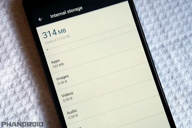
The “Storage” settings have been renamed to “Storage & USB.” Along with the new name is a fresh design for the page. Gone is the colorful bar showing how much space you’ve used. In its place is a simple line and a read-out of how much space you’ve used and how much space is available on the device. Underneath is the same shortcuts to apps, images, videos, etc. But at the very bottom is “Explore,” which takes you to the built-in file manager. A nice touch.
Memory Gets Moved to Prime Time
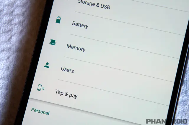
In the first Android M preview, Google added a memory management feature that was buried deep inside the settings. Now it has been moved to the front page of the Settings. They also cleaned it up a bit, but it still allows you to see how much memory has been used in the last 3 hours up to a day, and see which specific apps are using the most memory. It’s a very useful feature that deserves to be up front.
Opt-in to Google Now on Tap
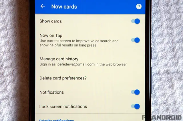
Google Now on Tap is going to be awesome, but it wasn’t available in the first preview of Android M. It’s still not working in the second preview, but we’re a step closer. In the Google Now “Now Cards” settings you can opt-in to Now on Tap. You’ll be brought to an unfinished page that allows you to choose “IN!” or “OUT!”
***
And that’s pretty much it for this release. It’s a step in the right direction. They’ve fixed some of our complaints from the first preview, and added some nice features. Are you running the new preview on your Nexus device? Have you discovered any features we didn’t cover?






Comments