Pushbullet listens to feedback, fixes annoying share menu after user backlash
On yesterday’s Mobile Roar podcast we talked briefly about the latest Pushbullet update and how it somehow broke the one feature many of us use it for in the first place: easy sharing to our Android devices.
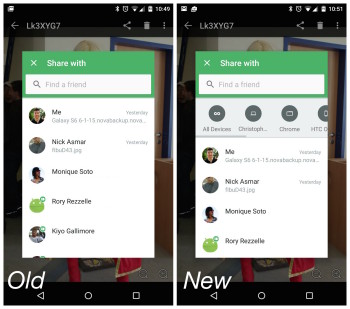
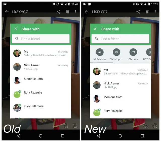
Pushbullet is seemingly going through a weird transitional phase where the app now mimics a messaging app more than anything. But that’s not even what bothered us. When sharing links, photos, or files to your devices, the app required an extra button press (I know, GASP!) to pull up your devices. You’d pick Pushbullet from the Android share menu, then select yourself, then select one of your devices. It wasn’t so much an annoyance as it was less convenient and convenience is exactly what Pushbullet has been selling this entire time.
Listening to feedback from users — just like us — who weren’t pleased with the new update, Pushbullet announced on their blog that they’ve updated the Android app with a new bar that displays all your devices. They’ve also made a few changes to their Windows and browser extensions based on feedback as well. Can’t remember the last time we’ve seen an app developer address so many user concerns so quickly, but there you have it. You can find an update to Pushbullet waiting for you on the Google Play Store right now.


