Google highlights their favorite Material Design apps on Google Play, here’s the full list
Hot of the heels of Google I/O 2015, Google’s Design Team is ready to talk about, what else, but design. During I/O, they gave their entire site a fresh new Material design overhaul. As most of you know, Material is Google’s new design language that was introduced last year in Android 5.0 Lollipop and bled out into all of Google’s web services.
Material design focuses on clean, minimal design with bold colors and typography that emphasize depth and are brought to life with gorgeous animations. Still confused? Simply put, it’s a lot like paper. Well, maybe the Google design team can explain it better in their latest video:

While we’re just now seeing more and more Android apps follow this design philosophy, some definitely do it better than others. There’s no better way to show what Material Design is than by simply showing you. That’s why Google’s Material Design team decided to showcase their favorite apps adhering to their guidelines in a new featured page in the Google Play Store.
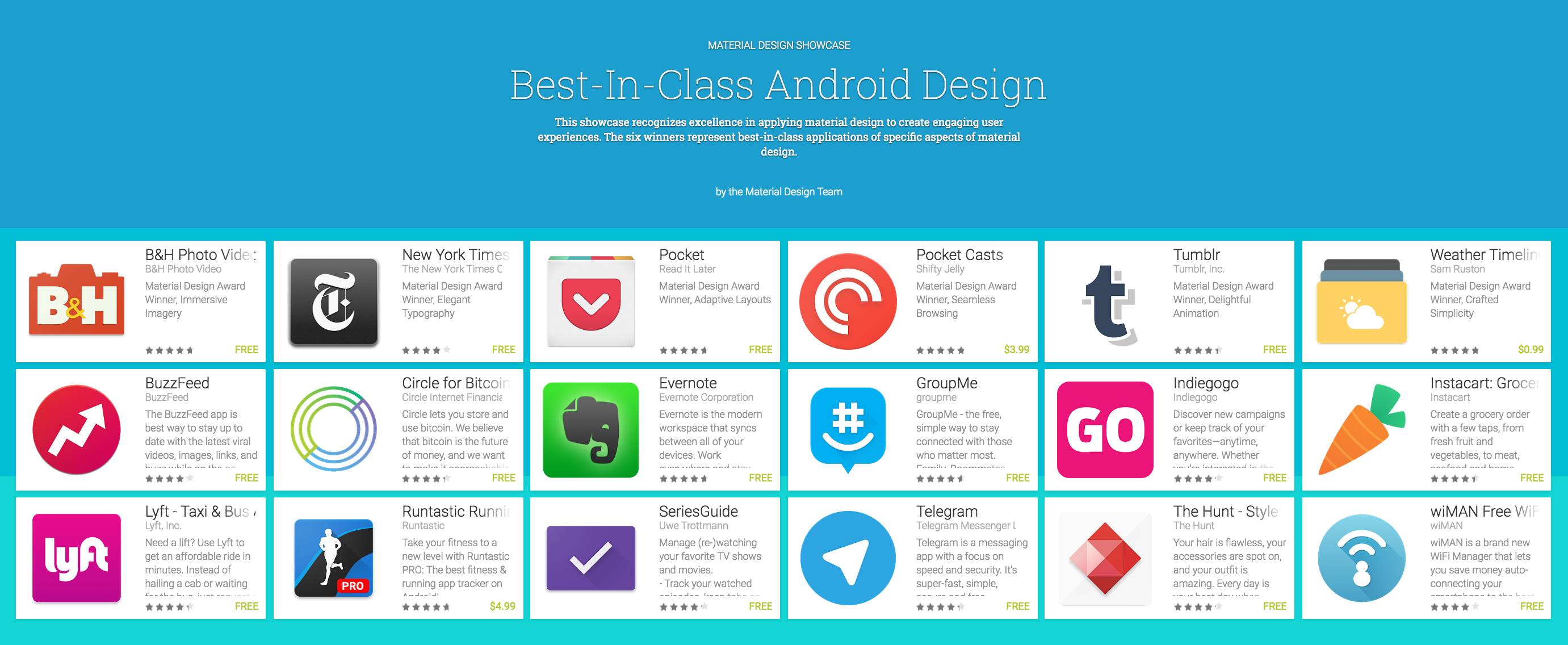
There’s 18 apps total ranging from fitness to messaging and everything in between but Google hand-picked 6 which they felt excelled in specific areas for their first ever “Material Design Awards.” Here are the top picks:
B&H Photo Video Audio Pro for Immersive Imagery
New York Times for Elegant Typography
Pocket for Adaptive Layouts
Pocket Casts for Seamless Browsing
Tumblr for Delightful Animation
Weather Timeline for Crafted Simplicity

If you’d like to see all the others are featured, the full list can be found over on Google’s landing page here.