Split keyboard and multi-window are just a few tricks Android Marshmallow has in store for tablet owners [VIDEO]
Android M’s hidden multi-window mode
To say we’re over Lollipop and its shenanigans would be an understatement. Right now, we got our eyes locked on Android M and all the improvements and polish the future Android update looks to bring to the platform. There’s a lot of stuff being uncovered almost everyday — and we’ve shown you much of that already. — but if you’re wondering what Android M has in store for tablet user, it seems Google’s got your back.
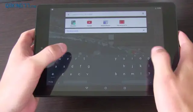
Our friend Tim Schofield, better known around Android circles as Qbking77, uploaded a video showing off some much needed features heading to the Android M release. He discovered that the default Google keyboard actually features a split typing mode for use on tablets where your thumbs have trouble reaching all the keys. It doesn’t appear to be available for smartphones, even ones as big as the Nexus 6 but that could change in the future.
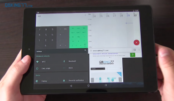
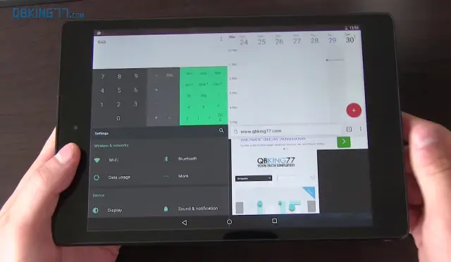
There was also an all new multi-window mode that actually isn’t available in any of the settings by default, but can be added only after tinkering around with the build.prop. Once the necessary changes have been made, the new setting can be toggled in the Developer options. It works pretty well even in this early state, with a button that appears in an app’s title bar whenever opening Android’s recents menu.
When pressed, a menu pops up asking you to specify the layout. It’s a little “hack-ie,” but we’re sure it’ll be polished up in time for M’s release later this year. We were actually surprised at how well everything worked. Even with 4 apps open at the same time, scrolling was smooth and everything loaded up quick.
Other small improvements like the notification shade the moves around the top depending on where you initiate the pull down gesture is also a nice touch. It’s surprising really. All these changes are somewhat small but when combined, make for an OS update that already has us drooling. Why these couldn’t have been included in Android Lollipop is anyone’s guess, but given Lollipop’s dramatic UI overhaul, I’m sure they just didn’t have time. We will admit, it’s nice seeing Google — who typically takes the bare bones approach with their apps — going this extra mile to add more user customizations like this. Choice is good. Check out Tim’s full video down below.


