
Android M’s new launcher has an app drawer you’re probably going to hate [VIDEO]
With the exception of HTC’s Sense UI, it’s been awhile since we last saw a vertical scrolling app drawer on Android. Ever since Ice Cream Sandwich ditched Gingerbread’s vertical scrolling app drawer for a nice horizontally scrolling one, it just felt… well, right. While Froyo’s cubed shaped app drawer will always hold a special place in our hearts, we’ve loved the way vertical scrolling felt.
Last year’s Lollipop update added a little spin on the classic home screen with an all new Google Now launcher featuring easier access to Google Now and white cards in the app drawer. It’s crazy to think that Google is already changing things up again this year and it’s pretty drastic.
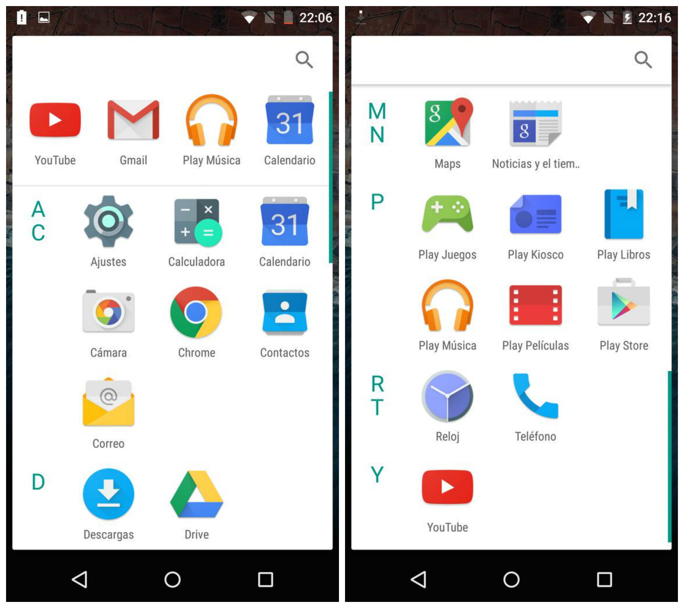
The Android M Developer Preview features a new throw-back launcher with an app drawer that scrolls vertically, something we haven’t seen since Android’s early days. Upon opening, a row of recently used apps can be found along the top (something we’ve recently seen in 3rd party launchers) along with apps that are now sectioned off by the alphabet.
You’ll also notice a new app opening animation that kind of zooms out from the app icon itself (although backing out of an app still uses the old Lollipop animation). Oh, and if uninstalling apps from the app drawer wasn’t easy enough, you can now do this by dragging icons straight from the launcher itself. You can see what we’re talking about in the video below.
https://www.youtube.com/watch?v=TNOCaBbn-KE
We have to say, it’s a strange move but of course this is a developer preview and anything can change in time for M’s official release later this year. In either case the vertically scrolling app drawer wont mean much to many of you already invested in one of Android’s many 3rd party launchers.
Thanks, Hernan!