Samsung Galaxy S6 Edge review: worth an extra $100?
After posting our lengthy Samsung Galaxy S6 review a few weeks back, it behooved us to do something similar for its sibling, the Samsung Galaxy S6 Edge. Sure, we briefly talked about some of the new Edge features already in our S6 review, but we felt like going more in depth with these new Galaxy S6 Edge features in a review all of their own.
On the hardware front, the Samsung Galaxy S6 and S6 Edge are near identical for the most part, sporting nearly the exact same internals as one another (with the exception of a very small 50mAh increase in battery capacity for the S6 Edge). It’s this reason for our review, we’ll be focusing on the one feature that sets the two apart: the $100 extra curved Edge display.
EDGE SCREEN
How it looks (Verdict: Stunning)
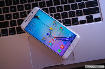
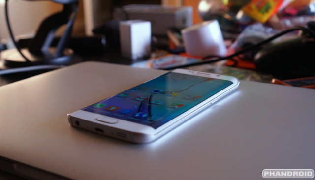
It’s the single defining feature of the Galaxy S6 and most can agree it improves upon the traditional boring “flat” smartphone design with something that looks like it stepped out of science fiction. The fact that the phone can often times be found appearing solo in Samsung Galaxy S6 marketing materials has us feeling like this is the Galaxy S6 Samsung wanted to make, but simply couldn’t due to constraints surrounding production of its curved AMOLED display. Without a doubt the Samsung Galaxy S6 Edge looks fresh, leaving Samsung with a product to finally set itself apart in a crowded market. In other words, they done did good.
Samsung would love for you to believe that the S6’s “Edge display” brings some kind of added functionality to the phone by displaying UI elements not normally viewable (or difficult to see) on a regular flat screen. Truth is, you could probably view the exact same information on a flat display when viewing the phone at a downward angle.
When looking at the phone directly from its side (if you’re laying in bed and viewing on your nightstand for instance), information from the Edge screen features are actually cut in half where they sit a lot higher than the actual edge of the display. How’s that for irony?
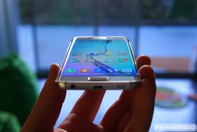
Before we got our hands on it, we were honestly expecting something much more extreme and/or closer to what we saw with the Samsung Galaxy Note Edge. Upon closer inspection, the Edge display is actually much more discrete than it appears in promos and it’s probably better off. If the curve was angled any more than it already is, it would make full-screen viewing an extremely awkward experience.
That’s not to say the curved display doesn’t take some getting used to. Viewing web pages, videos, or images online feel strange at first, with your eyes focusing only on the flat portion of the display, discounting anything wrapping over to the curve portion. Aside from the image becoming warped and colors looking off, the curved edges also pick up a fair amount of glare, making full-screen viewing a bit more difficult than usual.
We’ll admit, it’s only really a problem when using the phone outside or when the display is dimly lit. Turn up the brightness indoors, and you shouldn’t have much of a problem, if at all. It was bothersome enough for us to want to run back to our boring, basic, flat S6 unit. In the end, the Samsung Galaxy S6 Edge isn’t necessarily going to turn any heads and anyone that doesn’t know much about technology likely wont be impressed by this hardware feat.
How it feels (Verdict: Awkward)
Apart from its handsome good looks, the Edge doesn’t really offer up any real-world benefit. In fact, the curved display actually makes for a smartphone that’s both more difficult to view and awkward to hold. This is all thanks to the same metal frame from the Galaxy S6, only on the Edge, it shrinks down around the sides of the device. This allows that curved edge to extend halfway down its sides.
The problem is with such little surface area to grab onto, you never quite feel like you have a confident grip of the S6 Edge. Doesn’t help matters that the metal frame also feels like non-stick Teflon.
Needless to say, unless you’re comfortable with your phone flipping and flopping out of your hands and onto pavement — you’re going to want to invest in some protection. Using a case largely remedies this lack of grip issue , but you may find the selection of cases for the S6 Edge is much more limited than say, the regular S6 model (we listed some of our favorites right here).
And although it may sound weird to say, using a case was probably our favorite part about the S6 Edge. Because the frame is so far along the sides of the phone, equipping a case — even those bulky rugged ones — never impedes on the edge itself. This allows your finger to reach and slide over the edges of the curved display without the usual thick rim of a case getting in the way. We absolutely loved that.
Speaking of sliding our fingers over the edge of the display, grabbing UI elements — like slide-out navigation menus — feels a hundred times more enjoyable than your usual flat device. We did notice a sort of dead zone along the sides (as well as slightly thicker black bezels), more than likely there to compensate for fingers that may slightly encroach on the Edge display when holding the device. We should also note there were more unintentional screen presses along the edges when viewing full screen media and/or playing video games. It was more than frustrating.
We should note, tempered glass screen protectors (the only kind we use on our phones these days) present a very real challenge for the Galaxy S6 Edge as the vast majority available only cover the middle flat portion of the display — not the curved edges. There are very few tempered glass screen protectors available for the S6 Edge (we did find this one from Amzer), but expect to pay a higher premium than usual. This means plastic film screen protectors are generally going to be your best bet for now, but at least they’re inexpensive.
Ultimately, the way that 3D-ish display felt when gliding our fingers across was easily the best feature of the S6 Edge and something that made transitioning back to flat phones feel…. well, a little boring to us. But as we mentioned, a nice case is all but mandatory for this version of the S6. Thankfully, we listed some of our favorites in a previous post right here.
EDGE SOFTWARE
Even if the Galaxy S6 Edge doesn’t bring any real world functionality in and of itself, the phone is bundled with a handful of exclusive software features to help take “advantage” of its curved display. Sure these features could have come bundled on the Galaxy S6 and worked just as well, but that’s neither here nor there.
In this portion of the review, we’re going to examine Samsung’s new “Edge screen” features for the Galaxy S6 Edge and evaluate whether or not they are helpful, or just more bloat Samsung packed onto the device to try and fool the masses. Let’s get to it.
Edge lighting (Verdict: Useless)
Edge lighting is an S6 feature that allows the edge of the display to light up whenever you receive a phone call or notification. It only works when the phone is faced down and gives users the option to reject calls by long pressing the heart rate sensor (you can even set this up to shoot out a customized quick reply).
Edge lighting also works with People edge, so it’ll glow with the color you set for some of your favorite contacts. This is so you can always see who’s calling/notifying at a glance. But you know what also works for seeing who’s calling at a glance? Setting your phone face up like the good Lord intended.
Not only is Edge lighting almost completely pointless, it’s downright dangerous if you care about keeping your phone in pristine condition. You will — I repeat, will — be scratching your phone’s display if you lay it face down on just about any hard surface. Tiny bits of dirt, salt, or any other micro particles will scratch up the display, Gorilla Glass 4 or not. The only time this feature would even be acceptable is when using a screen protector, but even then — why not just set the phone upright?
People edge (Verdict: Helpful)
The People edge is probably going to be the feature most people use on the Galaxy S6 Edge. It’s basically a persistent shortcut on the home and lock screen that appears along the right or left side of the phone’s display, giving you quick access to your favorite contacts. Pull it out, and you can quickly call, text message, or email one of the contacts you’ve preselected (up to 5).
Since these contacts are all color coded (blue, green, yellow, orange, and purple), it’s easy to see at a glace any missed notifications and quickly address them by tapping on the appropriate icon. There’s also an option to have your phone alert you every time you pick it up to ensure you never miss a notification from the people you care about most (or those who keep you on a short leash). You can even toggle what kind of notifications you’d like to receive (missed calls, messages, or emails).
This is actually a neat feature, don’t get us wrong. But it’s just one that doesn’t really require the Edge screen to exist. It could have been just as helpful on the regular S6. Of course, that doesn’t take anything away from People edge which was something we found actually came in handy for the most part.
Information stream (Verdict: Somewhat handy)
Information stream is basically a news ticker that displays feeds according to your interest. Since they’re only displayed on the edge screen — and the main screen is “turned off” — Samsung says it shouldn’t eat up too much battery life when displayed. Activating the Information stream (when enabled in Edge screen options) is done by performing a quick swiping gesture on the Edge screen while the phone is sleeping. After that, a ticker will be displayed according to the feeds you’ve set up and for however long you’d like (15 seconds, or even up to 10 minutes).
Options for the news ticker are fairly limited at this point and include general Android notifications (specific apps can be turned off, but all are enabled by default). As far as news feeds, Yahoo! News, Twitter Trends, Yahoo! Finance, and Yahoo! Sports available on the device, with the ability to download feeds from Whoscall – Caller ID & Block, RSS Feeds for Edge, and BILD Newsticker. Tapping on a news item will open the browser and pull up the article. Oh, and weather can also be displayed, with the settings controlled by the general Samsung weather app.
We found Information stream somewhat useful, but couldn’t help but feel like it sucked up more battery life than Samsung lets on. This wouldn’t have been so much of a big deal if Samsung simply added the option to display Information stream only while the phone is charging.
Night Clock (Verdict: More harm than good)
Night clock is the final Edge screen feature and, well, does exactly what the name suggests. It displays a dimly lit clock on the Edge screen for easy viewing while laying on your nightstand. When enabled, it’s up to the user to set the display time and the duration maxes out at 12 hours, so you can’t have it on 24/7.
Despite only displaying a dimly lit clock — which is supposed to keep the “main screen” off — we noticed a good deal of battery drain than when normally sleeping. We activated Night Clock in a pitch black room and actually noticed the entire display was dimly lit. Suddenly that battery drain made a lot more sense. In the end, this meant that unless we were plugged in for the night, Night clock wasn’t a viable option for us, again, something Samsung could have easily rectified by adding the option to display only while charging.
Verdict
Now that we’ve fully examined the Samsung Galaxy S6 Edge and every single one of its Edge screen features, it’s time to reach a verdict. At $100 extra for the S6 Edge, does the curved display actually bring anything more to the table than sexy good looks? The short answer: no. But does it really have to?
In a world of cookie cutter smartphones, it’s clear someone needed to step out and finally do something different. It just so happened to come from the unlikeliest of places, Samsung, who has done a great job at building a smartphone that looks unlike all the rest and even steals some of the lime light away from beauties like the iPhone 6 or HTC One M9.
As long as you understand what you’re getting, we don’t think anyone should feel bad dropping 100 extra dollars for the S6 Edge. People value good design. They do it all the time. I found myself buying more expensive plastic silverware simply because it looked nicer than the cheap stuff. Others may splurge on designer name clothes or shoes because they simply fit better or look nicer than the stuff they find at Walmart. And there’s nothing wrong with that.
We will say, for the more thrifty buyer, that $100 might be better spent on upgrading the internal storage of the Galaxy S6 (which also sees a $100 jump for every configuration). Just something to keep that in mind if you can’t decide between a 32GB S6 Edge, or 64GB regular S6 for the same price.
Sure, we found the Edge screen was little more than a gimmick to get you to pluck down more money for a smartphone that does everything the regular version can do. While spending an extra $100 is probably asking a little bit much (Samsung really couldn’t have made it only $50 more?), we couldn’t help but find ourselves suckered into picking up the S6 Edge over the regular model.
If you received a little extra dough in your tax refund and have $100 burning a hole in your pocket than by all means, treat yo self. As long as you know what your money is getting you, ain’t no one going to fault you for it.
Samsung Galaxy S6 Edge Rating: star_emptystar_25star_50star_75star_full (4.6 / 5)
The Good
- Fresh design
- Great conversation starter
- Cases don’t impede on Edge screen at all
- Envy of friends too poor to afford it
The Bad
- Edge screen distorts images
- Edge screen picks up extra glare
- Awkward to hold
- Software features are mostly gimmicks
- More expensive than regular S6 model
The Bottom Line
The Galaxy S6 Edge sure looks pretty, but its hardware benefits mostly fall flat. Unless you’re hell bent on being the coolest kid on the block with its cutting edge design, that extra $100 would be better spent on increasing the internal storage on the regular Galaxy S6.
Additional Samsung Galaxy S6 Edge resources:
- First 13 things every Galaxy S6 owner should do
- 50+ Samsung Galaxy S6 Tips & Tricks
- 10 Tips every Samsung Galaxy S6 Edge owner should know
- Best Samsung Galaxy S6 Edge cases
- Samsung Galaxy S6 Edge forums at AndroidForums.com


