With a seemingly endless amount of marketing dollars at their disposal, Samsung has long been the reigning king of Android. Nobody else comes close on a global scale. This isn’t so much because Samsung has always built the best-looking devices, or even developed the most intuitive software. It’s because Samsung discovered early on that if they threw enough ad dollars into something, it would guarantee success. And for the most part, they were right.
But as we saw with last year’s Samsung Galaxy S5, it was clear people were wising up. The device failed to resonate with consumers and in the end, failed to meet Samsung’s lofty sales goals. Sure it had lots of “me too” features (fingerprint reader, heart rate sensor, loads of software enhancements), but it was a jack of all trades and master of none.
With the Samsung Galaxy S6 and Samsung Galaxy S6 Edge, Samsung has finally seen the error of their ways. The new handsets aren’t so much a deviation from Samsung’s traditional Galaxy line as they are a very necessary evolution. The good kind. But is it all roses? Let’s jump into our review.
Design / Build quality
I’ve always been pretty vocal about my disgust strong distaste for last year’s Samsung Galaxy S5. In a world where smaller OEMs like HTC and Motorola were focusing sleek designs and more premium build materials, Samsung was content in selling yet another plastic flagship with the same tired, uninspired design. Needless to say, the Galaxy S5 left a lot to be desired and plenty of room for improvement in the Galaxy S6.
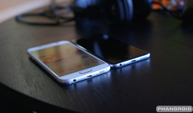
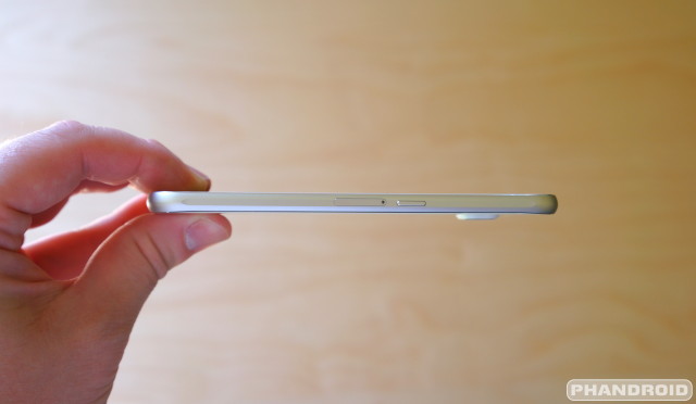
At first glance, it’s clear the Galaxy S6 is unlike any other Samsung devices before it. But we’d be lying if we said the phone didn’t appear to take a few design cues from a certain other competitor. Not so much the new aluminum sides. One could easily argue Samsung adopted that design from their ATIV S Windows Phone. Yet we still feel like some additional work could have been done to avoid obvious similarities with the iPhone 6.
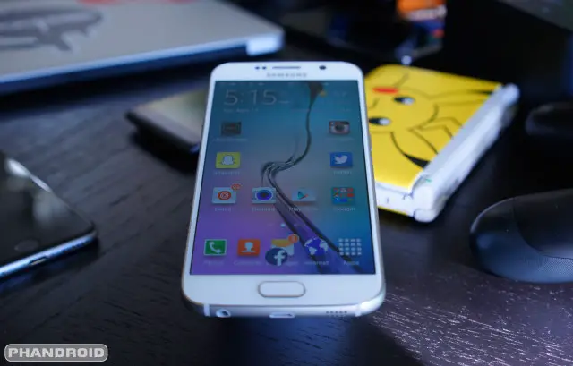
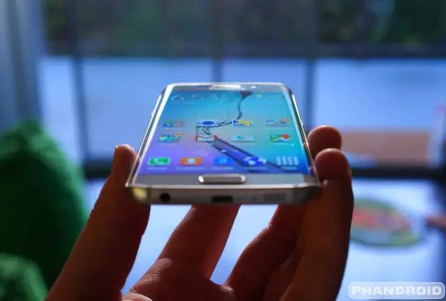
Instead of avoiding similarities with the iPhone 6, Samsung seems to have wholly embraced them. It feels blatantly intentional. The 3.5mm headphone jack has now moved from top — where it has been since the original Samsung Galaxy S — to an all new position at the bottom of the S6. Sure a few phones have a similar setup, but it’s even placed to the left of the charging port just like on the iPhone 6.
On the opposite side, we now find billet drilled holes where the speaker has, wouldn’t you know it, also been moved from the back to the bottom. We know. It’s entirely possible this is all just one big, silly coincidence. Perhaps Samsung designers never once laid eyes on the iPhone 6 when adding the final touches on the Galaxy S6. Somehow we doubt that.
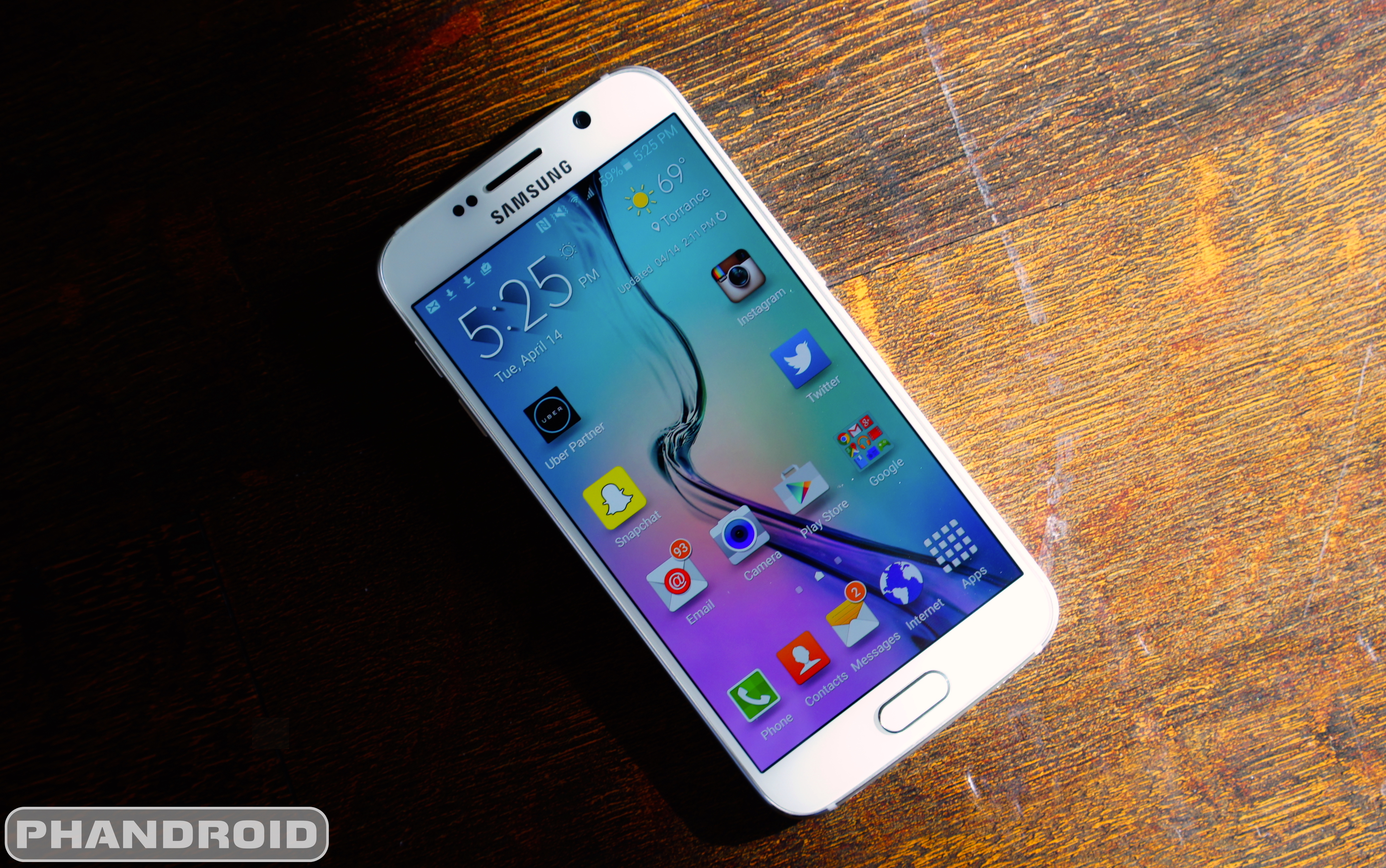
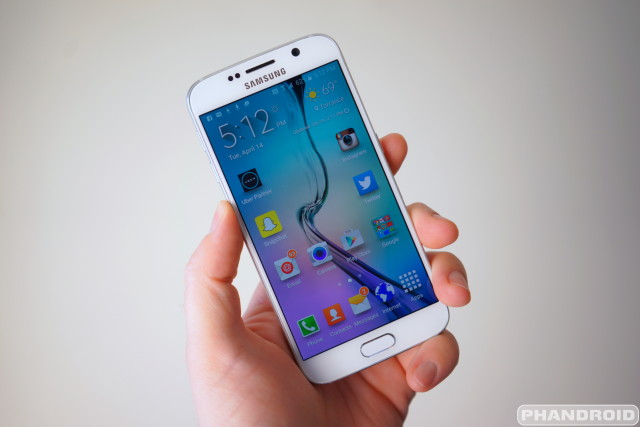
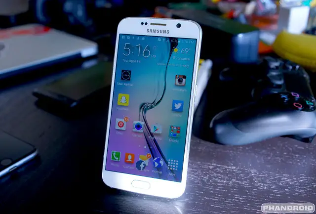
The good part is that’s where the similarities end. From head-on, the S6 is classic Galaxy. Samsung’s all too familiar chrome earpiece makes yet another appearance, along with their now trademark oval home button. Coloring on the device is handled by luminescent chrome slipped underneath smooth Gorilla Glass 4 that now covers the entire front and back of the device.
According to Corning, it’s supposed to be less prone to surface scratches and shattering than Gorilla Glass 3 which was found on the previous Galaxy S5. We’ve seen enough drop tests to know that the phone isn’t immune to shattering, so we’d still recommend buying a nice tempered glass screen protector and/or case just in case.
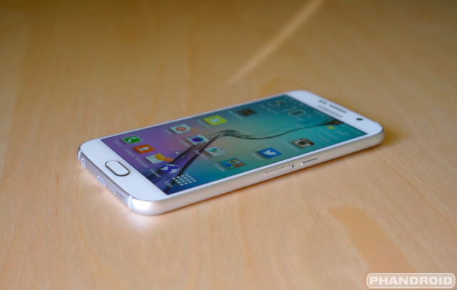
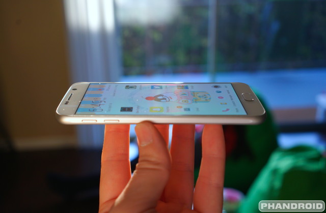
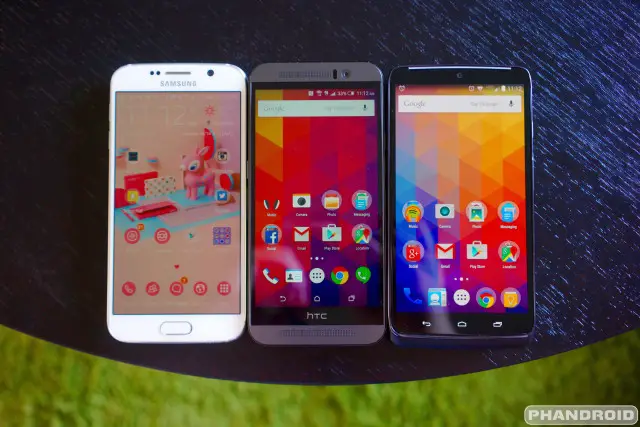
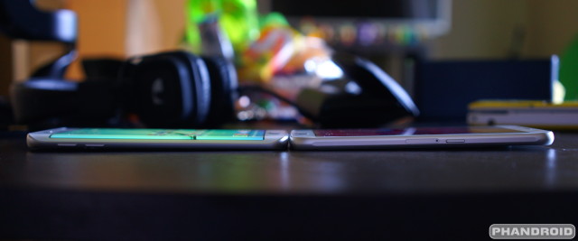
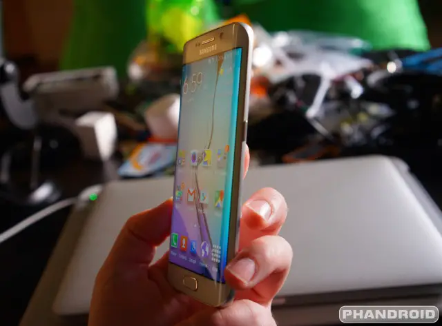
Speaking of the glass, unlike the Galaxy S5 which was completely recessed, it is now slightly beveled and sits almost completely flush with the frame edges (more so on the sides than the top and bottom). This means when grabbing UI elements from the sides of the display — like those slide out app menus — your finger gracefully glides over the edges of the display, making for a smooth and silky experience. It’s not quite as pronounced as the 2.5D glass on the iPhone 6, but a little closer to what we’ve seen on the Moto X (2nd Gen) or DROID Turbo.
Once again we find Samsung opting for their traditional home button setup along with recents and back capacitive buttons on each side. I can’t begin to tell you how frustrating it is that they still don’t use stock Android’s setup (back on the left, home center, recents on the right), but those coming from a previous Galaxy device will feel right at home. Everyone else, well, you should adjust in no time.
A design area we were a tad disappointed to find Samsung didn’t work on was the Galaxy S’s ever growing bezels. Things were looking good from the S3, to the S4, but all that went out the window when the S5 introduced thicker top and bottom bezels. The Galaxy S6’s bezels look to match last year’s model (although we don’t have specific measurements). We’ve seen advancements in this area with Sharp and LG creating devices with super small bezels, but then again, they don’t have the hardware the S5/S6 has (fingerprint scanner). It’s because of that, we’ll give Samsung a pass on this one. Function over form, we suppose.
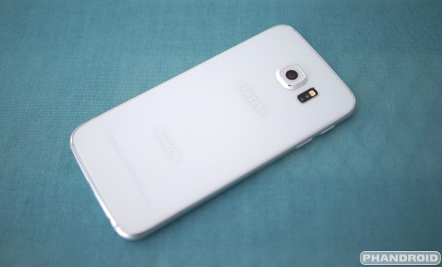
If there was one thing to be said about Samsung’s choice of plastic in previous Galaxies, it’s that they were durable. Ditching the perforated, soft touch pleather of last year’s model, the S6 now features a single pane of glass that covers the entire back of the phone. Underneath all that glass, the phone’s metallic surface can be seen, creating a sheen and flashy multidimensional effect. Samsung devices have always been shiny, but this is shiny on top of shiny.
The only thing messing up the sleekness of the back is the camera housing jutting out towards the top. A protruding camera is nothing new for Samsung devices. It’s just now further accentuated thanks to a much flatter, all-glass back plate. If you thought the iPhone 6’s camera was an eyesore, the S6’s is sure to make you cringe. Not only that, the phone always lays at a slight 5-degree angle, resting on the camera housing. If you’re not careful, you could end up with scratches on the lens or even worse, a crack if lay down the phone down with a bit of force. Something to be careful about.
Samsung’s choice to go with wireless charging in the S6 prevented them from going with a metal back plate like how they did on the Galaxy A series. For the record, we would have been cool with matte or even high gloss plastic although we’ll admit, the glass certainly does look pretty. That is, until it’s covered in a hundred fingerprints after a few minutes of use. In the phone’s defense, fingerprints are super easy to wipe clean with a cotton shirt or sleeve. Did we mention the Galaxy S6 is really shiny?
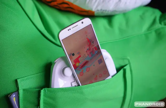
In the hand, the Galaxy S6 feels great. The non-stick, anodized aluminum siding can make it difficult to gain a confident grip on the phone, but the light weight (138g compared to 145g of the S5) keeps it from feeling like it constantly wants to slip out of your hand. Let’s also not forget the dozen or so official cases Samsung is offering, let alone various 3rd party cases already available online. If you’re worried about slippage, you’ll have no problem finding a nice bumper case with added grip and protection from just about every case maker under the sun.
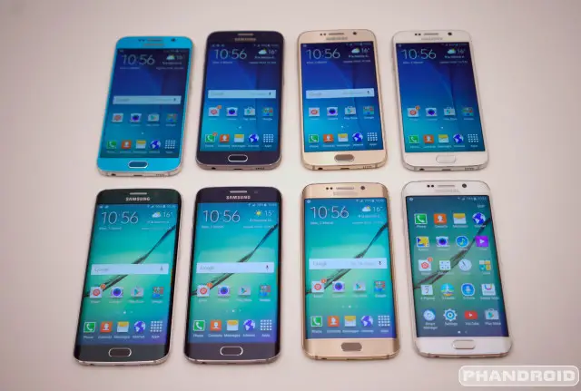
At the time of writing the Samsung Galaxy S6 is available in 4 colors: White Pearl, Black Sapphire, Gold Platinum, Blue Topaz (Galaxy S6 only) and Green Emerald (Galaxy S6 Edge only). Why each model got a single exclusive color is beyond us, but we really had our hearts set on an electric blue option for the Edge.
All-in-all, we’d say Samsung did a fantastic job at updating their flagship Galaxy series with the S6. The phone offers a much more refined experience than any Galaxy before it. There are similarities with the iPhone, but it doesn’t really take anything away from the phone and we wont knock off any points because of it. We will say after taking a look at other devices like the Motorola Moto X (2nd Gen), HTC One M9, or even the Sony Xperia Z3, we wish Samsung would have done a little more to avoid similarities with their biggest competitor, while carving out a truly unique identity all their own. As of right now, they’re off to a great start.
Hardware
Display
By and large, the Galaxy line’s greatest strength has always been its stellar AMOLED displays. Over multiple iterations the past few years, Samsung’s AMOLED displays have managed to carve out a name for themselves as the best on the market. Deep blacks, colors that pop, and phenomenal refresh rates, there’s just so much here to love.
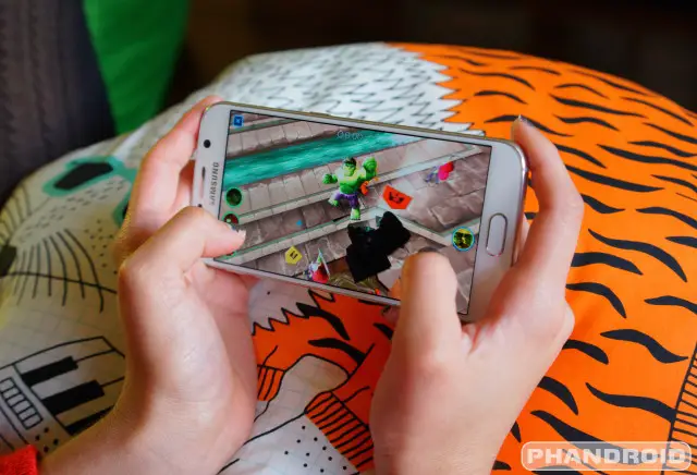
The move from the Galaxy S5 to Galaxy S6, we’re now seeing Samsung up the ante in terms of resolution, employing their most advanced display panels yet. The display on the Galaxy S6 now carries an eye blistering 2560 x 1440 Quad HD resolution at 577 pixels per inch. It was a logical progression, if not a little overkill. But we knew it was coming, especially after last year’s LG G3 hit the market with their own 2K display. When it comes to Android competition, often times it’s a numbers game (more cores, higher res, bigger batteries). The real question is whether or not the jump to Quad HD provides any benefit to the user and whether or not it’s worth the hit on battery life.
We’ll admit. We were skeptical that Quad HD would look drastically better than the now standard 1080p resolution, especially on a smaller 5-inch device where the ppi is already plenty dense. But after spending more than a week with the Galaxy S6, it’s officially made us believers. The quality is sharp. Pin sharp. We still believe the move to 2K might have been a bit premature as there just isn’t much content that takes advantage of this resolution at present, but the market is certainly headed that way. Nothing wrong with staying ahead of that curve and we’re sure it wont be long before content providers catch up.
Anytime someone brings up a discussion about AMOLED displays, there’s always that one guy who says he doesn’t like their over-saturation. As most Galaxy users will know, these arguments were laid to rest back in the Galaxy S4 when Samsung’s custom software allowed users to turn down saturation for a more accurate LCD-like color gamut.
The Galaxy S6 is no different, with the option to choose between AMOLED cinema (super saturated, cool whites), AMOLED photo (less saturated, warmer whites), and basic (the lowest saturation setting). Samsung also included an Adaptive display mode which they claim “optimizes the color range, saturation, and sharpness” of the display according to whatever it is you’re viewing. The only problem is this mode isn’t compatible with all 3rd party apps.
Edge screen
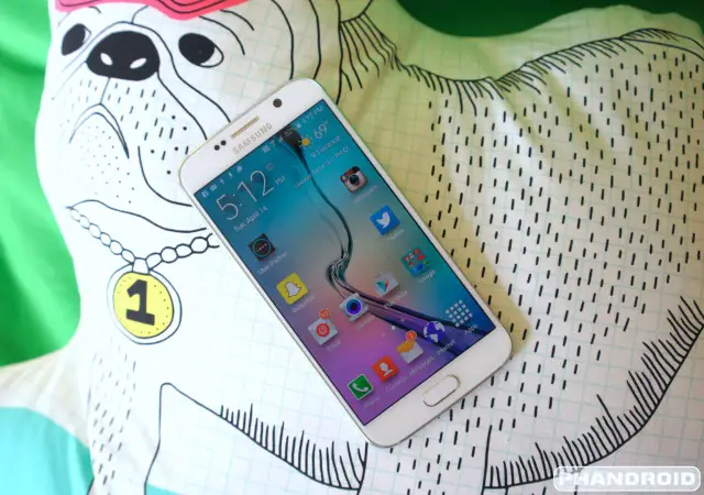
The single defining feature — and only difference between the regular Samsung Galaxy S6 and the Samsung Galaxy S6 Edge — is its new double-sided curved AMOLED display. There’s no question it improves the phone’s design. It looks absolutely beautiful. Like some kinda of smartphone from the future. The thing is, it doesn’t really offer up any real world benefit outside of its good looks. Because the angle of the curve is so minute, the Edge screen really adds little functionality to the phone.
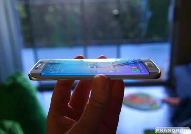
Like an optical illusion, the angle of the curve is much less prominent than what Samsung would have you believe. Don’t get us wrong, it’s definitely noticeable. But it doesn’t really wrap around the sides of the device much, if at all. It’s nothing like the Galaxy Note Edge which is, admittedly, much larger and features a dedicated section for app shortcuts.
Samsung would love for you to believe that the S6’s Edge screen adds functionality by displaying UI elements not normally viewable (or difficult to see) on a regular flat display. But truth is, the majority of the time you could probably view the exact same information on a flat display when viewing from an upward angle. When looking at the phone directly from its side (if you’re laying in bed and viewing on your nightstand for instance), the top half of whatever is displayed on the Edge screen is cut in half. It’s more like a half-edge.
While the Edge display doesn’t curve much around the sides of the phone, it’s probably better off. Unless Samsung increased the aspect ratio, or added separate little screens, viewing videos and other media would cause even more of the image to get all warped around the sides. And that’s the biggest challenge we found in adapting to the new Edge display. It’s hard to explain, but it feels… weird. Your eyes really have to adjust and it can take some definite getting used to, but I’ll be damned if it sure doesn’t look pretty. Whether that’s worth an extra $100 is up to you.
Performance
Without question the Samsung Galaxy S6 is one of the fastest phones on the block. Sure, this is generally expected when a new flagship hits the market, but as we saw with last year’s Galaxy S5 (or even the LG G3), this isn’t always the case. For the S6, Samsung has built their all new 64-bit, Octa-core Exynos 7420 using an advanced 14nm manufacturing process. Yes, “Octa” means 8, and there’s four 2.1 GHz Cortex-A57 high performance cores working together with four 1.5 GHz Cortex-A53 cores.
This means the processor is not only quicker, but more power efficient than older SoCs. What we found was this translated into a processor that opened apps at lightning quick speeds, while never feeling hot in our hands. The Exynos 7420 is also supposed to sip battery when in standby, but you’ll have to read our battery life section for more on that.
Even though the S6 is kicky fast, we did notice the occasional stutter or longer than usual load times during use (like waiting for a keyboard to popup, or app drawer to redraw), but that could be buggy software as much as anything else. After comparing the S6 to the One M9’s Snapdragon 810, it’s clear Samsung made the right choice in opting for their own silicon. Not even the phone’s absurdly high resolution 2K display could hamper its performance. Other hardware specs on the Samsung Galaxy S6 include:
- 14nm 64-bit Exynos 7 Octa chipset
- 3GB of LPDDR4 RAM
- 32GB, 64GB or 128GB UFS 2.0 storage options
- 16 megapixel rear camera with optical image stabilization, 5 megapixel front camera with real-time HDR
- 5.1-inch Quad HD Super AMOLED display (577 ppi)
- Dual-mode wireless charging with support for both WPC and PMA charging pads
- 10 minutes charging for 4 hours of use, 0% to 100% battery in half the time it takes an iPhone to charge
- NFC, heart-rate sensor and improved fingerprint scanner
- Depth: 6.8mm/7.0mm edge
- Weight: 138g/132g edge
Fingerprint scanner
We saw Samsung’s first awkward attempt at adding a fingerprint scanner to the Galaxy S5 last year. Needless to say, it wasn’t anywhere near as intuitive as Apple’s “Touch ID.” This was thanks to a weird swiping motion it required users to do across the button in order to scan your fingerprint. Sorry, but no thanks.
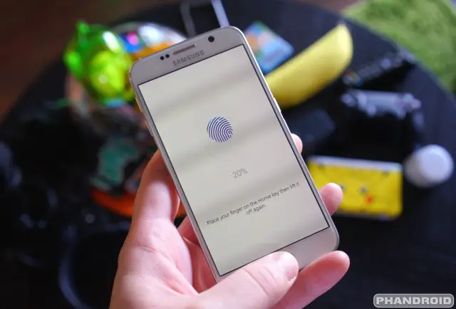
This year, Samsung has vastly improved the fingerprint scanner with the Galaxy S6 and simply put: it works just as well as it does on the iPhone. Trust us, that’s a good thing. No more swiping. Simply hold your finger atop the home button (you don’t even need to physically press it in) and watch as the lock screen fades away in nearly an instant. Authentication is super quick and more importantly, a hundred times easier than using a traditional PIN or password. Screw that noise, fingerprints are the way to go and I’m never looking back.
Setting up the secure unlocking method on the S6 is eerily similar to how it’s done on the iPhone. The UI and animations of the app are practically identical. While registering your finger prints (up to 4), you’re asked to press and remove your finger in a variety of orientations so the phone can learn your entire fingerprint. For those concerned your fingerprints are being sent to the cloud, Samsung assures us all your fingerprints are encrypted in the S6’s secure device storage.
After successfully scanning your fingerprints, a backup PIN code will help gain access to your phone should your fingerprints get burned off or something (or perhaps the hardware fails for some reason). You can even set up the phone to log into websites using your fingerprint, but you’ll first need to enable this feature in the settings. We would have loved to see this feature system wide (like logging into the Play Store), but we’ll take what we can get.
We can’t tell you how amazing it feels to have a fully functional and accurate fingerprint scanner on a phone. As someone who finds PIN codes, passwords, or pattern unlock methods too troublesome to put up with, the fingerprint scanner on the Samsung Galaxy S6 is an absolute godsend and functioned properly 99% of the time. We did run into a few fails, but simply tried again and it worked like a charm.
Storage
Samsung made a very controversial move by forgoing removable expandable memory in the S6, a previous staple of the Galaxy line. We’re sure there are some Samsung fans who feel slighted by the move, but at least Samsung is offering ample internal storage, albeit, at a much higher premium. The Samsung Galaxy S6 comes in 32GB, 64GB or 128GB varieties and sees a +$100 increase for every upgrade. Combine that with the $100 premium for the curved display on the S6 Edge, and you’re looking at one expensive smartphone.
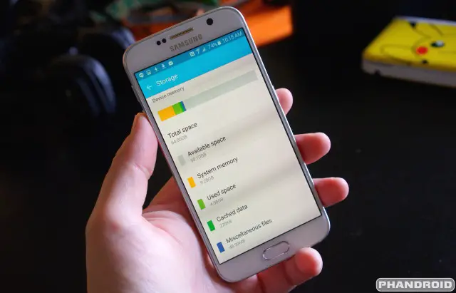
Before you make your decision, we want to remind you that out of the box, the Samsung Galaxy S6’s system OS takes up around 9GB of internal memory, and you lose a little after formatting and the bundling of those extra system apps that come pre-installed. That being said, you’ll never see the 32GB as advertised in which case we’d recommend sticking to the 64GB as your base model should you plan on keeping the phone for a good while.
Battery life
This is probably our least favorite category to talk about in a review, given how battery life is one of those things that always varies from person to person. Before we get into that, let’s start off with the facts. The Samsung Galaxy S6 features a 2,550mAh (2,600 in the Edge) non-removable battery. In case you haven’t figured it out yet, this is actually smaller than the 2,800mAh battery in last year’s S5. It’s not bad enough OEMs have continually favored a slimmer profile over equipping their phones with bigger batteries, but to actually take a step backwards? What. In the actual. Eff.
We’re guessing Samsung got caught up in the promises of their new 14nm Exynos. So how did it hold up? It’s tough to say. Reports are mixed around the net with some users reporting software bugs (WiFi Calling bug, Google Play Services bug, etc.) that are drastically impacting battery life. After reviewing our stats, our device didn’t appear to be affected by any of these issues, so we’ll report our findings as normal.
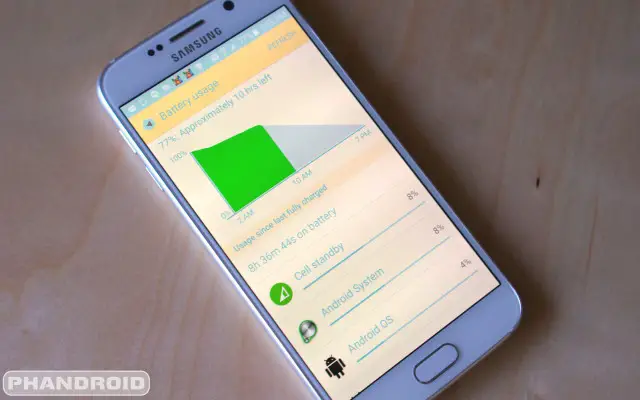
During our first week reviewing the Samsung Galaxy S6, we found battery life averaging a mediocre 15 hours with normal to light usage. We found the phone would drop about 10% from a full charge every 1.5 hours or so. Maybe even 2 if we were lucky. That’s with brightness turned up about halfway, and just using our phone like normal (occasionally checking Twitter, Reddit, sending a few messages on Hangouts). Screen on time was anywhere from 2 to 3 hours.
When actually using the phone, battery life takes a huge drop. I gave our spare review unit to my girlfriend (the ultimate stress test), and she averaged around 7 hours (3 hours screen on time) by constantly checking on Facebook, web browsing, listening to Spotify, watching Netflix, and/or snapping the usual 400 selfies in the mirror.
Adaptive Fast Charging
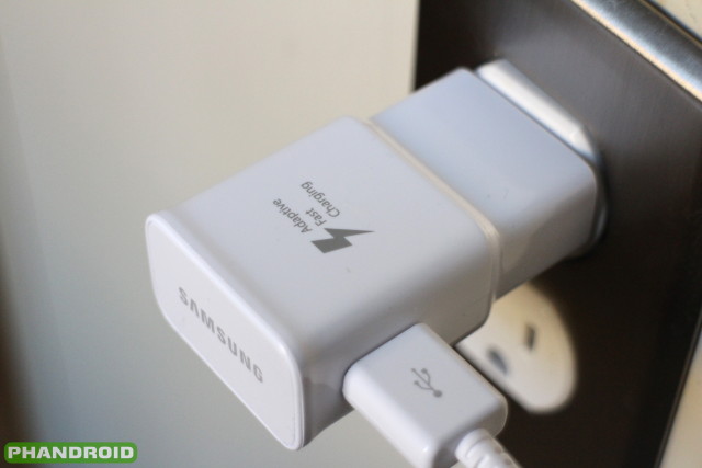
Its clear OEMs just aren’t making battery life a big enough priority in our mobile devices. To help alleviate some of the pains associated with keeping your device juiced up, they’re using fast charging technology. The Samsung Galaxy S6 comes out of the box with an Adaptive Fast Charging USB charger. It’s similar to Qualcomm’s Quick Charging 2.0 technology — which is also compatible with the S6 despite using a different processor — in that it shoots out a high voltage to power up the device quicker. Really quick, actually.
Samsung claims you’ll get 4 hours of usage after only 10 minutes of charging, and our tests mostly confirmed that. We tried both a standard Qualcomm Quick Charge 2.0 charger and the included Adaptive Fast Charging charger and found Samsung’s charged a little quicker after the 70% mark. This is probably because the phone switched back the standard 2A charging, while the phone using Quick Charging defaults back to 1.67A.
Samsung Adaptive Fast Charging / Qualcomm Quick Charge 2.0
- 0 min: 0% / 0%
- 15 min: 25% / 28%
- 30 min : 53% / 50%
- 45 min: 78% / 73%
- 1 hour: 93% / 85%
- 1 hour 15 min: 99% / 95%
- 1 hour 20 min: 100% / 1 hour 25 min: 100%
Battery saving software
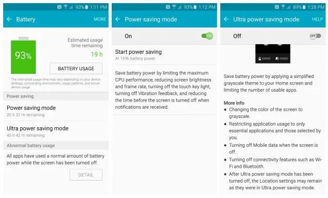
Because you’ll be running out of power nearly everyday, thankfully Samsung including their excellent battery sipping software to save as much battery as possible. With such a huge dip in performance and functionality, you’ll want to save this for when you hit 50% or below.
Power saving mode
Power saving mode is the first level of battery savings, and limits the maximum CPU from running at its full potential. This mode will also reduce screen brightness (and big battery sucker), turn off haptic feedback and LED touch key navigation lights, while reducing the frame rate and the amount of time it takes before the phone sleeps. This doesn’t interfere with data or anything like that, so you’ll continue receiving notifications, emails, and instant messages as normal.
Ultra Power saving mode
As the name suggests, Ultra power saving mode is the more extreme version of power saving mode. Once enabled, the Galaxy S6 turns the color of the display black and white (grayscale) off, while limiting mobile data to only when the screen is on and you’re actively checking your phone. Screen off, data is off and you’ll no longer receive emails or Facebook updates. Background apps are also severely limited, with only the following accessible to the user: Calculator, Clock, Facebook, Google+, Memo, Twitter, Voice Recorder, and WhatsApp.
Emergency mode
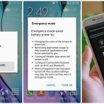
Tucked away in the power menu (long pressing the power button) is an “emergency mode.” It’s pretty much the same as Ultra power saving mode only it provides unique shortcuts to a flashlight, emergency alarm, the ability to share your location with others, phone calling, and internet browsing. The only additional apps are Facebook, Google Maps, and Twitter. Should you find yourself trapped in the middle of nowhere with your arm stuck under a rock, gotta take a selfie and share it with your friends, right?
Wireless charging
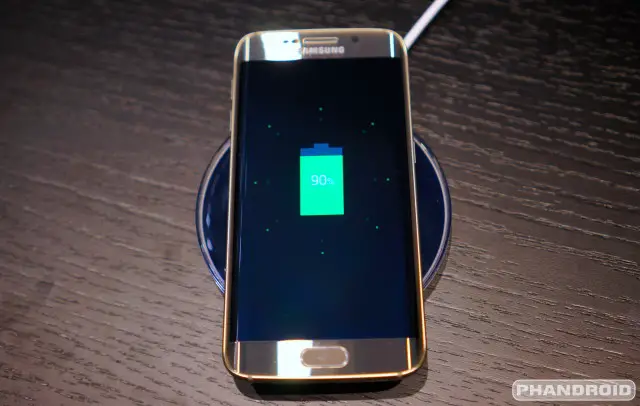
Unlike last year’s model (we’ve been saying that a lot, haven’t we?), the Samsung Galaxy S6 now comes with wireless charging straight out of the box. This is actually the reason why Samsung chose to go with a glass back on the phone, not because it looks pretty, but because glass is simply more efficient at wireless induction charging than metal is. With that out of the way, the Galaxy S6 is agnostic when it comes to wireless charging standards, meaning it supports both Power Matters Alliance and Qi based wireless chargers.
What does this mean to you? It means no matter where you go, if you happen upon a wireless charger — whether someplace public like Starbucks, or one built into your furniture — it’s going to work with the Galaxy S6. While the majority of wireless chargers on the market are Qi chargers, really this was the smartest way for Samsung to go. Why support one form of wireless charging when you can do both.
Camera
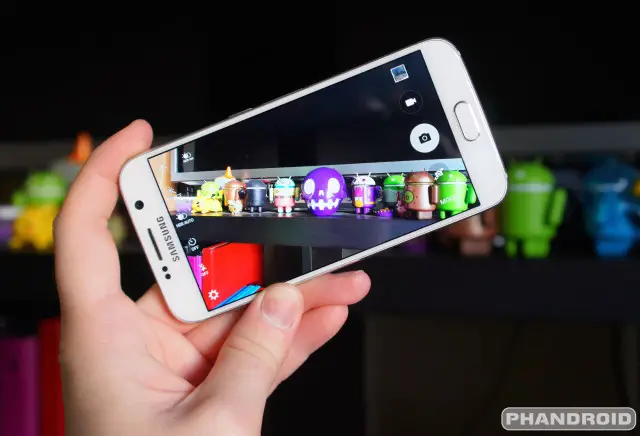
One stand out feature on the Samsung Galaxy S6, is, without a doubt, its amazing photo capturing capabilities. Over countless generations of Android devices through the years, none have been able to top the iPhone. Some have gotten close, but none could beat its quality or consistency. We knew it was only a matter of time before some Android device would top it, and the Samsung Galaxy S6 is just that smartphone.
The Galaxy S6 is outfitted with a 16MP rear camera and 5MP front camera. For the back, it uses a Sony IMX240 sensor — the same sensor as found on the Galaxy Note 4. But the tiny lens now features a larger f/1.9 aperture, which allows more light in. It’s this, coupled with the new optical image stabilization (OIS) that delivers a 1-2 punch and makes the Galaxy S6 an amazingly versatile shooter, even in low lighting conditions.
On the software side, Samsung’s increased camera launch speed by keeping the app in the background at all times. A quick double click on the home button acts as a shortcut that can pull up the camera from inside any app. The camera does support Lollipop’s Camera2 APIs, but sadly there’s now RAW support on Samsung’s software end. At least not yet.
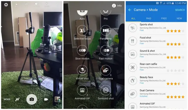
The camera app itself is wonderfully laid out, with a handful of modes and features to keep mobile photographers happy. The phone supports tracking auto-focus to keep moving subjects in focus, voice commands for the shutter, and even a Pro mode for those that want better control of the ISO, shutter speed, exposure, or white balance. There’s a handful of downloadable modes and effects (filters) too, all the stuff Samsung used to have in their previous Galaxies, but removed in the Galaxy S6 to keep it simple. Here’s a quick list:
- Surround Shot: a Photosphere-like mode that lets you take 360-degree photos
- Sound & Shot: record the audio of your surroundings at the time the photo was taken for more immersive photos
- Rear-Cam Selfie: use the rear camera to take a selfie with visual cues to let you know when it’s about to snap the shot
- Dual Camera: snap a photo or shoot video with both the front and rear cameras simultaneously
- Animated GIF: create a moving image of a series of photos or videos and save it as an animated GIF
- Beauty Face: image tweaks to enhance the look of human faces
- Sports Shot: automatically selects focus and exposure settings for fast moving scenes
- Food Shot: a macro-focus mode for bringing out the best details in a close-up shot of food (or anything else, really)
Sample photos
Other hardware
Other hardware making a return in the Galaxy S6 is the IR blaster and the heart rate monitor. The universal remote functionality is now powered by the Peel application, while the heart rate monitor is handled by S Health. Since we already have a heart rate monitor built into our smartwatch, we didn’t use this feature much. But the heart rate monitor did work great as a shutter button for the camera in selfie mode.
Also worth noting is the speaker loudness has been drastically improved from the previous Galaxy S5. We suppose the lack of waterproofing has something to do with that, but the speaker is now louder and clearer than ever. So much, in fact, we never turn it up all the way to full volume, instead keeping it a notch below max in most cases.
Software
While software features are typically a good thing, at some point back during the Samsung Galaxy S4 that Samsung appeared to have lost their way. TouchWiz — Samsung’s custom Android interface found on their Galaxy devices — had grown into a monster straight out of a horror flick. With more features and gimmicks than you can shake a stick at, it quickly began feeling slow, bloated, and hacked together.
With the S6, Samsung appears to have changed all that. According to them, they’ve trimmed some of the fat that originally made TouchWiz such a bloated mess and the result is a cleaner, leaner, meaner, and all around more user friendly OS than ever before.
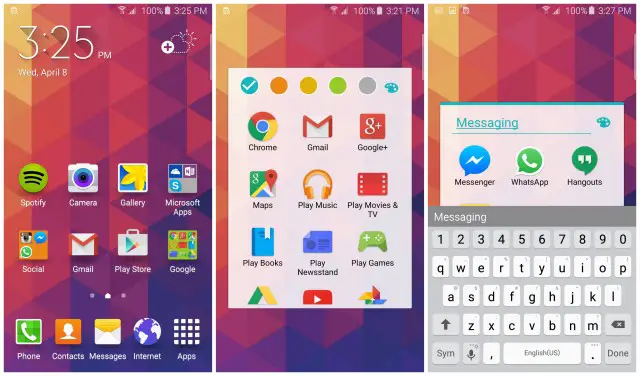
On the UI side of things, menu icons are now spelled out clear as day. The search icon now reads “Search” while the 3-dot menu, where Samsung has now tucked away many excessive app options out of sight, simply reads “More.” It keeps things clean and leaves little guess work for the end user. We like that.
The new TouchWiz is definitely fast. That weird lag found on previous Galaxy models has, thankfully, been completely obliterated. In most cases, the phone flies through apps and multitasking. While we did encounter a slight stutter and hiccup here and there (the Recents always takes a second to load), it was nothing too terrible. In fact, we’re not even sure if we should blame TouchWiz, Android, or just some glitchy app.
In terms of memory, TouchWiz is pretty light too, weighing in at around 6GB on the Galaxy S6, and 9GB on the Galaxy S6 Edge (believe it or not, the S5 was also around 6GB size). Compare that with the HTC One M9’s Sense 7 taking up 12GB of system memory or even Android on the DROID Turbo taking up 11.7GB, and you have an OS that feels as light as Samsung’s claims.
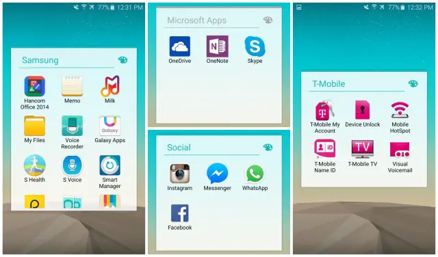
That’s not to say there isn’t any bloatware. Samsung has done away with many of their Google alternative apps, making them available for download inside their Galaxy Apps store. This is great, but you’ll still find a few stragglers like Hancom Office 2014, Memo (note taking app), Milk (music streaming), My Files (file explorer), Voice Recorder, S Voice, S Health, Smart Manager, and Samsung’s new Theme Store.
There’s also the usual assortment of carrier apps, along with miscellaneous apps like Peel Smart Remote, and Facebook’s app suite: Instagram, Messenger, WhatsApp, and Facebook. What was that about fat trimming? The weirdest part is the bloatware seems to vary with carrier devices in the US. You’ll find the Galaxy S6 on Verizon comes bundled with Amazon apps in lieu of Microsoft’s, and even some core TouchWiz features are missing. More on that later.
Since one man’s gimmick is another man’s treasure, you’ll still find the Samsung Galaxy S6 chock full of software features. This doesn’t even feel so bad when the OS no longer runs like sh*t. Even still, it seems Samsung has never heard the term “less is more ” and has always been concerned with the kitchen sink approach. With every new flagship, they’ve been throwing everything against the wall to see what sticks. After 6 iterations of Galaxy devices, the software features found on the Galaxy S6 are what was left clinging to the wall. Here just a handful of software features you’ll find inside the Galaxy S6:
- Smart Stay – Prevents display from sleeping while you’re looking at the phone.
- Smart Alert – Alerts you every time you pick up the phone of missed calls or messages,
- Direct call – Bring the phone to your ear while viewing one of their messages to call them directly.
- Flip to mute – When receiving a call, place your phone face down to quickly mute it.
- Quick toggles – Quickly toggle system functions like WiFI or Bluetooth and customize buttons for easy access.
- Multi-view – Use two apps at the same time or create a popup app in a floating window.
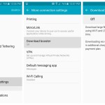
- Download booster – uses both your LTE and WiFi connection to download files at blazing speeds.
- S Finder – one-stop search for every app, file or contact on your device.
- Notification Reminder – Remind yourself to take action on past notifications by reminding every few seconds or minutes.
- Quick connect – Send files to other Galaxy users quickly and easily.
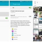
- Private mode – keep “sensitive” content on your phone safe by making it only visible while in Private mode.
- Send SOS messages – Quickly send an emergency message to designated contacts along with photos and location.
- Emergency mode – It’s like extreme ultra power saving mode for those emergency situations.
- Adapt sound – Uses a variety of tones and beeps to custom tailor a sound profile to your ears.
- Smart Manager – This app is supposed to help you keep up with routine maintenance on your phone but is god awful.
We know, all these features can be a bit overwhelming. Lucky for you, we’ve provided step-by-step directions on how to enable the software features listed above, so make sure you check out our Galaxy S6 Tips & Tricks post here.
When all is said and done, we wont knock Samsung for including all of these software features into their device. Hell, some of them are actually incredible helpful (those bloatware apps are another story, however). Our only real complaint is, unlike Motorola, HTC, or Sony, Samsung continually avoids dropping their system apps into the Play Store for easy updating. This would eliminate the need for a full system update when they wanted to add a few new software features. Every other smartphone maker has caught on, so why hasn’t Samsung?
Themes
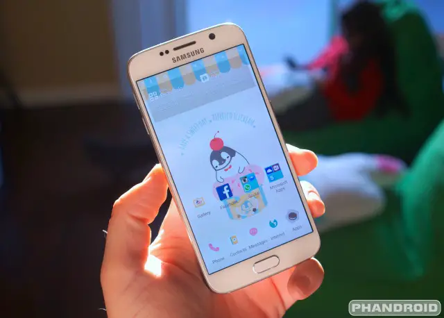
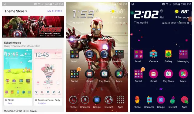
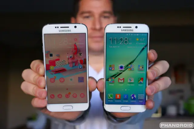
Themes seem to be all the rage these days and the Galaxy S6 with its new version of TouchWiz is no different. It’s funny too. Themes were once only found in custom Android ROMs, so it’s refreshing to finally see big name manufacturers like Samsung get on the ball after all these years.
For the Galaxy S6 and S6 Edge, Samsung has opened up an entire theme store where designers can show off their virtual creations. These themes drastically change up the look of the device across a variety of UI elements. We’re talking icons, menu popups, quick toggle settings, the dialer, folders, app headers — just about everything that has to do with the user interface can be altered with a theme. We absolutely love it.
However, there are only a handful of themes available at launch and a good majority are quite “girly.” We were disappointed that a stock “Nexus” theme wasn’t available, but hopefully that’s coming somewhere down the road. We also didn’t like that it’s an all or nothing affair. Currently, there is no way to pick a theme apart, choosing only an snazzy icon pack or really cool wallpaper you found in another theme. Oh, and don’t even get us started on the theme store which is a mess right now. It’s probably just the early stages but we’d kill for some theme categories or even a search function.
Edge screen software
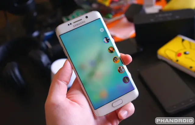
Aside from looking more aesthetically pleasing, the Samsung Galaxy S6 Edge does feature a handful of software features tailor made for the curved display. Because the Edge screen doesn’t quite work the way it does on the Galaxy Note 4 Edge, these are features they could have easily included on the regular Galaxy S6, but I digress…
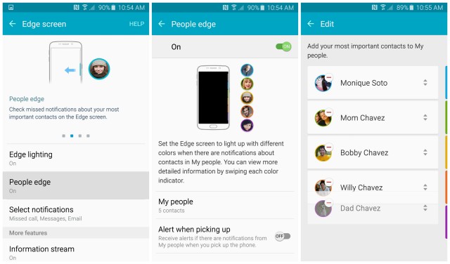
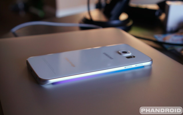
In the Settings app, Samsung has added new Edge screen options which allow you to adjust things like the placement of the Edge screen (right or left side), as well as turn on/off some of the other options like a news ticker. The “People edge” is just a shortcut for your favorite contacts and when used in conjunction with Edge lighting, allows the edge to glow when the phone is flipped over on its face to let you know when you’ve received a message or call from one of your People edge contacts.
Since the actual display just barely creeps over the edge, it can be tough to actually see the glow (plus you’ll need a light colored (and preferably soft) surface to place the phone down on. Simply put, we felt like the Edge software features were merely a ploy to help nudge prospective buyers into picking the S6 Edge over the standard model (and spending an extra $100 in the process). Um, no thanks.
What’s missing?
Like any smartphone or piece of technology for that matter, the Samsung Galaxy S6 isn’t perfect. Far from it. Although there is a lot here to love, Samsung made a very conscious decision to remove key hardware features found on last year’s Galaxy S5. We’ll focus on all of those below, along with something we would have really like to have seen on the Galaxy S6.
- Removable battery – For years Samsung handsets allowed you to removed the battery and swap them out with another should the need arise. This meant you could potentially carry a handful of batteries on your person and swap them out as needed.
- Micro SD card slot – While we don’t particularly miss not having a micros SD card slot, we absolutely have to mention this given it’s been such a staple with previous Galaxy devices. Heck, even the HTC kept expandable memory for the One M9. To simply throw the baby out with the bath water sounds like a bad move, especially when they could have easily kept this in.
- Water resistance – The Galaxy S6 no longer features the water resistance that debuted on the Galaxy S5. It’s especially odd considering a non-removable back plate and lack of memory card slot seems like it’d be much easier to seal the device.
- Bigger battery – We should be at that point that our smartphones are getting so physically thin, we can pack more mAh in them. Since the battle for thinness is alive and well, with that came an actual reduction in mAh for the Galaxy S6. Either Samsung was really confident in their Exynos processor, or they were blinded by shaving off a few extra millimeters to compete with the iPhone 6.
- USB Type-C – It’s still early, but USB Type-C devices have already begun hitting the market. For the uninitiated, USB Type-C is the newest port on the block and is fixin’ to become the new industry standard in how we transfer, power, and display content to external monitors in our next generation devices. It’s a damn shame Samsung didn’t have the foresight to include this on the Galaxy S6. It could have been yet another killer feature.
Conclusion
Believe it or not, it actually feels like Samsung is trying now. This is the phone people have been asking for and the phone we always knew Samsung could build. Samsung has always been the king of gimmicky features but for the Galaxy S6, Samsung has married the absolute best hardware with the software features of the Galaxy S5 and built upon them. Without a doubt, this is one of the best smartphones on the market and a worthy entry into the high-end smartphone market.
As we’ve seen with other OEMs in the past, things can quickly change (remember BlackBerry?). The mobile landscape is quickly changing and you can either evolve, or find yourself falling to the way side. Perhaps it was Samsung’s overconfidence that caused them to become lazy. They were on top, and didn’t see themselves going anywhere but up. But complacency often times leads to failure and the Samsung Galaxy S6 signals the company’s new found effort to become really competitive — not with clever advertising — but by first and foremost building a quality device.
It’s this competitiveness that will drive innovation, not just for Samsung products, but all mobile devices, Android, iOS, and the like. Lord knows we need someone to keep the heat on Apple and with the Samsung Galaxy S6, Samsung brought a flame thrower to a knife fight.
Samsung Galaxy S6 Rating: star_fullstar_fullstar_fullstar_fullstar_75 (4.9 / 5)
The Good
- Fast processor
- Solid construction
- Premium materials
- Fantastic camera
- Wireless charging
- Fast charging
- Quick fingerprint scanner
- IR blaster
- Speaker volume
The Bad
- Battery downgrade
- Average battery life
- Edge screen is gimmicky
- Non removable battery
- No micro SD card slot
- No longer water resistant
The Bottom Line
Samsung has meticulously put together one of, if not the best Android phones currently available on the market and although battery life may leave you wanting, the rest of the phone sells itself. Without a doubt, the Samsung Galaxy S6 is the best smartphone the Korean manufacturer has ever made. Click here for our full Samsung Galaxy S6 Edge review.
After you buy…
If you’ve finished our review and now have your heart set on picking up the Galaxy S6 (or maybe you already purchased one), we wanted to make sure you check out our posts for new Galaxy S6 buyers. These posts will provide you with a variety of tips, tricks, and step-by-step walkthroughs on getting the most out of your shiny new Android:
- First 13 things every Galaxy S6 owner should do
- 50+ Samsung Galaxy S6 Tips & Tricks
- 10 Tips every Samsung Galaxy S6 Edge owner should know














Good God – this is 2 days of reading material. Wow.
Thanks.. Going to read it now. Hope you cover if it has a glove mode?
A page search of the word = no mention.
thanks.. I was reading in the app earlier when I posted so couldnt search. Had to read the whole review ;-)
I’ve got the edge and there is no glove mode. Verizon. I doubt its a carrier specific thing… I’m thinking this is all hardware but don’t forget about the upcoming s6 active!
agh, really? They took the *good* stuff out.. Does it work with gloves anyway, without a specific mode?,
My Alpha has glove mode but I live in Miami now lol.
Seems like the S6 would have it ….
s6 active is rumored ATT only,
Watched a video last week of the S6 being water tested. Though it is not officially water resistant, it survived for upwards of 20 minutes in a bowl of water (the same video said that most other phones only made it 1-2 minutes before shutting down). Obviously this does not mean you should take it for swim but it at least gives me some level of security knowing that a quick accidental drop in some water might not kill it.
A lot of customers are experiencing wifi calling battery issues and overheating from the S6. No phone is perfect, but Samsung has the best smartphone so far this year.
Im usually very critical about this Phandroid site..mostly because I’ve been a loyal reader for more than 5 years..But I have to say.
Wow. Chris, Bravo man. Bravo. Great review. I actually enjoyed this more than some video reviews (something about reading, is just pleasurable)????
This made my day ^_^
You earned it bro.
Brilliant review Chris – I know some android die-hards might whine about the references in to the iphone in your review, but I, for one, really appreciate the comparison as the I tend to consider the iphone at the top of the smartphone pile in terms of hardware.
The s6 basically seems like what I’ve been secretly longing for all these years – an iphone with Android instead of iOS (I can’t stand iOS’ lack of flexibility).
I feel the same. I love the build…and I don’t use cases.
I am very glad they moved the speaker and headphone jack to the bottom. I am loving the S6. It reminds me of my favorite phone of all time, he S4…but better. Since the S4, I had the S5 and Note 4. The Note 4 is great, but too big for my small hands. Having the S6 is like going home again…it just feels right.
I need a bigger display so hoping for an early Note 5 Edge release.
I had a Note 4, just sold it to get the S6. You fit the same amount of content on both screens it is just blown up huge on the Note 4.
Great battery life. Pshyaw, right!
Some information about the screen. There is a wide misconception about the screen res increase meaning a reduction in battery life. This is true for LCD’s but not AMOLED. The s5 consumes .82 watts while the s6 only .65 watts. The iPhone six screen consumes 1.52 watts. Samsung have not only increased the res on the screen, the RGB colors increased. Diamond sub pixels instead of still make the pentile screen issue unnoticeable. The screen here is a vast improvement and the best on any smartphone today.
So you’re saying the battery life would’ve been the same had the screen been 1080?
You’re forgetting processing power to push more pixels. It’s not completely insignificant. Performance takes a slight hit, battery life is less, and it kind of offsets the performance/efficiency gains of octa/14nm.
Which means that we can fully utilize the performance/efficiency gains of octa/14nm from S6 right now for gaming because most of android games run at a 1080p or lower resolution.
Yeah. That’s exactly why the One M9 still beats the Galaxy S6 in gaming performance. The Adreno 430 is vastly improved, but only has to push the same 1080p resolution. If the S6 were 1080p, it would reap those benefits for battery life and gaming instead of for a marginal resolution benefit when viewing your phone closer than 6″ from your face.
Nope, what I mean is that gaming at S6 still enjoys all the performance/efficiency gains because upscaling a rendered result at 1080p to 1440p marginally affects the performance . The offscreen Basemark X score of S6 is about 30% higher than that of M9. And the QHD display of S6 is 15~20% more energy efficient than the FHD display of S5.
The OS runs at 1440p, though, and even thought the screen is more efficient, it could’ve been even more efficient. There’s something to be said for Sony’s 1080p optimizations on the Z3 that led to 2-day battery life, while the S6 still represents a step backward in battery life for the most part. (And Quick Charge really doesn’t do much to help when you’re nowhere near a charger.)
‘The OS runs at 1440p’ part does hardly affect the gaming performance or battery life because it is invisible during gaming. ‘The screen could’ve been even more efficient’ part is not proven. According to the benchmark done by gsarena, Z3 has 3100mAh battery capacity and 9h 29m battery life, while S6 has 2550mAh battery capacity and 7h 14m battery life. So in this case battery life is nearly proportional to battery capacity. That’s a design issue, not a problem of the screen resolution.
Newer processors have faster lower powered GPUs. The 14nm transistors mean less power consumption and less heat then the Qualcomm 810 which mean less battery consumption.
Theoretically yes, the SD810 suffers because of 20nm vs 14nm but I am talking about the 14nm exynos advantages and the screen optimizations being offset to power the 1440p screen. Without 1440p Samsung would have been able to save even more battery life. Imagine if they took those optimizations in their new 1440p and had stuck with 1080p resolution. Imagine if the CPU/GPU gains could be used to more easily push 1080p instead of necessarily running harder to power 1440p. Basically, if there was 14nm, an optimized screen, and 1080p, (and no TouchWiz), then the S6 likely would be much improved in battery life.
Very objective review Chris. The folks over at The Verge could take a lesson from you.
Only objective if the device was purchased and not provided by the manufacturer.
Most definitely purchased. You’re looking at nearly $2,000 worth of hardware right there. Lol
If the edge and the s6 were the same price, which would you get?
Very thorough and unbiased review. I always look forward to Chris’s reviews and basically base my next purchases on his reviews.
Very thorough and unbiased review. I always look forward to Chris’s reviews and basically base my next purchases on his reviews. With that said, I am not getting this phone. lol. I am waiting for the next compact Sony Xperia Z4? Z5? Z3 Neo? Who knows what Sony is doing.
Heard the rumor about the Z4 leaks actually being a “Z3 Neo.” Excited to see what an actual Z4 (or Z4 Compact) may bring. :)
I’m very disappointed that the option to loop your home screen has been taken away. I set my phone up with the same apps & widgets as my s4 was but I’m so used to scrolling through page 1-5 & looping right back to 1. This may seem like it’s not a big deal but it really is. I can honestly say I’m not impressed with this phone at all. I miss my 4.
Funny u said that…my coworker had the GS4 on Verizon at launch, then on Sprint(left Big Red due to pricing), just last week she dumped sprint in favor for T-Mobile.. And she drove 40 miles to a retail store that had the GS4 on sale…during lunch today I helped purchase an unlocked GS4 from amazon as a backup phone…She said she loves the GS4
Glad you are complaining about thinness killing Battery Size and life.
I am hoping for an S6 Pro Device at about 7.6 mm thick which will allow a 3100 Mah Battery.
It will have to be expensive enough to not cut into regular S6 sales and not be available till the big Sales wave dies down but for people who Work ON and WITH their phones S6 Pro at$ 850 or a bit more would be great.
I’m pinning all my Samsung hopes on an S6 Active. Otherwise, I’m calling the LG G4 the clear winner in the Android market this year (even though history says that the camera won’t be quite up to the best that Apple, Samsung, and Sony offer, and the 2k LCD screen will quite literally suck the life out of your battery).
In the past they have always lowered the Camera resolution on Active ( like on my Alpha)
Not to save money but because ” nothing can beat the S Series except Note Series ” logic but maybe now they will let Active have the great Camera also from S6 .
Would be great if they made something with a 5.1″ screen without those hardware buttons- pressing those hundreds of times per day would annoy me I think..
I really would rather have a device be thicker and have a 5000mAh battery than have a thin, light device. I couldn’t give less of a dump about either thinness or lightness.
I just want to be able to make it through a day without having to worry about having to turn off location. Maybe even leave my screen at a brightness I can actually see stuff at.
Or how about a plastic back so you could replace the POS one they put in there? IMO, that would be a better option, because I like having a thin phone most of the time.
Agreed…we’ve won the battle of having phones that are thin enough. As long as my phone is sub 9.5mm, give me the biggest battery and best hardware you can cram in the frame. Heck, the extra space will probably help with thermal throttling because it would allow for a little more air flow around the processor (I know there’s no fan, but it’s still better than packing everything in like a can of sardines.)
The battery is a problem, the storage not so much. I know a lot of people like to expand their storage options, but, if you can pay for the higher memory, I’d rather have that, because of the way faster memory. if people stay in reality, they know there’s a certain lag, when you move an app to the sd. The battery is not so good though. I’m sure peeps will be heading to xda, for some of these problems, and modifications(I guess someone will find a way to get both edges working at the same time, with more involved apps for them). It’s still in it’s infancy right now, let’s wait, and see what happens, in a half year.
I never move apps to the SD, but I LOVE to store my photos there, and it makes a great place to put backups when you do a factory reset that takes out everything on the phone.
It’s not about storage speed. It’s about having someplace to back up to that can survive a hardware failure on the phone. And to be able to get more space later without being forced to buy a new phone.
Battery is the biggest killer for me, being a Z3 owner. That, and the fact that the blue S6 isn’t available stateside.
Now maybe if Samsung didn’t decide to start screwing over the consumer and instead left the battery removable…
I wouldn’t say they screwed over the consumer in that aspect. They could have made up for it in the same manner that you can’t change the battery on the Z3. Just put a larger battery inside.
Damn saving a couple of ounces of weight or a millimeter of thickness, just give me a good battery. Bump the current 2,550mAh battery up to about 3,100mAh and it would be good.
Minor side note: I still could give two shits about a 2K screen, either. Battery life > 2K display.
Actually 2K display of S6 drains 15~20% less power than FHD display of S5.
Everyone has been so (undeservedly) down on TouchWiz for a long time. Maybe we can finally put that stupid gripe to bed, because it’s been fast since Jellybean 4.3, even on the S3. The S4 had a 1.9GHz Snapdragon 600 processor vs the Nexus 5’s 2.26GHz Snapdragon 800 processor, and it could hang with it in an actual performance review.
I don’t understand the love affair with software keys…I’m currently rocking an LG G3, and I hate them. I find it annoying to bang on the screen to turn it on when I just want to get the time.
And finally, call me crazy, but I don’t call materials that interfere with cell radios and break easily “premium”.
I was the proud owner of a Vibrant and an S3, and my mother owned the S4 and S5 while I looked on in envy. I’m MUCH less envious of any future owners of an S6/S6 Edge. Sure, the camera is all the way at the top of the heap (which is HUGELY important to me). Yes, the screen is bright and beautiful (although I’d prefer 1080p as a much more realistic resolution on a sub 7″ device that won’t find its way to 3 inches away from my eyeball). But the transition to a mono-frame glass device with a too-small battery and lack of external storage means that Samsung has really given other OEM’s an opening to poach even more customers away.
The thing may be selling well now, but the sad battery life alone is going to leave a horrible taste in the mouths of millions. Looks like the days of the wall huggers are back…https://www.youtube.com/watch?v=jUfvZs01ePI
GS6 looks great and Samsung definitely moved in the right direction. I still hate everything about Touchwiz looking at this but glad it’s toned down.
I find it odd though that Samsung claims this is 6.8mm when it clearly looks thicker than the 6.9mm iPhone 6, even on the front away from the large protruding camera.
S5 was equal with the iPhone 6 in terms of camera and the Note 4 was even better.
i like the hardware button. My Note 1’s power button gave out because I use it to wake the device, and it’s expensive to repair because it’s soldered onto the main board. Now i use the home button to wake up my Note 3. Also, if there’s no hardware home button, where would Samsung put the fingerprint scanner?
i could double tap my screen to wake my device, so i personally dont need a hardware button. I also dont find finger print scanners to be something worth while. But obviously this is all personal preference
Excellent article. Great job.
It’s so frustrating to read comments on this topic around the internet. So many people just don’t get it. They have misconceptions about why these features are important. So instead of replying to each confused post in this thread, let’s just consolidate all the points:
Response #1: “32GB/64GB/128GB should be more than enough space”.
First of all, maybe it’s enough space FOR YOU. That doesn’t mean it is for the other user. Secondly, maybe what the user needs now will be different from what they need in the future, and this can’t always be predicted. How nice it is to be able to install more storage cheaply without having to buy a new phone. And lastly, its much, MUCH cheaper to get a 64GB phone then a 64GB MicroSD card at market prices than to get a 128GB phone, paying whatever Samsung feels like charging for flash storage.
But lastly, one of the biggest points and benefits of the MicroSD card is NOT that ir provides MORE storage, but that it provides REMOVABLE storage that can survive a device failure. Smashed screen? Water damage? Phone just randomly kick the bucket and doesn’t turn on anymore? All the data you kept backed-up on the SD card is still safe. I do a complete, automatic nightly backup every night to my SD card… and this backup has saved me across multiple smartphones, multiple times per phone, including the most-recent time in February which forced my upgrade to the S5. Each time, I just moved my SD card to the new phone, restored my complete backup, and I was right back where I left off.
Response #2:”Just use the cloud if you need more space”
This is an insulting, ill-informed non-answer. In this age of data caps and significantly LESS than 100% wireless coverage, depending on “the cloud” for your backups or data overflow storage is ridiculous and unreasonable. Not all of us stay confined in a tiny little bubble around an urban oasis. Most of the world is NOT cities, and we spend a significant amount of time with weak or even no wireless service. Should I be unable to access my files, media, data, etc as well as be unable to make my backups every time I have no signal? It’s simply not an option. Secondly, with the data caps on all plans you would eat through this quick in no time, especially in the case of full phone backups (how long is YOUR data-capped plan going to survive backing up that 64GB phone?). And finally, “cloud” storage is EXPENSIVE. A few places will give you maybe 5GB free, but if you want more than that then you pay through the nose PER YEAR. My 64GB MicroSD card was a one-time cost and is accessible regardless of wireless coverage.
Response #3: “The battery lasts plenty long enough”
For YOU perhaps. Good for you, nice to hear you’re one of those light phone users. Those of us who are heavy users don’t have the same experience (and if you say that you’re a “heavy” user and it lasts a whole day, then actually, no, you’re NOT a heavy user). In a typical heavy-use day for me, my phone is dead well before 5pm. If it’s a REALLY heavy and long day for ME, I might even need to swap in a THIRD battery before I ultimately go to bed in the evening. And if I’m away from charging sources for a long time, those spare batteries come in real handy.
But also… it’s not just about not being able to last through the day. It’s also about the fact that batteries wear down over time. In about 2 years, your lithium-ion battery holds a fraction of the original “full” charge it did when new. Or perhaps it has been exhausted entirely. Why be forced into replacing an otherwise perfectly-good phone for the sake of a $10 battery that should be user-replaceable? This anti-consumer planned obsolescence is why I went with Android instead of iPhone in the first place. Now Samsung seems to think it’s cool to screw over users like Apple does.
Response #4: “Just carry an external battery pack”
That’s just ridiculous. I don’t want to be tethered to a huge lithium brick any more than I want to be tethered to a wall outlet. Compare that with just quickly swapping in a fresh, charged battery then getting on with my day without any wires. It’s not a reasonable alternative and does not allow one to continue to be functional.
Response #5: “Samsung couldn’t make a thin/premium phone and still have a removable battery and/or MicroSD slot”
This has been proven wrong over and over and over, not only by other phone manufacturers but Samsung themselves. The S5 was only 8.1mm thick and had both a removable battery AND a MicroSD card slot. Hell, the Samsung Captivate had a REMOVABLE metal back. Anyone who really cares that the S6 is a “whopping” 1.3mm thinner than the S5 is just an OCD thickness chaser. We’ve long ago crossed the threshold where “thinner” doesn’t make the phone “better”… it makes it more delicate and less able to hold reasonable internals and features. Besides, Samsung is a huge, talented company with massive resources… if anyone could figure it out, they could. Their line about not being “able” to while still providing thinness or premium is just a marketing excuse that unfortunately far too many Samsung-apologist fanboys just lap up without question.
Response #2 “SD Cards are slow”
Answer: don’t buy crap SD cards. There are plenty of fast MicroSD cards out there, including the ones I buy. Are they AS fast as internal storage? No. Does it matter? No, things still load up wicked fast. Is it worth it for the safe, removable, expandable storage (see the last part of #1 above)? Hell yes. Stop chasing meaningless speed specs like some OCD junkie and instead look at the benefits granted by this feature.
And finally, and perhaps most-important of all: If for YOU a removable battery and MicroSD slot are of no use, then no one is making you use them when they’re present on your phone. You didn’t use them on your previous phones? Fantastic for you, you got on just fine. Meanwhile, the option WAS there for all those people for whom these features WERE CRITICAL. But with the features gone in the S6, now those users are stuck without the option. Here are my criteria:
– OLED screen
– Removable battery
– MicroSD slot
– Usable on AT&T
– Unlocked bootloader (had to go with a T-Mobile S5 for this one)
– Not an oversized “phablet” style phone like the Note or any of that ridiculousness.
(And PS: the correct phrase is “I COULDN’T care less”. To say “I could care less” makes absolutely no sense and would mean the opposite of what you’re actually trying to say. https://www.youtube.com/watch?v=uCUsPnKD1gk )
Unfortunately it is impossible to make the perfect phone for everybody and so manufacturers must decide who they are targeting the phone at and how to make the best phone for the largest amount of people in that target audience. For every reason you stated the Galaxy S6 isn’t the right phone for you. Luckily there are many other phones (even some by Samsung) that are better suited for your needs.
Nobody is telling you to go to every “misinformed” poster on the internet and explain why you won’t be buying a Galaxy S6. Instead your time would be better served researching which is the best phone for your needs. I also like to have an SD card and own a Note 4.
The Galaxy Note is far too-big. It’s no longer a phone… it’s a mini-tablet, very impractical for carrying around, holding to your face, etc. Point me to the phone with an OLED screen, no bigger than the S6, removable battery, and MicroSD slot, with better specs (CPU/RAM/storage) than the S5 then we’ll talk about suitable alternatives.
The kicker is (and as I already explained): Samsung could’ve included the removable battery AND the MicroSD slot and suddenly the S6 WOULD’VE been the perfect phone for both camps. Just because those features are there doesn’t mean you have to use them, so they don’t affect users like you. But they DO allow both camps to have a device that exists for them without Samsung needing to make a separate device.
And before you complain making the battery removable would’ve made it “too thick”: the difference in thickness between the S5 and S6 is all of 1mm. The thickness of a paperclip or credit card. No one complained the S5 was “too thick”. This insane fixation and addiction to ever more and more thin is ridiculous and impractical… people following spec numbers like drug addicts, as if the numbers even matter anymore. ONE WHOLE MILLIMETER OMG. Should more-properly refer to it as a 0.001cm difference so people can put it into perspective.
I’m not sure you can claim that the only reason they didn’t do a removable battery or SD slot is b/c of thickness. It very well could do with the double sided glass and unibody approach. We don’t know what they would have needed to sacrifice. And clearly we do know that there is a significant majority that will accept a phone without a removable battery and SD slot as evidenced by the sales numbers of the iPhone.
Again, it is your responsibility to find the best for for your needs. Nothing will be perfect and if you are hell bent on waiting for the perfect phone for you, you may be waiting a long time.
You just do not get it. I do not know how much clear someone could have been as @sremick:disqus was.
Nice novel.
I liked it and read it all. And agree 100%.
Awesome review Chris. This is bordering on anandtech.com review detail territory! Agree with you on all accounts – and love my S6 Edge so far. It was just too pretty and felt better in hand compared to the normal one… the battery life is a bit of a downer :( but that’s not a big issue for me most of the time.
Wow, to get Chris to rave about it after the S5 is a big deal. Nice review, even though I skipped to the bottom line :)
Great job on the review, Chris! You can tell that you took your time and properly reviewed the phone.
He really did an awesome job.
I still definitely won’t be copping this device(s). They made a great device this year with decent hardware… but it aint for me, not with that damn Touchwiz… and no I don’t wanna slap on the google now laumcher
There is always CyanogenMod :)
you haven’t played around with the TouchWiz…its very fast and efficient. A shame really. its a solid device and definitely beats anything else on paper or real life at the mo
I dig the Action 3 launcher…have it on every device I own.