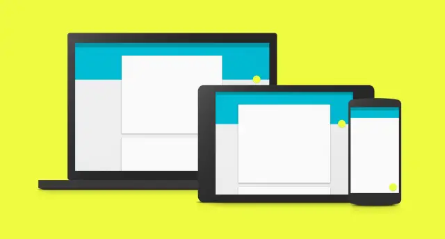
In an effort to flesh out their Material Design guidelines, Google has released a whopping 7 new sections that’ll show you best practices for crafting user interfaces, handling data and providing an overall sensible user experience as it pertains to the current standard. Here are the new sections Google has added for developers to take a look at:
Data tables
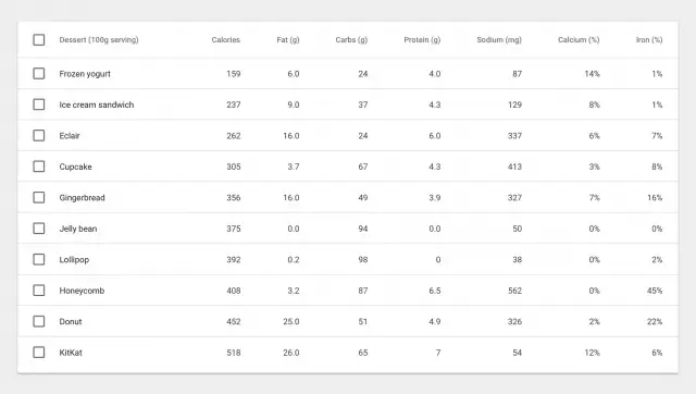
Whether you’re including ingredients for a recipe, stats from a sports league, or results from an arcade game, Google gives you the lowdown on the best practices for incorporating data tables into your apps and websites with material design (read more).
Units and measurements
Ever wonder why phones from the low-end to high-end seem to ignore pixel widths and resolutions? They’re not being ignored, Skywalker… it’s all a matter of pixel density (and much more).
![]()
Floating Action Button
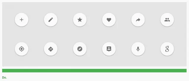
This beautiful addition to Android now gets its very own Material Design section. Learn when, where, and how to use the floating action button appropriately right here.
App structure
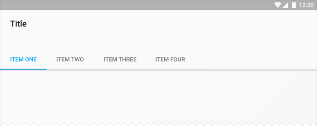
Having trouble deciding how to organize and structure the content in your app? Google has some ideas for you.
Adobe After Affects – Component Sticker Sheet
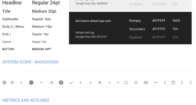
Users of Adobe Photoshop and Illustrator have long had access to system icons and component sticker sheets, but what about folks using Adobe After effects? Well… you’re now in luck.
Data truncation and redaction
Feel free to show me your credit card number, expiration date, and secret pin number on the back… I’m an angel and would never use it for nefarious purposes. However, developers will want to protect their users from meanie heads by not showing important info like passwords, so Google is now helping you conform to their design standards in cases like these.

Writing guidelines for Settings
It’s all about consistency. Nothing bothers me more than jumping into settings and not knowing what the heck is going to happen when I make a selection, so I really hope developers follow these guidelines closely.

And there’s more…
Google has also updated existing sections with more detailed guidelines, including topography, cards, dialog boxes, tabs and scrolling techniques. You can find all the newest changes right here, while the entirety of the Material Design guideline document is waiting for you here.
And remember developers, while you’re not forced to follow these guidelines you’d be doing yourself a favor to make sure your app conforms to the latest standards. Not only will it improve usability for your existing loyal users, but it will help you gain a lot more visibility — users tend to be a lot more willing to check your app out if they see it uses Material Design.






I’m torn because I love Material, but I still love Holo, too. I think Timely (one of the Holo-centric styled apps) is one of the most beautiful apps ever written. But then again, so is Action Launcher 3, and it’s full on Material.
I’m a man of eclectic taste…