One of the most popular 3rd-party launchers is getting some Material Design love today. Alpha testers have been using the Material Design version of Nova Launcher for a little while now, and it’s ready to graduate to public beta. There are plenty of new Material goodies for Nova fans to enjoy.
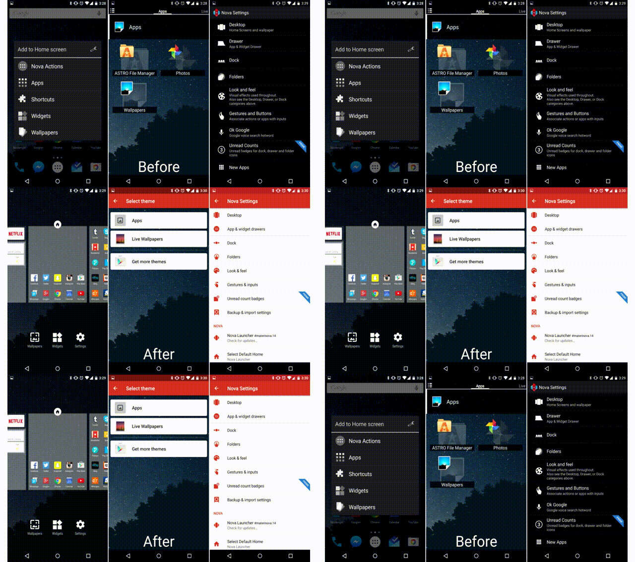
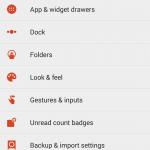
First and foremost is the brand new look and feel of Material Design. You might not notice it immediately on your home screen (depending on your set up), but diving into the menus and settings will show a brand new look. A long-press on empty home screen space will bring up a more modern dialog instead of the old 2.x style pop-up. You’ll also notice a new red and white theme in the settings with smooth Material animations.
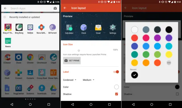
A new feature that I really like can be found in the app drawer. When the app drawer is opened you can swipe down from the top to bring up a search bar and list of recently installed or updated apps. This is super handy for trying to find apps quickly. Another new feature is the awesome app icon layout editor (seen above). You can also now adjust icon size and font size independently for desktop, drawer, dock, and folders.
All of these new #materinova features will eventually come to the stable version of Nova Launcher. If you don’t want to wait for that you can opt-in for Nova Launcher Betas from Google Play by following these steps. Check out the full changelog for below.
- Join the Nova Launcher Beta G+ Community (This is not optional)
- After joining, Opt-in for Nova Launcher
- When a new beta update is available you will get it through the Play Store
#materinova.14 public beta 1
- Full Material Design
- Google Search from the search bar shows as an overlay
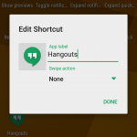
- Edit Shortcut dialog, and quick menu, tinted based on colors of the icon
- New icon
- New Nova Action icons
- Rebased on top of Launcher3
- Individual icon layout settings (size, font, etc) in Desktop, Drawer, Dock, Folder
- Max icon size boosted to 150%
- Widget Search
- Pull to search (pull down in the drawer to open app or widget search)
- Widgets given their own drawer, removed from App Drawer
- Ability to change Page Indicator color
- Drawer Tab Bar completely optional
- Support for Android for Work managed profiles (Lollipop)
- Workaround Expand Notifications Nova Action not working on Samsung Lollipop
- Requires Android 4.1 or higher (Dropped support for Android 4.0 ICS)
- Unlimited desktop pages (previously limited to 9)
- Add/remove of desktop pages by dropping icons on the blank page, or removing all icons from a page
- Add blank desktop pages (for gestures or live wallpapers) from overview
- Improved bulk edit of folders (Folder > Menu > Select Apps)
- Added shadows to unread badges
- Unread Badge size scales with icon size
- Allow reordering drawer folders by drag/drop within window
- Added Roboto-Medium font option
- Improve handling of apps installed to sdcard





I prefer the old style
All of this optional. Tons of material things have been added the past few months and they were not forced on you.
Although this is kinda forced on you if you choose to upgrade.
Honestly, I’m not sure why Google hasn’t bought out or contracted this company to make their UI for them. It’s leaps and bounds better than the Google launcher.
@LiamSpradlin:disqus was the dude behind adding the Material Design. Laim + @kevin_TeslaCoil:disqus = awesome results for sure!
I have been using the alpha for a while and seriously can’t live without Nova. I test lots of launchers but always come right back to Nova.
I like to try new launchers, or new themes in MyColorScreen or Buzz launchers, but I also always come back to Nova. It does what I want it do without being confusing and just works.
I had used Nova for years but recently switched to the Google Now Launcher for a more minimal and stock experience. What I missed most is being able to have separate app category tabs in the app drawer (apps, games, widgets), and launch gestures on app icons/folders. Don’t miss it enough to switch back, though.
Similarly, I ditched Swype once Google’s keyboard gestures got good enough. Don’t want the kitchen sink anymore.
The only real extra feature that Nova does not have is swipe to Google Now. Everything else can be tweaked to act/look just like Google Now Launcher.
On top of that, Kevin actually has fixed bugs that are not even fixed in Google Now Launcher. Nova is more like Googles sink that is polished.
I am in the beta and what happens if I purchase it? Will I still get updates?
Yes. I purchased it a long time ago and i get the updates. You may need to opt-in again, but just follow the instructions and you should have no problem. To get the latest update you would still go into the setting and check for update, since you are in the beta, you can choose between beta and released versions.
Thank you Sir :)
Since 2011 I’ve been a nova user and I don’t think It’ll change any time soon.
Nice update but one thing I don’t like is how the dock and home screen icons cant be perfectly aligned anymore. The width margins don’t line up with each other
I used Nova Prime exclusively for a solid 3 years, but have not installed it since I got my Nexus 6. Is it worth using a launcher when you have a pure Android experience???
I think it’s great on Nexus devices. I have a Nexus 6 too, and I liked the Google launcher, but just wanted a few extra options. You can make Nova look identical to stock and still enjoy the extra options.
I’ll give it a whirl then. Wasn’t sure if it would take away from the buttery goodness of stock android. Thanks!
If you want customization, yes. Google’s launcher gives you no customization options
One thing they got rid of was the ability to get to the Android Settings app via the menu button. I really hope they add this back.
not happy they hi-jacked that option
I will be using Nova launcher for the first time when I get my S6. I’ve been using Go Launcher for 4yrs, just want to try something different.
Buggy, and breaks most gestures. Back to stable.
Going back to stable 3.3 did you just download the apk from apkmirror or directly from the Nova website? I tried downloading the apk from apkmirror and it wouldn’t let me install 3.3 to roll back.
I did a backup of my Nova settings. Then I cleared default launcher setting. After that, I just uninstalled Nova, reinstalled from the Play Store, then restored Nova settings.
Okay cool, I just uninstalled it and thought that would remove the beta and revert to the stable build of 3.3 but when I installed it again it was the beta build .15 again
Ahhh, Nova…. how I love you so. Looking forward to the final release.
Anyone found one of those new animations? Or wasn’t he talking about transition animations?
Is there any way to back to a dark app theme? I don’t like the white and red.
Good question, I like the dark better
I really hate the new Widgets interface. I would much prefer a scrollable list, rather than a paginated side-swiping UI that you can’t set to pure scrolling. What used to take about 4 seconds (Long press > Widgets > scroll to MemoWidget > select size) now takes much longer.