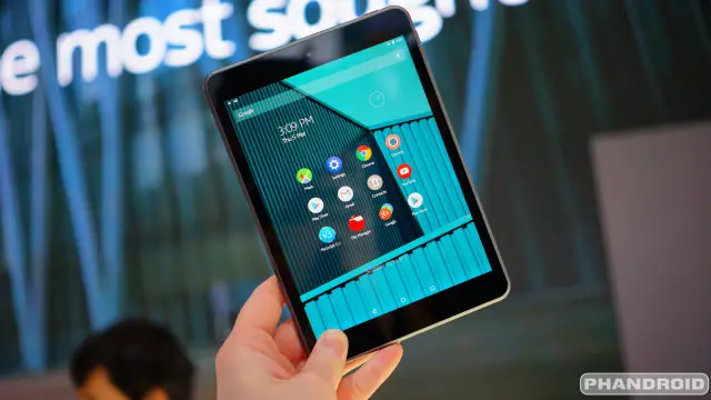
It wasn’t that long ago that Mobile World Congress was flooded with Android tablets. Everyone from Alcatel to ZTE had to get in on the post-iPad tablet boom. Nowadays tablet releases are few and far between. We haven’t seen many new tablets at MWC this year, but one from an unlikely source really grabbed our attention.
Back in November you may remember hearing about the Nokia N1. It came out of nowhere, but looked really nice. Nokia is showing off the N1 at Mobile World Congress, and we couldn’t pass up the chance to check it out. The first thing you’ll notice about the N1 is the design that mimics the iPad more than a Lumia device. Nokia says the design is made to fade away and not distract from the contents of the display.
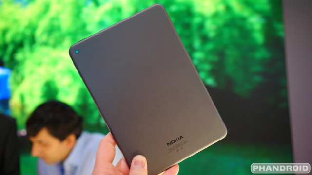
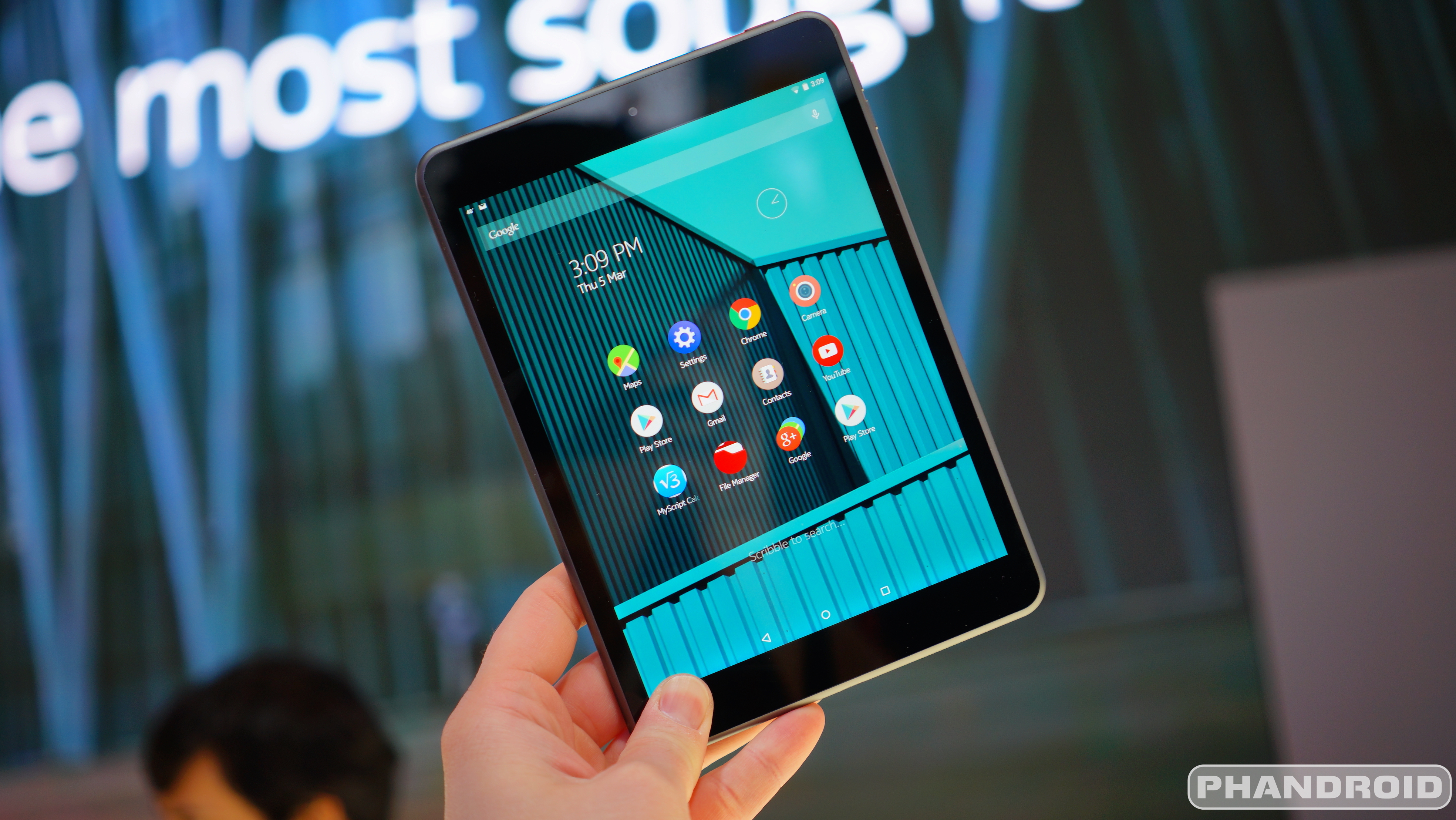
iPad-esque or not, the Nokia N1 is a very attractive device, and that’s not the only thing to love about it. The N1 runs stock Android Lollipop out of the box. Nokia only pre-loads one app, which happens to be the app you use the most. Z-Launcher is Nokia’s own home launcher replacement that uses contextual information to show apps you might need at the moment. It also has a handy handwriting search for apps, contacts, and bookmarks. The good news is you can simply use a different launcher if you don’t like it.
The display is 7.9-inches at 2048×1536 resolution. It’s powered by an 2.3GHz Intel 64-bit processor, 2GB of RAM, 32GB of storage, and a 5300mAh battery. On the back is a 8MP camera, with a 5MP camera on the front. One really cool spec is the USB Type-C reversible charging cable. This is the newest standard that allows the USB cable to be plugged in at any orientation.
The Nokia N1 has one big flaw: availability. If you live in China you can buy one for the equivalent of $250, but here in North America it’s nearly impossible to get. That’s a real shame because we like the N1 a lot. It has a great design, excellent build quality, top-notch specs, and stock Lollipop. If it ever does come to the U.S. for $250 it should be an easy sell.



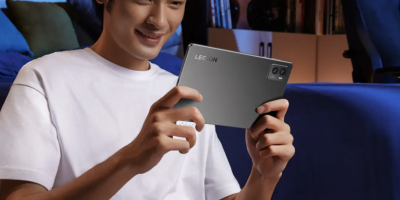


4:3? No thanks.
Agreed I really prefer 16:10 personally. I also think my kindle fire because 8.9″ looks far better then the n1
I think Sony wins in that category. iPad clone? no thank you.
ipad clone?? I dont see it. And the sony is really friggin nice, I just hate the HUGE bezzles it has….that is more ipad clone really (in my opinion)
How don’t you see it? I mean, I get that it’s a generic design, but the only thing that’s missing is the physical home button.
I guess if u want to go by generic design…. But there are a lot with a generic design with a physical home button…. Are they all iPad clones?
You need glasses if you cannot see this is an ipad clone, seriously.
obviously I’m not the only one who does not see this. Nor the only one who does either. So we could technically sit here all day and push our points on one another. Seems we are at an impasse and will just have to agree to disagree.
This isn’t even discussion worthy. 9.999/10 people will confuse that tablet with an iPad, no ifs or buts about it. Whether that’s a bad thing or not, up to you.
fair enough :)
Wouldn’t bother me if it’s an ‘iPad clone’, in fact I see that as a good thing as Apple make good looking hardware. It’s the restrictive nature of iOS that I couldn’t deal with. But the N1 is running beautiful Android, so I say; yes please. Btw, I like the latest Sony tablets too.
It looks like that new dell tablet. You know, the one with the dim screen.
It actually doesn’t look like Dell tablet!
Wow. My Nexus 7 has been dropped to near oblivion so I’ll probably be back in the market for a tablet soon. I really want one-o-these.
I always thought an iPad would be nice with android on it. Hope this comes to the UK
Best looking pos tablet from Nokiawindoze
Who’s peeing in their pants now
Doesn’t look like anything special to me.
Me either. Just looks like a boring ipad.
It’s been produced by Foxconn who also produce the iPad…
…and most other smartphones and tablets.
Seeing a device and using it, are two completely different experiences
the best android launcher simple elegant & practically stock android
Typo? “the app you ‘use’ the Most.”
Audio speaker? Power button? Volume rocker? Anyone?
Naah, that would “distract you from using the device” :)
kinda expected this answer, awesome community
“Nokia only pre-loads one app, which happens to be the app you the most.” what? : D
I guess the word was love, coz Z launcher has been really appreciated by the masses when it was launched…everyone hearing about it was trying to get hands on it. Personal tastes aside, it’s something similar to Yahoo’s Aviate launcher. But yes aviate has it’s own feel… I like aviate, can be used to have a different experience on android :)
Xperia z4 tablet look better… But to expensive
This felt like a bored and unenthusiastic Apple presentation
Finally a good looking Nokia product! Love the design.
What what what? Nokia has always had some of the nicest looking tech (and quality) in the entire industry!
Yes, but not always the nicest to hold. I bet this one feels great in the hands.
No, but I liked 32GB of storage.
It’s literally a iPad mini
Not literrally, but it sure looks like one. Which is a good thing. iPads are the best looking tablets on the market….or were….until now.
Nahh it looks like an ipad. I think the Z4 tablet looks a lil better.
I’ve been using Z Launcher on my Galaxy S5 for a month now and totally loving it. No more organizing of the home screen. No more looking for an app icon in a particular place. :-)
So you’re finally admitting that the iPad is the best looking tablet?
Uhg it has that stupid aspect ratio like an ipad mini. I’ll stick with my Nexus 7 2013 and have no interest in this ugly thing.
Yeah the aspect ratio is weird and I do love my N7 but gosh dang I would buy the hell outta an N1
“by an 2.3GHz Intel”
You would only need the “an” if you said “Intel 2.3Ghz”. Should be “a”.