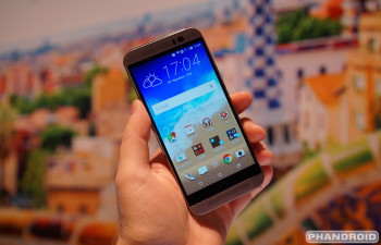
Hands-on with the new HTC One M9 [VIDEO]
Talk about the HTC One M9 at AndroidForums.com!
Yesterday the HTC One M9 was officially announced at Mobile World Congress. We were in attendance at the event, and we had a chance to check out the device in person. The One M9 looks a lot like the One M8. In fact, it’s pretty much identical. From the front they look the same, but the back and insides are what set the M9 apart.
Specs are a very important part of any phone, but even more so for the One M9. Since HTC didn’t change the outer design they have put all the focus on the specs and software. The M9 has a 5-inch 1080p display, 20.7MP camera (2 “UltraPixel” front), Qualcomm Snapdragon 810 processor, and 2840mAh battery. Check out the full HTC One M9 specs here.
On the software side you’re getting Android 5.0.2 and Sense 7. Like the design of the M9, there aren’t many visual changes in Sense 7, but the functionality has big changes. The biggest change is a new “Sense Home” widget that you’ll find on the home screen by default. HTC tries to predict what apps you’ll need for certain situations and put them in this widget.
If your phone detects that you’re at work it can fill up the widget with productivity apps, and when you’re home it will display entertainment apps. At least that’s the general idea. If you don’t want HTC to try to figure all of this out for you it can be set up manually. There are also “Smart Folders” that automatically organize things for you.
Another cool new software feature is custom navigation buttons. By default you have back, home, and recent, but you can add a virtual power button, notification shade shortcut, fullscreen button, and quick settings, and more. It’s a really cool idea that we’d love to see more manufacturers embrace.
The One M9 lacks the excitement of previous HTC phones, but this is still an excellent device. The M9 will be one of the top devices of 2015. Do you think HTC did enough to improve from the M8? Will you be buying the HTC One M9? Let us know what you think about this device!