Palabre might be the most beautiful Material RSS/Feedly reader [VIDEO]

Can you believe it’s been nearly two years since Google Reader closed up shop? In the time since that sad day Feedly as become the de facto RSS reader service. There are tons of excellent Feedly apps available in the Google Play Store. Developers are slowly incorporating material design into these apps, but the newest Feedly app may be the most beautiful.
Palabre is a new app created by LevelUp Studio, the same team behind Beautiful Widgets, Plume, and Bright Weather. If you use any of those app you know that Palabre is going to be a quality app. They’ve built it from the ground up with material design in mind.
When launching the app for the first time you will have the choice to log in with a Feedly account or simply tap Start. Logging in with your Feedly account will sync all of your subscriptions, categories, and saved articles. Tapping Start will bring you to page with genres such as Technology, Gaming, Food, Cars, etc. Each one of the genres has a few suggestions for websites to follow. There is also a floating (+) button in the bottom corner to manually add feeds.
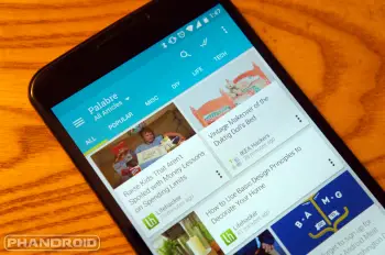
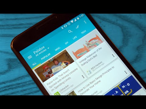
Once you’re all set up you will be greeted with a magazine-like view of all your feeds. Across the top of the page is tabs for all of your categories. If you’re signed in with Feedly you will see a “popular” tab with a mix of articles that are, you guessed it, popular today, and your saved stories. Tapping on a story from any tab will reveal the full story with a very material-like animation. On the article page you have a few more options that make this app great.
A feature that I always look for in a RSS/Feedly app is Readability support, and Palabre has it. Readability is a service that makes webpages easier to read. In this case it strips an article down to just the basic text and links. On the article page you can also adjust the text size, share the story, and save it for later. There is also a button at the bottom for opening the story in the integrated browser.
Palabre comes with a few customization options that can fine tune the experience to your liking. By default the app uses a light theme with the magazine layout. In the settings you can switch to a dark theme and list layout. You can also choose how often the app refreshes in the background, when to mark articles as read, and what to do when you double tap.
I’m really digging the style of this app. The material elements are all there, but it doesn’t seem as bogged down by animations as some other apps. I love that you can manage subscriptions and add news ones right from the app. Not all 3rd-party Feedly apps allow this. If you’re looking for a clean and fast app for Feedly or just reading RSS feeds you should give Palabre a try. It’s available for free, or for $2.47 if you want to remove ads.

