Google app update brings refreshed Google Now Launcher and even more Material to non-Lollipop devices
It’s been awhile since we last saw an update to the Google Now Launcher in the Play Store (not since August 1st, according to Google). And while there still isn’t an update available quite yet, an update to the Google app is infusing even more Material design into the Google Now Launcher.
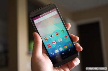
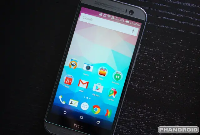
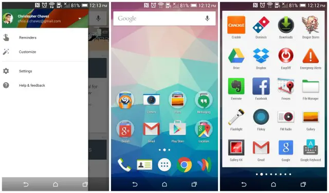
We were puzzled after our Google Now Launcher on our HTC One M8 — still running KitKat, mind you — suddenly looked identical to the version running on our stock Moto X Pure Edition. The search bar has finally been whited out, along with the app drawer button and app drawer itself. Turns out, after diving into our app settings, the actual Google Now Launcher app wasn’t updated at all (the version number stayed the same) — our newly updated Google app was the actual culprit.
You may remember that both the Google app and Google Now Launcher are closely tied together. This has something to do with the fact that Google Now is so closely integrated into the launcher (accessible by swiping to the right on the home screen). In any case, if you’re looking to update the look of the Google Now Launcher to mirror more closely our Lollipop brethren, update the Google app in the Google Play Store. Link below.


