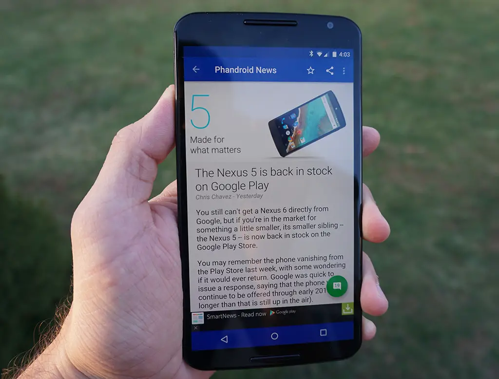
Just before Christmas we gave you a sneak peek at the updated version of Phandroid News for Android, totally redesigned with Material goodness and some awesome new features. At the time it was only available to the Phandroid beta community, but we’re happy to announce it is now freely available and ready to download from the Google Play Store.

We’ve worked really hard to bring you this update – it’s been in the works for quite awhile – and we’re hoping to earn your 5-star praise. It’s inevitable that there will be some bugs and we hope you’ll give us the opportunity to identify and fix them by sending an e-mail to support (rather than the frustratingly loathed “terrible update 1-star kthxbye” post to the Google Play Store).
Wait no longer- head on over to the Google Play Store and download the world’s best Android News App. And while you’re at it, check out our Forums for Android App brought to you by AndroidForums.com!


Done updating :D its awesome
Liking it so far. Only thing would be to make the navigation button bar black instead of grey for the dark theme.
I didn’t think about it till you said it but I agree. Or perhaps another color like teal, but not grey.
Been using the beta for a week or so and updated to the stable version today… Steve did a great job.
Great work as always Steve.
Loving the update. Great job Steve!
Looking great. Perfect readability. Glad you kicked out justified text altogether, Steve (but that might have been versions ago). Took the liberty of subscribing as to show my support, although you might make more money of showing the ads. Well, whatever. Keep up the good work guys!
One request though, could we have the author in the list view next to the publication time, like on the item itself? I have my preferences…
Thank you for the blue nav bar!
Well, I must say those responsible did a wonderful job. Seems to be fairly smooth and is much more appealing to the eyes now.
Loving the updated design. Great work Steve!
Dude. This app is boss AF now. Now I’ll actually keep it on my phone. I’ve uninstalled it in the past just because it was such a clusterfudge to navigate and it looked horrible. This thing is clean and fluid in its animations. The dark theme looks great on my Note 3.
Looks a lot better, seems to crash less often, too!
I don’t see anything that special.
Awesome, material design
I like looks very nice.