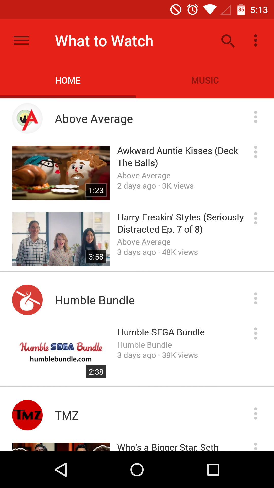
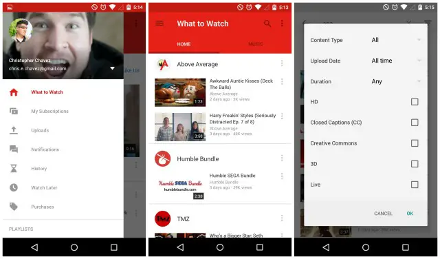
Heads up. YouTube 6.0.11 is now rolling out in the Google Play Store and (finally) brings the Material redesign you guys have been itching for. Aside from a completely new, more Lollipop looking UI, the new YouTube brings a few additional filters to help find that really specific video you’ve been searching for.
What not sure what took so long, but no matter. It’s here now and for those that don’t feel like waiting for the staged update to hit your device, you can sideload it by downloading here.




About Goddamn time
Seconded. Trolldad. Nice.
I wonder if 2k videos will finally work
The more accurate term is 2.5k
Accuracy is not the point it’s just because everyone hates how long out takes to say 10-80-p.
Nope 1080p is still Max resolution on my lg g3.
OMFG can you guys please hire someone who has at least a basic understand of the English language to proofread what you people write? It’s downright embarrassing.
Says the guy who uses “OMFG” and forgot the -ing at the end of understand.
Got em
Curses, foiled again!! I may or may not have been a bit drunk when I said that last night. That said, my drunken grammar is still better than these guys’ grammar. ^_^
Relax people make mistakes it’s not a big deal
Not sure if the blue theme is app-wide or just for certain channels, but I do like the Material touches here and there. Nice to see Google being timely on their app updates!
– Jennifer
I reaalllyyy don’t like this dark-on-dark colors trend. :/
There is currently a nasty bug in the Youtube app affecting (perhaps only Samsung) tablets where the controls disappear in full screen mode, making the app hard to use. Anyone know if this has been fixed with this update?
Gonna download now and let you know. It pissed me off when it affected my tab 3 10.1
It’s fixed for my Galaxy Tab 3 10.1
Fantastic, thanks :)
No prob.
FINALLY
I don’t like it…I dont like change! XD
Anyone still using the Xoom, this app seems to fix the flicker you get when videos are playing minimized in the corner.
Nice. I like it a lot, it’s definitely the best version of YouTube so far, aesthetically speaking. :)
All we have to wait for now is Hangouts.
Messenger has Material Design.
Opinion rewards and blogger and translate
The most prominent change appears to be the amount of whitespace added everywhere.
WTF…. Still only 720p on Droid turbo.
That was quite an ugly nuance of read they are using. And small text. And too much space.
No, I don’t like it.