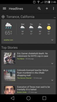
Google News & Weather gains dark theme option in latest update – will more Google apps follow suit?
Back in August we saw the biggest update to the Google News & Weather app since it was introduced year’s ago in Froyo. The update brought about a refreshed look with Google’s familiar white card-based layout. Today, an update to Google News & Weather is allowing users to now choose a “dark theme” for the app, something users have been clamoring for in some of Google’s other apps and services.
Those with a keen eye will also notice a few added Material design animations when expanding cards, curated stories, and new weather graphs. Still, we can’t help but wonder if more apps will follow suit. Currently, a “dark” theme is only available the new Google Keyboard and Google News & Weather at the moment, but we’re crossing our fingers this is a sign of things to come.

