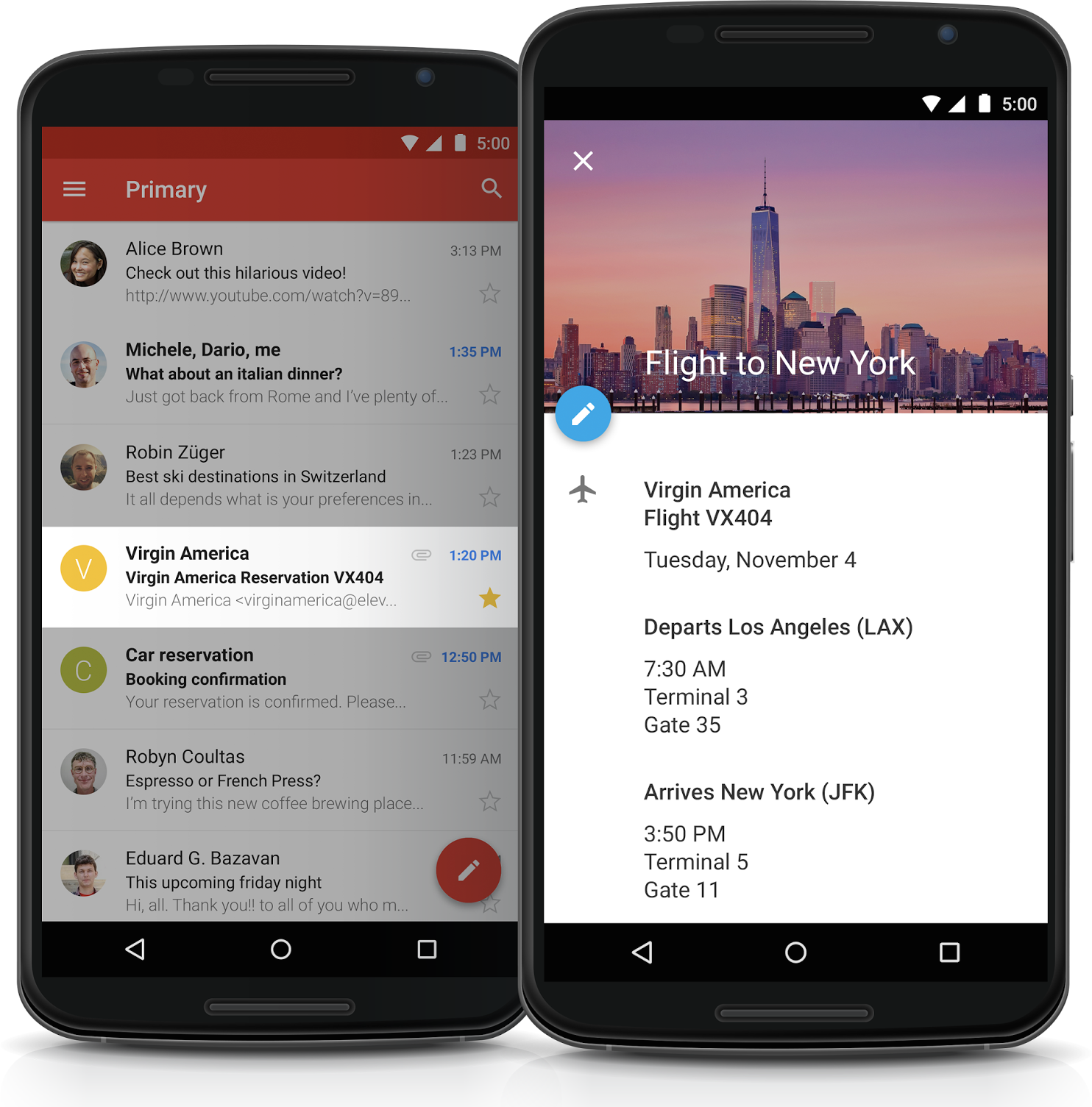
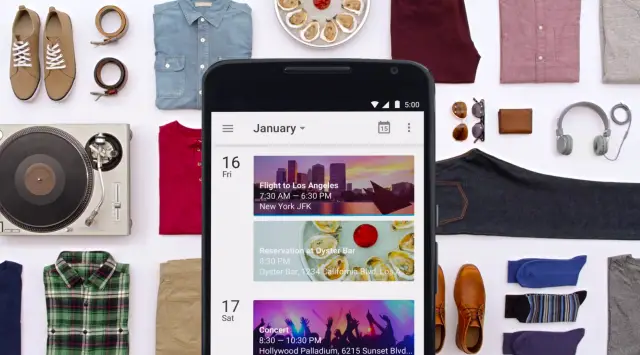
Google formally introduced the all new Google Calendar 5.0 yesterday, but outside of a vague “coming soon” launch date, many of us were left lusting after its fresh new updated Material Design user interface. With support for photos, maps, Gmail, and multiple inboxes from Yahoo or Outlook — your calendar never looked so alive and rich with data.
For all those that don’t feel like waiting, you can now sideload (install) the apk — which works on all Android 4.0.3+ devices — right here. Enjoy.
Thanks, Teets!




Been waiting for this all day
thank you!
sense 6 >>> Android 5.0
I don’t agree with that. However, I am excited to see what HTC does to material design in their new version of Sense.
Listen… You DO agree.
READ… “I don’t agree with that…”
Idk about that. However, Sense 7 w/ lollipop will likely be (that is just my opinion, don’t kill me everyone) better than stock 5.0
APKMirror is really slow…
Dropbox Mirror – https://www.dropbox.com/s/3tr7c7yxajwflun/Calendar_5.0.apk?dl=0
Thanks for the link.
It annoys me that there is still no month view for the widget. This is the reason why I didn’t use it before. C’mon Google. I wanna use as many native apps as possible.
Much better
I don’t like that the five day view only shows a few hours. It Newsome a 12 hour view.
I can’t get it to install. I have deleted the previous calendar app and rebooted. Should I move the apk file to system/app then install?
Thanks to anyone that can assist
Ugh. I can’t be the only person who HATES this redesign. It took me longer to download it than it took me to realize I hate it. I deleted it already. Sure, the little pictures and maps in the calendar may be a nice touch, but the overuse of the absurdly bright colors and lack of definitive breaks between days (and no differentiation for past events) makes it a no-go for me. Especially the widget. I can’t have that on my screen.
I can’t be the only one who really liked the previous design of the calendar app and widget???
Material Design is looking more and more like a mess to me.
Lots of wasted space, lots of useless things that keep users from taking full advantage of current apps.
This calendar app is quite a lot of clutter with little function. The 5-day view is terrible over the old 7-day view.
I’m hoping that 3rd party devs can do better than Google
Feel the same about the new gmail app
Without the ability to use attachments, short of putting a link to Drive in the Description field, this is kind of a pointless update that is only really providing graphical enhancements.
I kill the HTC Calendar as I don;t like it graphically and the widget sucks. The stock old widget is far better and works nicely on my home screen.
I am avoiding this update for now..
I think it would be okay on my tablet, but not on my phone. This doesn’t help my productivity. YMMV.
Love it, but the month view is where I live. I want to see the month at a glance and be able to spot the gaps in my current schedule.
I’m the same. The month view is there. Just click on the actual month’s name at the top, and you get it.
Love it! THANKS!!!
Really missing a true month view. I know I can click the month and a month calendar, but that view has no information. The month view should show colors for what calendars have items on each day – similar to the previous month view. I’m hoping for an update or I’ll be moving on to a 3rd party app.
I don’t understand why the stock calendar can’t have a widget that displays the day’s agenda. Need to use a third party one for that.
I feel stupid– I can’t edit existing events on my calendar. Am I missing something? lol