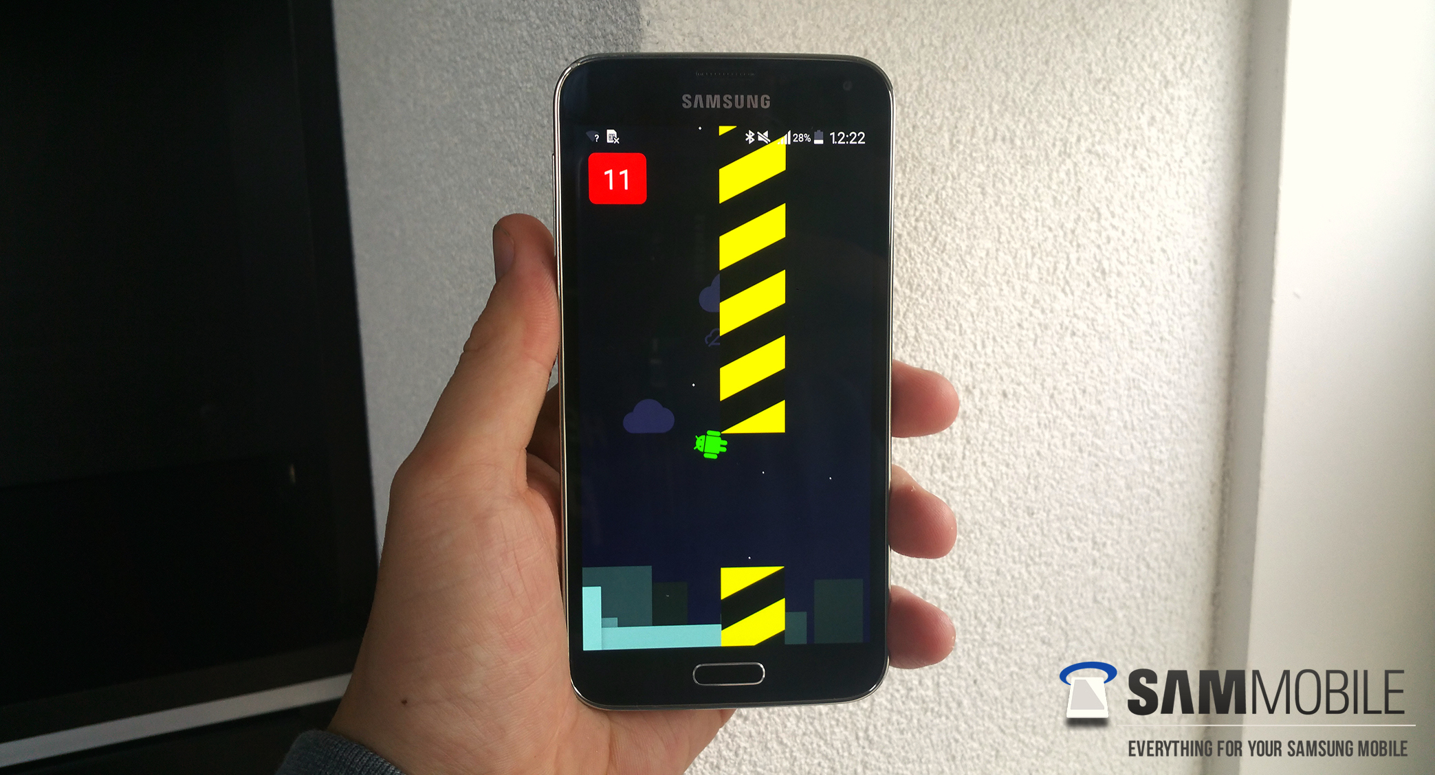
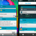
When Google showed off Android 5.0 Lollipop’s new Material Design aesthetic during this year’s Google I/O, the first thing we thought about was how this would translate to the custom skins offered by OEMs like HTC and Samsung. Just before we kick off the weekend, the boys at SamMobile are quenching a little bit of this curiosity with an early look at Android 5.0 Lollipop running on the Samsung Galaxy S5.
This is actually the second time they’re showing off Samsung’s version of Lollipop, although this one is much more recent build. Although it’s still an early version of the software Samsung will eventually roll out to their Galaxy line, it clues us in on exactly what the OEM has in mind for their version of Google’s Material Design UI and really, it’s not half bad.
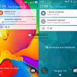
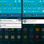
The current version of the TouchWiz running on the Galaxy S5 we found was actually much easier on the eyes and in some respects, not too far — at least in color scheme — to what Google introduced in Lollipop. The newly leaked version of Lollipopped TouchWiz shows a similar TouchWiz interface, only with small design tweaks to the Settings, Calculator, Dialer and more. Here’s what SamMobile noticed was changed from the previous leaked Lollipop build:
- New Note 4 fingerprint lock screen
- New system-wide font — similar to the original one, but a tad thinner.
- New animations, much smoother than before — there’s a screen off animation present as well.
- Google Search bar in recents menu
- Brightness slider in notification center has a new yellow color — while changing the brightness, the notification centre disappears and allows the user to view the content beneath it.
- Removed “Interruptions” from Sound settings
- Gallery: Media can be sorted using new filters including Pets, Events, Scenery, Documents, Food, Vehicles and Flowers.
- Music: Improved UI
- Clock: Navigation bar icons are now accompanied by text
- Calculator: Removed square grids which surrounded the numbers and symbols
- Contacts: New search box
- Stock Material Design inspired applications receive colored status bar
- Android Lollipop theme’s core green elements replaced with Samsung’s blue color
- Settings: Improved UI, new icon color
- New UI for setting wallpaper from home screen
- Better spacing between options in power off dialog
For more image comparisons, make sure to check out the post on SamMobile but in the meantime, check out their hands-on video below.
https://www.youtube.com/watch?v=AU3H1t0kIrQ







To make material design uglier from stock is a hard thing to do, but I think Samsung nailed it in that.
Naw, it’s looks amazing man
It doesn’t look terrible at all. I think people just like to hate on Samsung/TW beacuse they think it’s the cool thing to do. That’s not to say it doesn’t have it’s problems, but the software has vastly improved over the years.
I’ve long suspected the same; mostly bandwagon haters. I think it started a long time ago with the original Galaxy devices when TW was indeed ugly and slow. It’s been rocking the past couple years though.
Its stared when Apple took Samsung to court over the Galaxy S1
Yeah, I can’t imagine why anybody wouldn’t like it. (sarcastic)
That might be for some but other people just really dont like their design. I dont hate on samsung one bit but i dont like their design teams for hardware or software. They make a nice product but i would prefer a handful of other skins and phone designs over theirs.
They hate touchwiz because they have been conditioned to do so. It really isn’t that bad with that lollipop update.
No I hate touchwiz because I get a pop up on my Galaxy Tab 3 10.1 telling me touchwiz is no longer responsive. Having it freeze and restart is a huge pain.
That’s the most gorgeous UI Samsung has ever made… To bad it’s still ugly as hell…
Looks a bit similar to stock.
Uglier lol just stupid
Typical Samsung making stock look like crap
Touchwiz is utter garbage
Looks like a god send compared to S Voice, talk about bloated intrusive crap…
Awesome! Can’t wait for this on the Note 4.
Why Samsung? Why!!! You had one job
Do want on my GS4
I don’t get the boners all you guys are getting for lollipop. It’s just some different icons and a lot of solid colors.
And long awaited feature like a faster runtime, better battery life, more unified UI, tons of new APIs… Yea I have no idea what all the fuss is about (sarcasm).
It is normal for some people.
You clearly haven’t been paying attention or you just choose to ignore the laundry list of new features. They basically rebuilt Android from the ground up. Far deeper than just the look.
I don’t really get the troll-boners people like you get from trying to make people start arguing about something like this either so you’re not alone.
It looks much smoother
What about the S4 getting Lollipop?
Probably not for another 8 months, at least.
The app Themer just made the visual updates for Lollipop completely useless.
I have got a S5 about a month ago.Is lollypop already pre installed or I will get a update?
The final (official) build of Android Lollipop will be released in the next week or so. This is the stock operating system. Samsung will use this final build, adjust their touchwiz overlay (Samsung theme, design, launcher etc) and then roll out releases. The first releases for Samsung devices should start in December. Carrier-specific devices will take a little longer, depending on the carrier.
that guy in the video… well, i hope that isn’t his day job. looking forward to 5 for n5.