
Google Play Store 5.0 with even more Material Design rolling out to devices [Download]

As we move closer towards Android L’s impending announcement, more and more core Google apps are getting the Material Design treatment. Google’s Material Design update for the Play Store leaked a few weeks back, now it seems that Google is ready to unleash their latest rendition of the Play Store upon the masses. Version 5.0.31 began rolling out to devices this evening and as you would expect with a big version bump, the update focuses on Google’s new design language and user experience (#PraiseGrouchnikov).
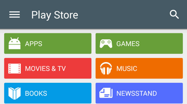
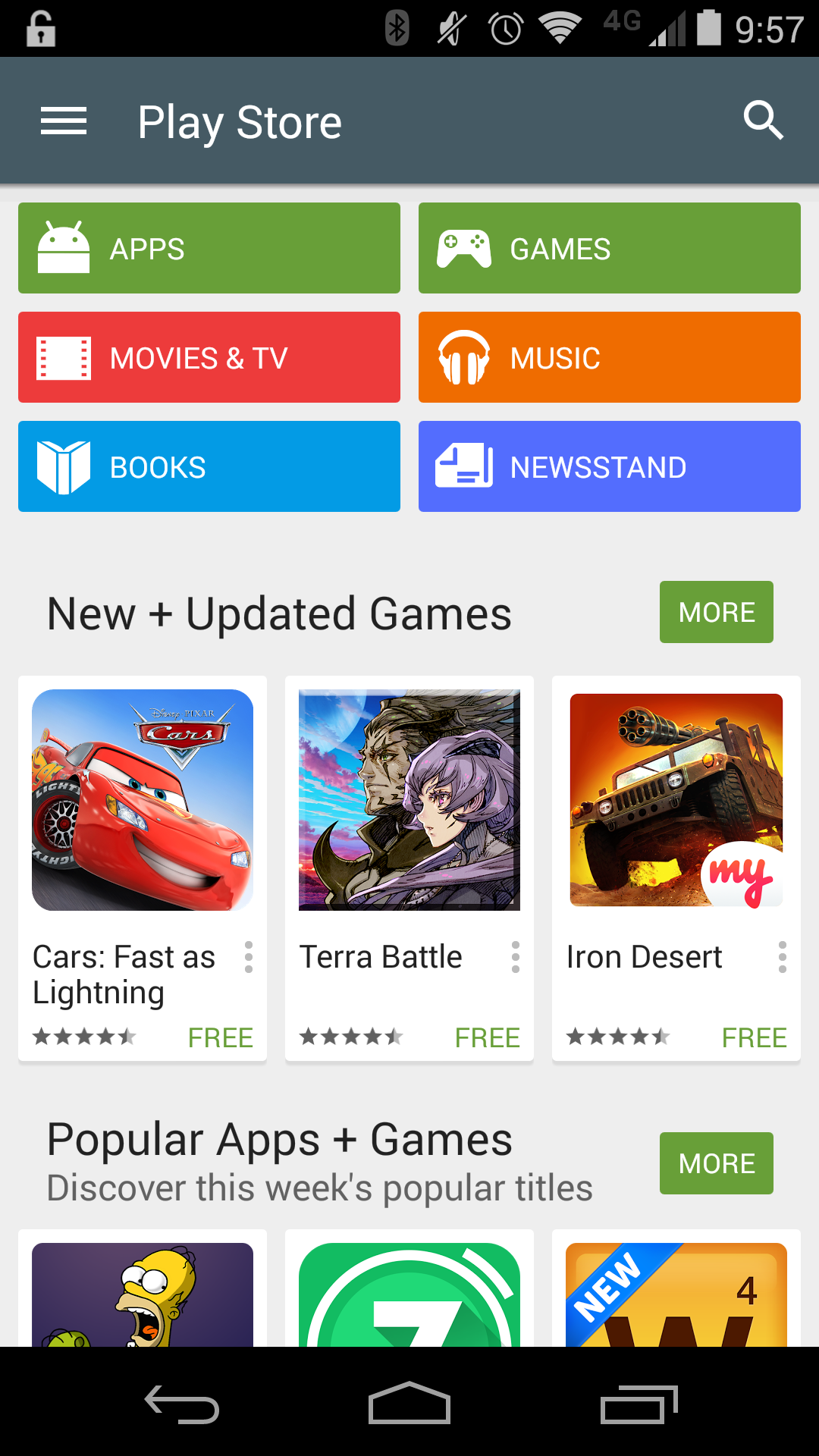
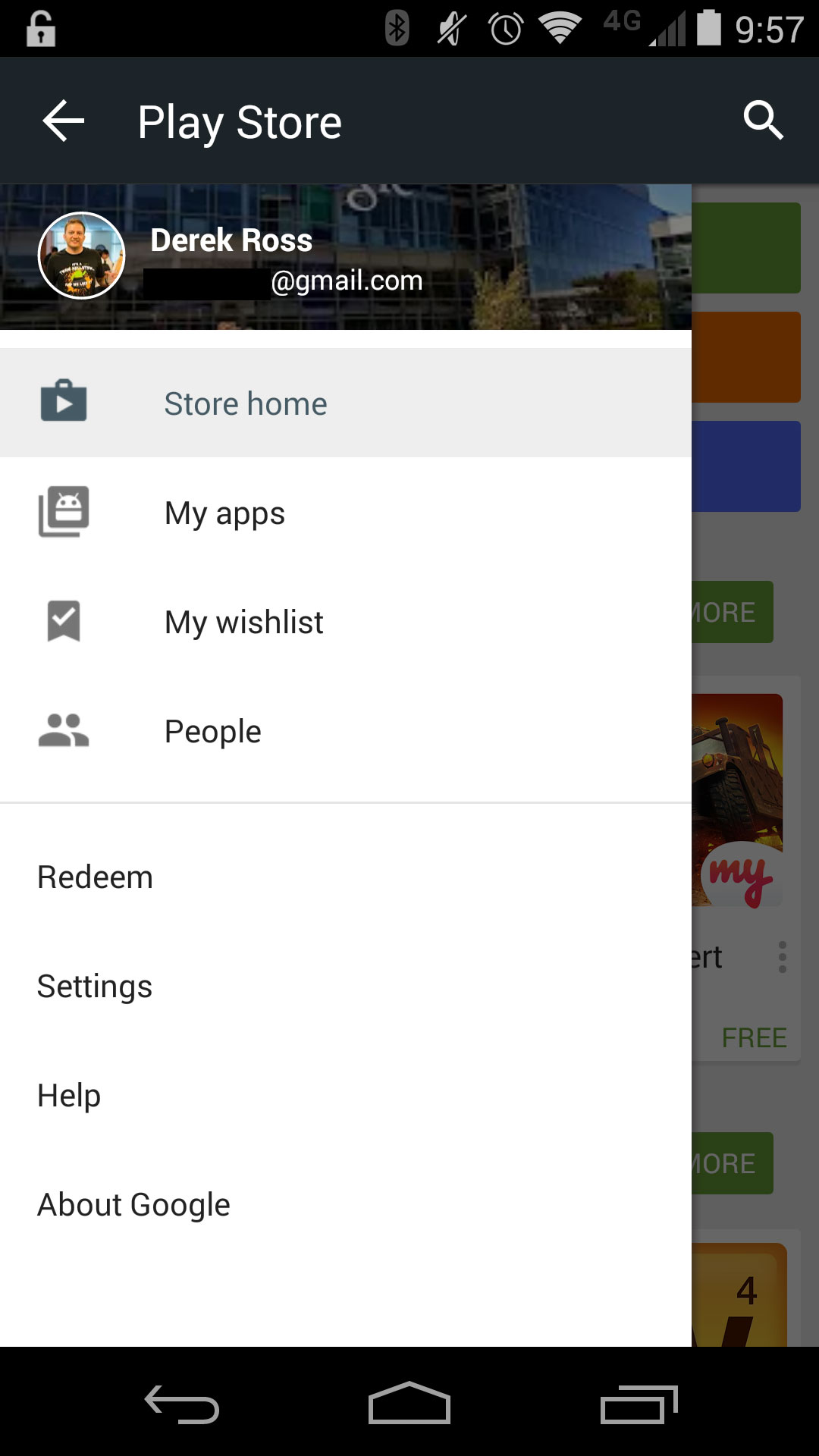
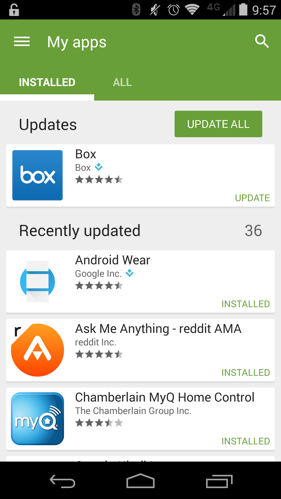
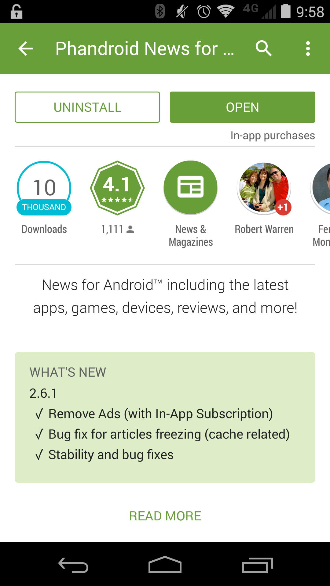
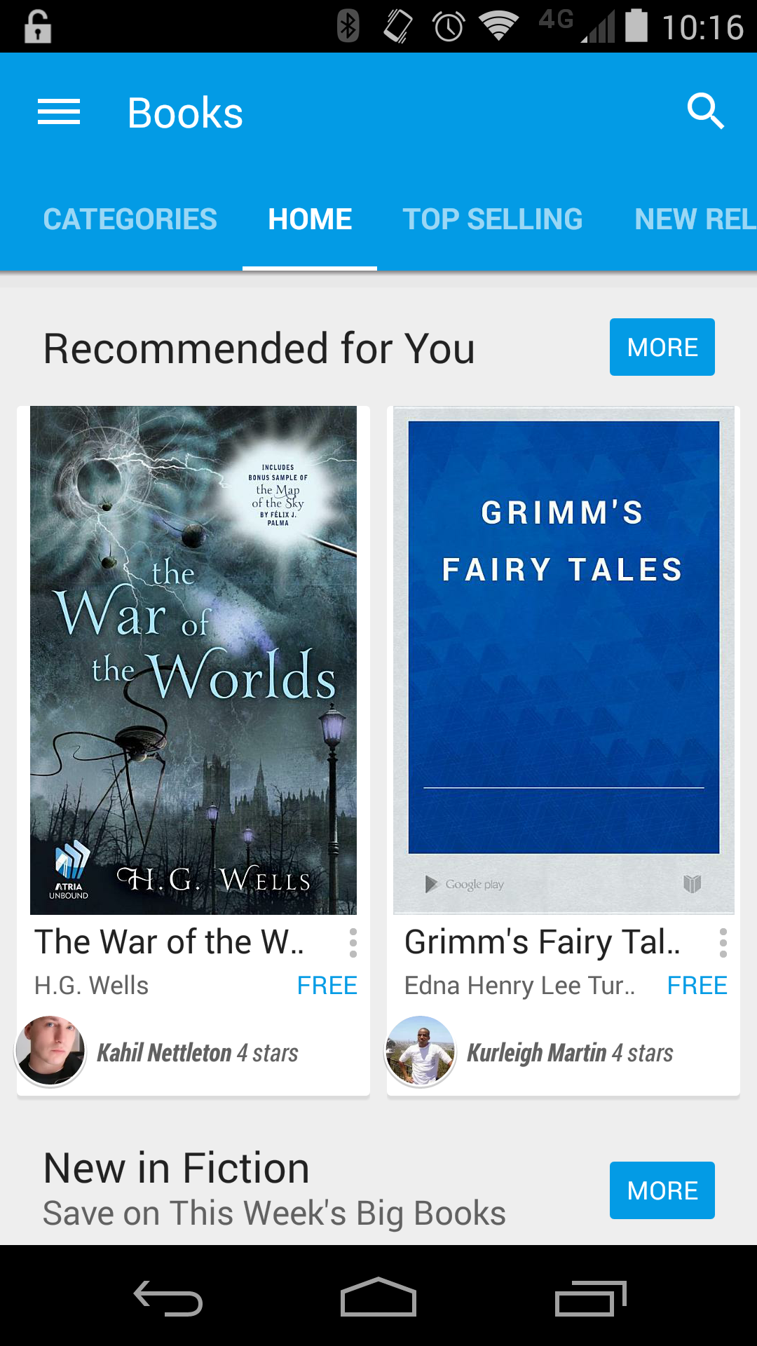
First things first, the Play Store icon itself has been updated to a flatter design. In material Design Fashion, the entire Play Store sports newly colored categories that align with Google’s Material Design color palette, which are incredibly bold and bright. The What’s New section for apps is now highlighted and front and center when you tap ‘Read More,’ meaning there’s no need to scroll furiously to the bottom to read the change log. You’ll also notice a new hamburger menu icon (with a kick ass animation I might add) on the side as well as a newly designed sidebar with flatter icons.


Besides the cosmetic changes you see above, the Google Play Store 5.0 update feels very snappy and flows quite nicely. Of course a lot of that feel could come from all of the new animations and transitions that are flowing freely through the app.
If you don’t want to wait for the Google Play Store 5.0 update to hit your device, we’ve snagged the APK for you to sideload. Enjoy!
Download Google Play Store 5.0.31
Update: If you’re running the Android L preview, you might want to hold off on this update. We’re seeing numerous reports of people having a rough time and having to revert back to a previous version.