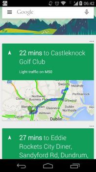
Is this our first look at Material Design for Google Now?
Despite inconsistencies in design language between their current apps, we fully expect Google to update most of their major Android apps with a Material Design coat of paint for Android L’s release. We may have gotten our first look at one of those apps today. A Googler inadvertently posted the photo you see below to Twitter, which appears to be a shot of Google Now loaded up with traffic cards. The Tweet the photo was posted in has since been deleted.
Evidence of Material Design exists in a couple of different areas. For starters, we now see a hamburger menu button on the left side of the Google Search box. That button is nonexistent on the current version of Google Now. We’re not sure what Google will use it for (easy access to different types of searches?) but it’s there.
We also see that the overflow menu buttons for individual cards are now placed on the outside of the card at the upper right corner, and are placed in horizontal orientation. Finally, the voice icon looks a bit different — this one has a hollowed microphone as opposed to the solid one seen in the current app’s design. [Update]: Looks like the hollowed microphone icon has always been there, and serves as a reminder for microphone input being disabled.
Some may think that the green-hued cards in the screenshot above is also another element of Material Design shining through, but it may just be that Google’s using green headers for traffic and navigation cards and will stick to the white that we’re used to for most other things. Of course, with so little to go on anything is just as good as a guess so we’ll have to wait for more details or the official update to rollout before getting a better idea of what’s in store.
[via Reddit]