Recent Android L builds looking a lot more mature with tweaked system UI [VIDEO]
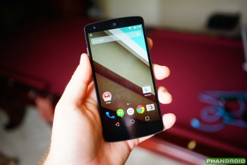
Android L might not look totally different when it makes its way out of the oven compared to what Google first showed at this past year’s I/O, but Google isn’t against changing a few things up ahead of its official release. A video from a recent Chromium report on a fairly recent build of Android L — build LRW87D — shows that the team has tweaked the looks of the status bar and navigation buttons.

The changes aren’t massive, though they do present enough of a difference to make us notice. Icons in the status bar for things like WiFi and battery level are now solid shapes instead of being broken up by thin lines. It should still be easy enough to tell how strong a signal is or how much battery you have left as the icons degrade so folks shouldn’t have too many qualms with that.
As for the navigation buttons, they have shrunken in size, become a bit brighter and the lines have thickened up a tad. Again, it’s a subtle change from current Android L builds but it makes the user interface look a lot more mature and tight than it originally did.
I especially like the change to the navigation buttons as I felt the previous design felt a bit too toyish. These tweaks make a world of difference to me despite them being the exact same shapes and designs. You can see the original Android L interface below so feel free to compare it to the changes seen in the screen grab above.
Of course, you may feel differently about all of it — you might have preferred the original Android L icons all along, or you may think this change is a step down. Let us know how you feel about the differences in the comments section below as we await the arrival of what should turn out to be a delectable treat. The quick video from the Chromium issue tracker is sitting below if you’re interested.

[via MYCE]