This is the Google Play Store’s Material Design update

Android’s new Material Design language has been slowly rolling out to Google services and 3rd-party apps. We’re still waiting on the release of Android L to see Material Design in all its glory. One app that has changed a lot over the years is the Play Store, and you can bet it will be changed once again for #Materiyolo. The good folks over at Android Police got their hands on some leaked screenshots of the update.
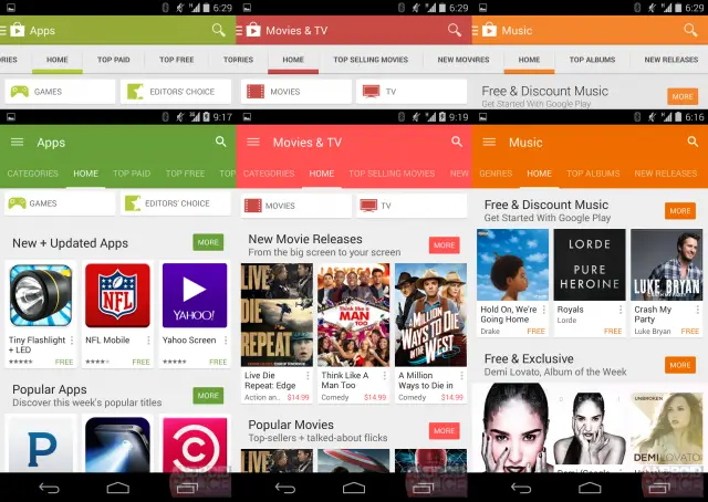
First and foremost you can notice some slight changes to the section colors and top bar. The gray has been replaces with a dark grayish teal. The colors for apps, games, and music have been adjusted slightly darker. Movies & TV, books, and newsstand are a bit brighter. You can see the color comparisons below (top is the current Play Store).


These new colors are even more present in the new UI. The section colors have migrated down to the navigation tabs. This creates a really nice clean and unified look. And yes, the Material Design animations are present as well, as seen below. All in all it’s a very nice update. Not a huge difference from the current version, but just enough refinement to look fresh. How do you like this new look? Are you ready for Material Design yet?