Did Google create a better smartwatch interface than Apple?


Apple has long been praised for their clean and simple software interfaces. This has especially been true for iOS. For a long time the Android design wasn’t even considered to be in the same league as iOS, but a lot has changed in recent years. Google has shown they can create beautiful and clean interfaces with the upcoming Android L, and the current version of Android Wear.
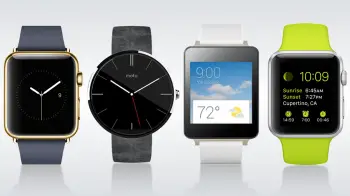
Earlier this week Apple finally took iOS to the smartwatch market, but the results are not as nice as people expected. In fact you can make a very strong argument that Google did a much better job at designing a smartwatch interface than Apple. Don’t believe me? Let’s take a look at some side-by-side screenshots painstakingly put together by Ars Technica.
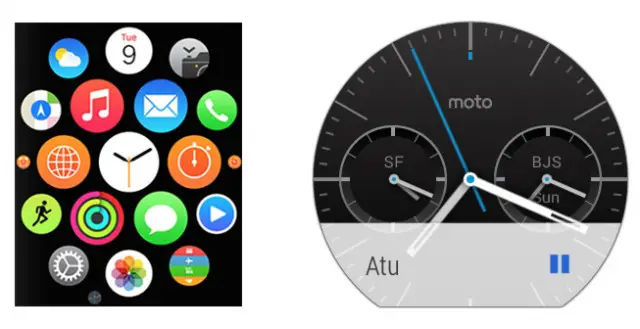

First up is the “home screen” for these devices. Apple goes the standard route with a launcher made up of circular app icons. You can zoom in and out with the “Digital Crown” dial to open the desired app. Apple uses the watch face as more of a lock screen. Android Wear doesn’t really have a home screen. The watch faces are more a part of the UI. There is technically an app launcher for Android Wear, but it’s well hidden in the settings instead of front and center.
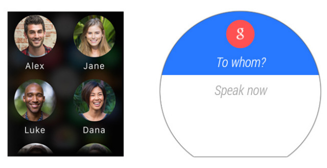
Next up is “Contacts.” Once again Android Wear doesn’t really have this “app.” The Apple Watch displays a standard list of contacts complete with name and photo. Four people are displayed at a time, and you can use your finger of the Crown to scroll through the list. To send anything to a person from your contact list on Android Wear you will need to use your voice. Sometimes you might want an actual list to use, but for most cases this is much quicker and simpler.
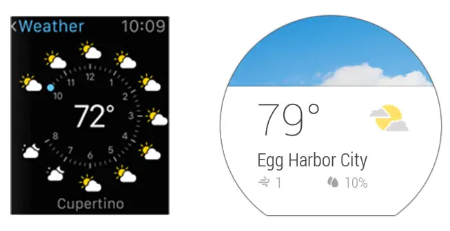
In the weather app we can see Apple has packed a ton of info on one screen. The clock-like dial shows the weather forecast for the next 10 hours, current temperature, location, and the time is displayed up top for good measure (even though the dial also shows the time). Android Wear shows the temperature, location, wind speed, and humidity. The text is much larger and the use of a background image conveys the conditions nicely.
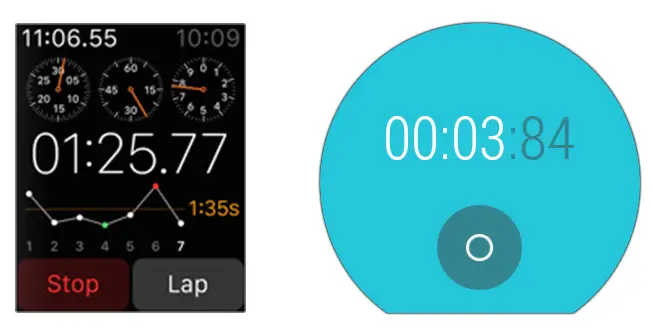
The stopwatch apps tell a similar story. Apple has jammed a ton of info on the screen, and remember, this is a 1-inch display we’re talking about. Android Wear simply has a button to start and stop, and of course your time. Simple as that.

Let’s take a look at directions. Apple actually displays your route in a top-down view (don’t ask me how you’re supposed to read those street names). Android Wear just skips right to the directions, and you can swipe horizontally through the steps. Even with an image taking up half the screen it is easier to read.
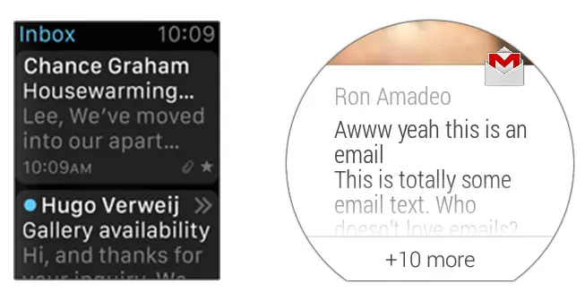
Lastly we’ll look at the email apps. Apple shows information about attachments, favoriting, and the time of arrival (not to mention the clock taking up space at the top). How are you supposed to tap that tiny star? The Gmail app on Android Wear strips everything away and leaves just the sender and email text.
So what do you think? Has Google created a simpler smartwatch interface? Is this a big Apple fail? Let us know in the comments below!
For more screenshots of these UI’s head over to the gallery at Ars Technica.