Chase Bank’s Android app is about as archaic as an old mummy tomb, but they’re finally looking to bring us out of the old ages with an upgrade headed our way soon. The company started sending notices to their customers about a new version that should be headed to Google Play this September.
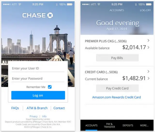
The notice didn’t go into incredible detail about the changes, though if it’s anything like the recent design to the iOS version (pictured below) we should be expecting a new coat of paint atop all the same features we already enjoy in today’s app. Said features include mobile transfers and account management, online check deposits and more. Here’s Chase’s official breakdown of what’s new:
- Simpler, more streamlined login
- New design that helps you locate key information, like account activity and balances, at a glance
- Enhanced design elements and functionality that make navigation easier and more intuitive
- Personalized, location-based backgrounds with friendly greeting messages
It basically comes down to design, though that can be the difference between a usable app and a frustrating experience. Unfortunately Chase didn’t have an exact date to give for its arrival, but we’ll have our eye on the Play Store and will certainly give you guys a shout when it appears.


I’d like that bank account lol
An average balance of $2K? Easy to please.
Wow out of touch much?
that credit card bill kinda kills it though lol.
I’m pretty sure that credit card balance is actually what he owes, so…not too great of an overall account balance to have.
Finally…
It still has the stupid menu button going on!
I am digging the redesign, it’s not like the old app wasn’t functional, but it was getting really old.
I actually don’t mind the current app at all. I’m all for re-design, as long as it’s not as goofy a change as Windows 8 was.
Yea, it’s funny, I didn’t mind the current app at all either, until a friend of mine pointed out the iOS version a few months back.
I actually never saw the iOS app till today!…LOL…No matter what, for banking apps, as long as it keeps everything secure and allows me to do whatever banking I need done (while on the go), I’ll be happy. If it becomes more confusing to navigate, that’s where I’d get frustrated.
Finally
Should have waited on L release…. Now it will look silly….
That comment is kinda silly. A gorgeous, useful app is ALWAYS welcome on my phone.
So when comes out and its not updated to the L layout it won’t be old? And we wait another 5 years for chase to rewrite code….not silly its what is happening…
I’m happy about it, although I wish they were going material with it instead.
Meh doesn’t matter to me as long as my money is there IDC what this looks like.
Chase: No special characters allowed in passwords. It’s hard to trust my money to a bank that has worse security than the Hello Kitty message boards.
Very welcome redesign.