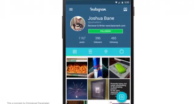
This is how Instagram could look with a Material Design makeover [VIDEO]
It’ll be a while before many of our favorite Android apps are given the Material Design treatment, but that doesn’t mean we can’t dream about what could be in the near future. One concept artist — Emmanuel Pacamalan — has decided to put together a reel of what he thinks Instagram’s app could look like with the new design language introduced at Google I/O this year.
My first thought? Absolutely stunning. Not that I thought Android was ugly (well… it was until Android 4.0), but it’s the kind of design that could make people change their opinion about the lack of well-designed Android apps. Eye-catching animations, colors that pop and efficient use of white space all make this Instagram experience seem ten times better than the one we actually have right now. Fingers crossed that the folks at Instagram (and/or Facebook) are taking notes.
As easy as it is to salivate over the future of Android design, we wonder just how fast Material Design can take off. After all, there is still an alarming amount of apps out there with designs that feel like they belong in the Gingerbread era. Doesn’t hurt to dream, though, so take a look at the concept in the video embed above.

