8 things I miss after switching from Windows Phone to Android

Almost three years ago I was given the opportunity to become a Windows Phone user. I was a little nervous to give up my Android device and switch to something completely different, but in the end I decided to do it. The first month or so with Windows Phone 7 was very rocky. As time went on I got more acquainted with the OS and started really loving it. Two years and two massive updates later I was being called a “Windows Phone fanboy.”
Four months ago I was given another opportunity, but this time it was to go back to Android. I was just as nervous to leave the OS I had learned to love, but in doing so I learned a lot. Switching back to Android from Windows Phone has given me an interesting perspective. Now that I’ve had the time to fully adjust back to Android there are a few things that I think Windows Phone does better than Android. Here are the 8 things I miss the most.
“Unofficially Official” Apps

Everyone knows that Windows Phone suffers from a lack of apps. The situation has been getting better, but there is still a ton of work to do. They say “desperation is the mother of invention,” and for Windows Phone developers that couldn’t be more true. If there is a popular app missing from the Store you can guarantee some developer is working on porting it over.
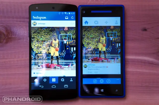
This may sound like a sad situation, but it’s actually one of my favorite things about Windows Phone. There is no official SnapChat app, but there is an app that is better than anything SnapChat could ever make. Instagram finally made a Windows Phone app, but there is an unofficial version that blows it out of the water. Having the choice of which Instagram app to use is something you can’t do on Android. Sure, there are hundreds of alternate choices for Twitter, but most services arrive on Android so quick that there is no need for anyone to build their own.
Customization
Customization is a funny thing. I am not going to try to convince you that Windows Phone can be customized more than Android. It can’t. The thing I miss is how Windows Phone does customization. You can’t choose custom launchers or icon packs, but what you can do is choose background and accent colors. These two simple color choices dramatically change how the entire OS looks.
In the screenshots above you can see Cortana in three different color choices. Many apps tie into the background and accent colors like this to deliver a personal experience for every user. Even the Start Screen icons for most apps use the accent color. If you do some tinkering there are ways to theme apps in Android, but the ease at which you can make the entire OS look different in Windows Phone is truly great. No hacking required.
Battery Saver Mode
One of the very first things I missed about Windows Phone was the built-in “Battery Saver” mode. This feature is a godsend when you’re stranded away from a charger. When enabled, it automatically shuts down some battery-hogging features. Apps won’t run in the background, email won’t sync, live tiles will be shut off, but important things like SMS and phone call will still go through. This helps you eke out several more hours of use from what would normally last a couple of minutes.
In Windows Phone 8.1 the feature got even better. Now you can decide which apps should be allowed to run in the background when Battery Saver is enabled. I’m glad to see Android is finally adopting some of these features in the “L” release. You will be amazed at how handy it is. I’ve used it in the past to go through an entire camping trip without charging my phone.
Volume Controls
I hate the volume controls in Android. I’m constantly changing the volume for the wrong thing. On larger screen devices like the Nexus 7 you get a little settings icon which lets you adjust the volume for media and notifications. For whatever reason that option is not available on phones. You can only adjust the volume for whatever is currently making noise. Windows Phone 8.1 does it better.
Tap the volume button once and you get a numerical value for the volume of “Media + Apps.” There is a down arrow icon that expands the menu so you can adjust the volume for other things, such and ringer and notifications. There is even an option to turn vibrate on or off. I have to laugh that I’m including this because in Windows Phone 8 the volume control was awful. A lot can change in one update.
Smooth as Butter
You have no doubt heard about how silky smooth everything feels in Windows Phone. It really is true. Android has come a long way since the days of laggy phones, but there is still just a little something that holds it back. For my money you can’t beat the smooth scrolling of an iOS or Windows Phone device. Even under-powered Windows Phone 7 devices felt incredibly smooth and fast.
I will admit that I don’t notice a lot of lag on my Nexus 5. It’s not as big of a deal as it used to be, but just go into a Best Buy and swipe around on the newest Nokia Lumia phone for a bit. You will notice how buttery smooth it is.
Hardware Camera Buttons
Having a dedicated camera button is a feature that too many manufacturers overlook. Some Android phones still come with a hardware camera button, but the vast majority do not. Microsoft requires manufacturers to include camera buttons (at least they used to). Having a two-stage camera button on your smartphone is incredibly handy.
Not only is it great for focusing and snapping pictures, but it also allows the camera to be launched while the phone is locked. Most Android lockscreens have a shortcut to the camera, but it’s not as quick as mashing down on a hardware button from your pocket. A physical camera button is also very useful for situations when I needed other people to take a photo with my phone. Every phone has a different camera UI, but all I had to say was “use this button like a regular camera.”
Multitasking
This one is honestly just a personal preference. I think the multitasking screen in Windows Phone looks nicer than Android. You get a full screenshot of the app, not just a list of square thumbnails. It also seems to be faster and more reliable. Sometimes when I tap an app in the Android multitasking it doesn’t open. I like the look of the new multitasking in Android L, but I would still prefer a full screenshot of the app. Like I said, this is just a personal preference.
App Lists Are Better Than Drawers
The last thing I miss is the Windows Phone app list. Everyone knows about the Start Screen with live tiles, but if you swipe to the right you can see a full vertical list of the installed apps with icons and names. The apps are organized alphabetically, and by tapping on a letter you can quickly jump to a different spot on the list. I find this to be a much quicker way to launch apps than finding them in the Android app drawer.
For this reason I have found myself using the Yahoo Aviate launcher as my daily driver. It organizes apps into categories, but also has a vertical list of apps in alphabetical order. Also, if you have a Samsung device you can switch the app drawer to a vertical list. So while the default app drawer might not be my cup of tea, at least Android allows me to download something that is.
***
The great thing about Android is I can usually find an app or mod to do something that I miss from Windows Phone. The nice thing about Windows Phone is all these features are baked right into the OS. I’m glad Android L is addressing some of the things that I miss. Windows Phone will always hold a special place in my heart, but for now I am very happy to be on #TeamAndroid.
Do any of these things sound like something you would like? Are there any other features from different platforms that you want on Android? Have you switched from another platform and missed some features? Let us know!
