For Twitch (the video game streaming website that allows folks to watch live streams of their favorite games) to be exploding in popularity in the last few years, their Android app sure did suck. Not anymore, though, because they’ve finally introduced the redesign we’ve all been waiting for. Twitch 3.0 Makes the app feel more at home on modern versions of Android, whereas the old app was ugly even for Android 2.3 Gingerbread’s standards.
Launching the new update will present a user interface that should feel familiar to most folks — you access all the different sections of Twitch using a sliding drawer from the left. This is where you get to all your channels and games listings for easy access to your favorite Twitch streams. You’ll also log in here so you’ll always have access to everyone you follow.
The main pane will list all the live channels and games you can check out. And yes, this finally does include offline broadcasts in case you aren’t interested in anything live that’s going on. Jumping a Twitch stream will present the usual interface: portrait mode gives you the video on top and a chat box below, while going landscape will offer up full-screen goodness. The chat interface in particular is a lot cleaner than it used to be, though it still isn’t quite as flexible as the iOS version’s.
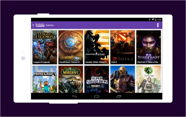
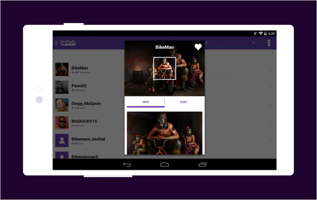
You’ll finally get options for changing broadcast quality on mobile, whether you want to watch a high quality HD stream or tone it down to a rougher bitrate in case you’re on a weak mobile connection. You could also head into chat-only or audio-only mode if you’re not interested in the broadcast itself. Search functions remain standard, with the app letting you sort by username, games or by the channel’s name. Especially nice is the tablet-specific user interface, with Twitch making use of all the screen real estate that they can instead of the over-sized phone UI we had before.
Twitch still has a long way to go if they want this app to be on par with the iOS version. For starters, a glaring bug that made Twitch chat freeze when exiting and reentering the app still exists, though the developer has said that they know of the long-standing bug and hope to finally get it right soon. Users are still clamoring for Chromecast support, but we’re sure this isn’t at the top of their list of priorities up against other needs. And there are still no push notifications like our iOS brethren enjoy.
Regardless of all that, though, this is still an experience that is ten times better than the garbage we had before, and for that we commend them. You can give it a shot for yourself by updating the app in the Google Play Store.
[Twitch]





Just downloaded it!
To watch Twitch on my Chromecast, I have been using Lakitu.
I have been using Vortex myself to watch on android since the official app has sucked so badly.
The overflow icon is weird. The dots are too big.
It’s been freezing up on my Nexus 7
It’s about damn time. Seriously. Their app lacked so much basic functionality it was practically unusable.
Actually I had been damn near harassing twitch on twitter about Chromecast support for months. I was especially pissed when EVO was nearing. Thankfully it was Google who came through and surprised everyone with screen casting right before the tournament started, so I didn’t even care anymore. They haven’t gotten around to the native PS4 viewer either. I don’t know if they’re lagging or just playing favorites.