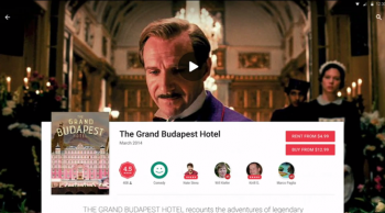
Leaked: first screenshots of Google Play Store’s Material Design update
It’s not that we didn’t expect Google Play Store to get the new Material Design update Google flaunted at IO, but our first bit of confirmation for that update’s impending arrival has leaked. Android Police has obtained screenshots of the new update with a bit of Google’s new design language sprinkled in.
So what are we getting here? Well, the changes to how it works aren’t drastic — you’re still presented with a vertical layout for which to see app descriptions, ratings and screenshots. Visually speaking the layout looks a lot less cluttered, with Google opting to use a great deal more white space to separate information and make it easier to digest.
Of noteworthy mention is the fact that banners are, once again, displayed prominently on each app listing after months of their disappearance. We’re not sure why Google originally decided to forego these banners (which made Play Store standings stand out a lot more than they currently do) but we’ll be glad to see them return.
From what we can tell, an app with a video preview will have its playback button embedded within said banner. We’re not sure if the video will play on the page itself or if the Play Store will kick you to the YouTube app, but we suppose those are questions that will be answered in due time. For non-apps? A book cover might serve as a banner for books, while a still from a movie or TV show would be used for video content.
All in all, though, the store seems pretty familiar and folks should feel at home once it finally arrives. We’re reminded that this app might still be a work in progress, of course, so what we see here today might not be exactly the same in its final release. That’s a nice way of saying “relax” if you don’t like what you see, because what you see might not be exactly what you get when it’s all said and done.