Sneak peek at Android L’s redesigned Settings, Gmail, YouTube, Calendar and lots more [GALLERY]

I think it’s safe to say we’re all pretty hyped about the upcoming Android L release, the next version of Android that looks to pretty things up with Google’s new Material redesign. As part of Google’s new found focus on design, the search giant is already providing developers with a handy resource page.
The page discusses all the dos and don’ts in regard to the new Material design and in the process, it appears Google may have let slip some of their Google apps getting the fresh new facelift. While in many cases, these were simply mockups to provide developers with examples of how to use Material, sifting through the guidelines were able to find a few that we believe can be called legit “leaks.” Let’s take a look.
Settings
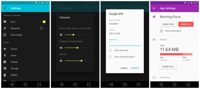

New for Android L is a redesigned Settings app and although it may appear to be rocking a dark theme in these images, we’ve seen some hands-on with L showing an all new light theme. So what gives? Well, we don’t think Google will allow users to choose between a dark and light theme with Android L, this is probably just an example of Settings using Material’s dark theme. Oh, and check out that redesigned Apps Settings, it looks absolutely gorge.
Contacts
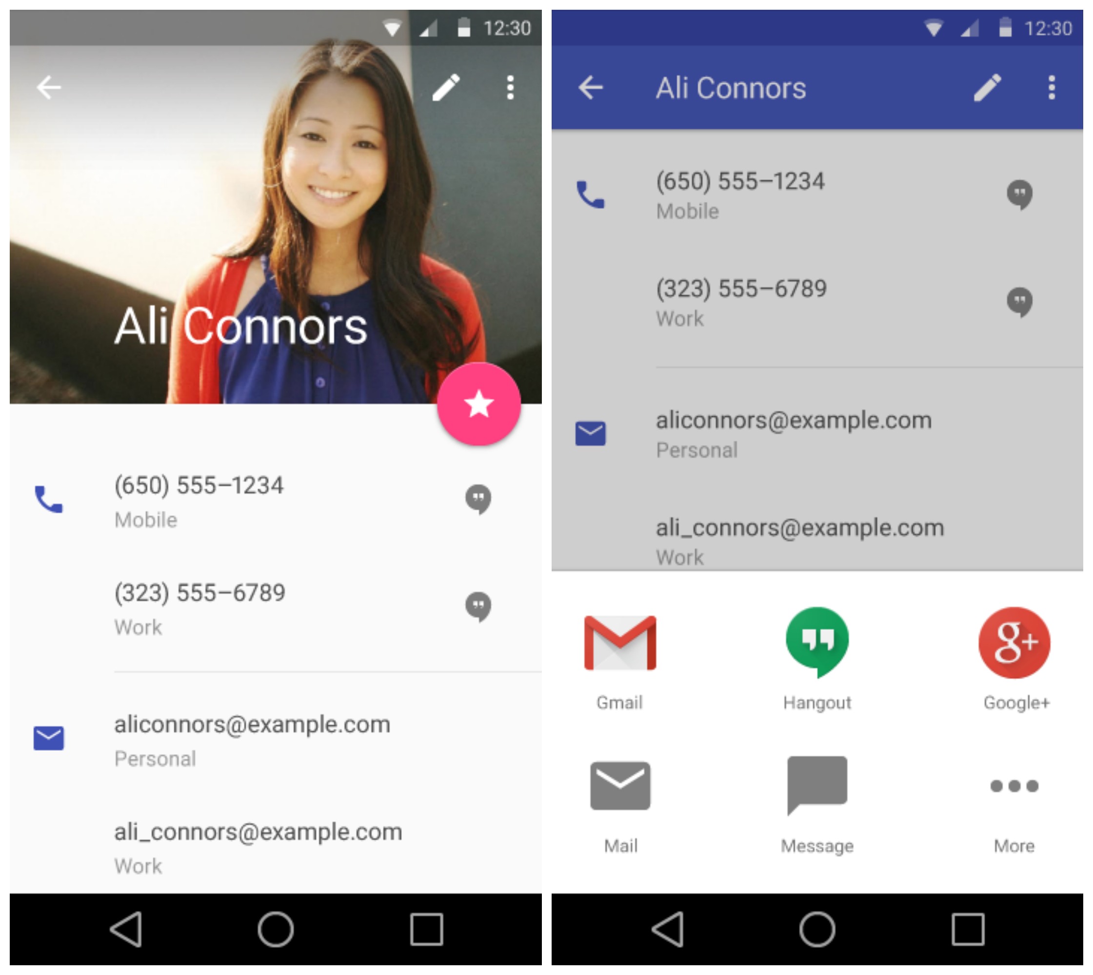
Contacts is also getting some Material love. We found Android L’s new “complete action” popup that vaguely reminds us of the one found on iOS. We’re sure it’s just a coincidence.
Gallery/Photos
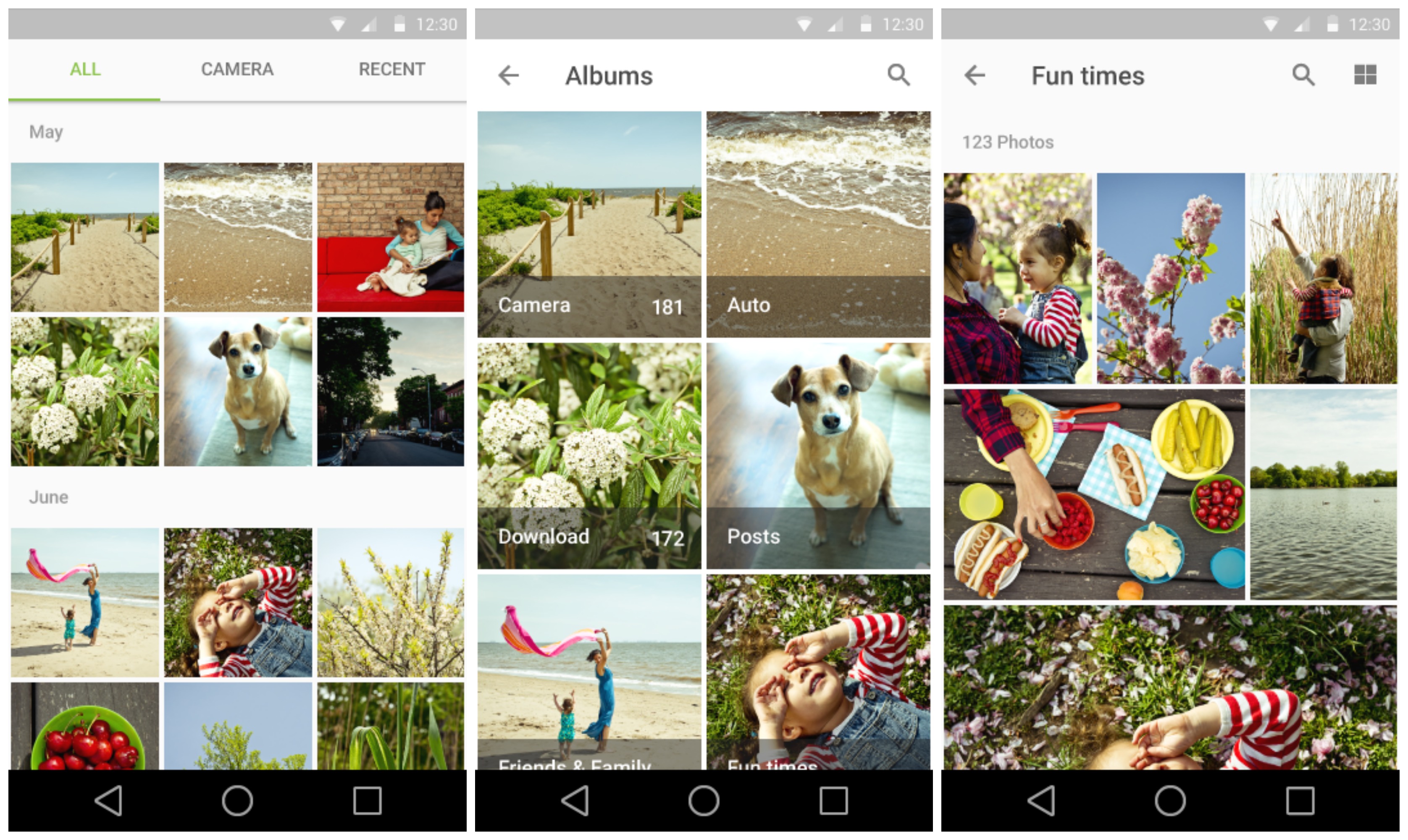
Now, we’re not entirely sure if this is the Photos or the stock Gallery app (maybe neither), but it looks all refreshed for the upcoming Android L release.
Google Keep
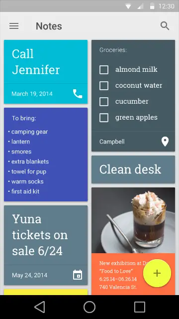
Google Keep also found its way in the style guidelines, and were not much has changed, you’ll notice Material’s new floating “compose” button.
Gmail
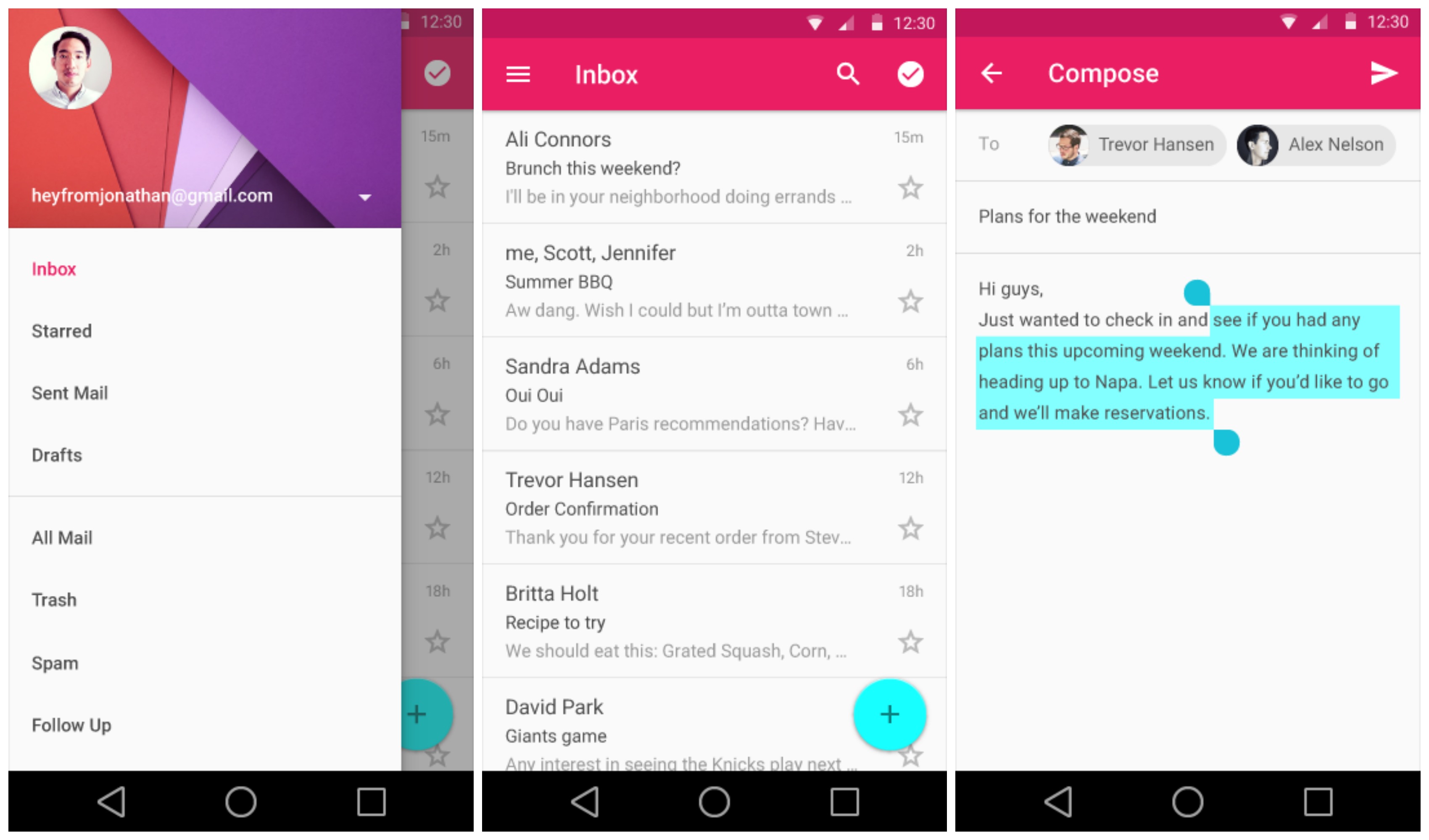
We got a glimpse of Gmail during the Google I/O keynote, and here we get a glimpse of the new text selection handles coming to Android L. Small, but simple.
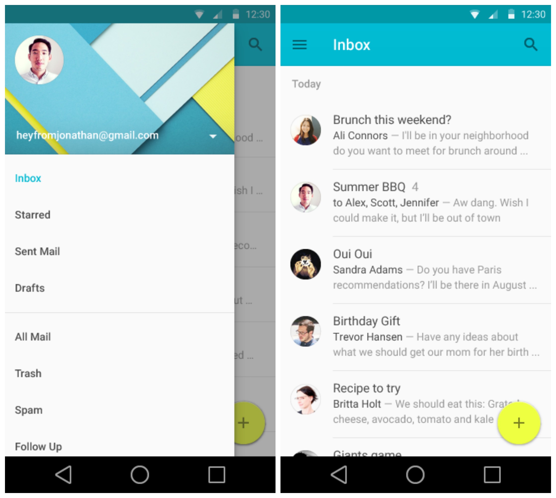
We found screenshots of what appears to be Google’s stock Email app, the one that recently became available on Google Play. It mirrors closely the Gmail application, only featuring an aqua blue/yellow color scheme.
Hangouts
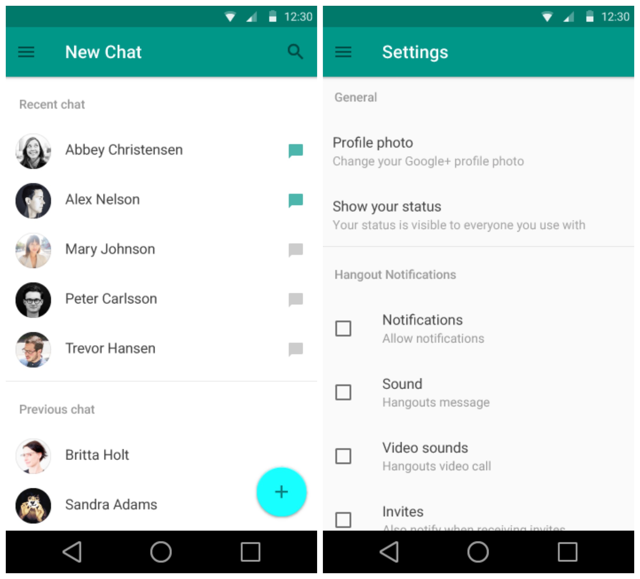
Now Hangouts looks so drastically different from our current version, we’re not entirely sure how accurate this new look is. Whether a generic mockup or a sneak peek, it’s clear Google is focusing on a much more minimal, simple user experience.
Google Keyboard
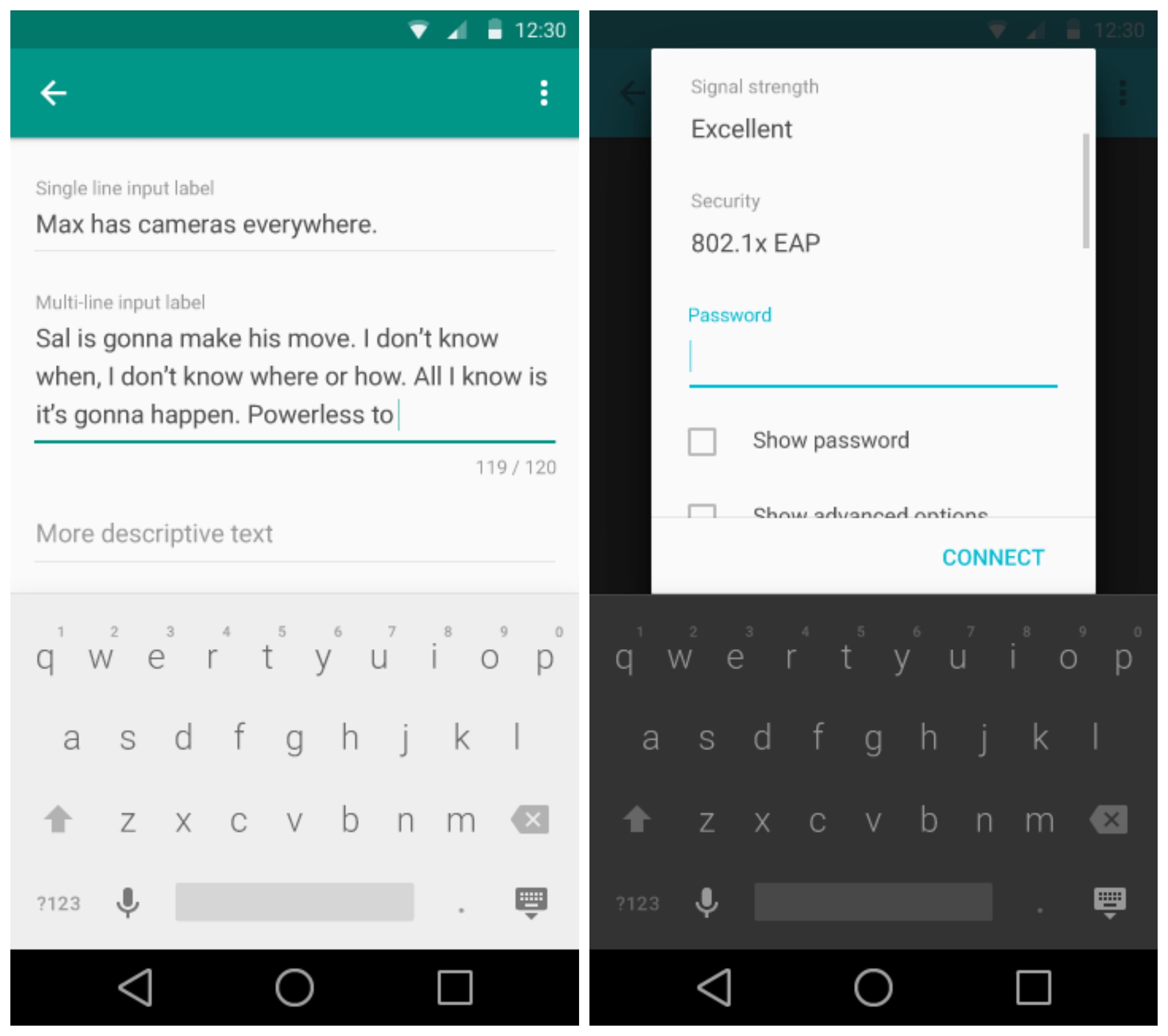
You’ll notice the Google Keyboard popping up in both a dark and light theme — but not so fast. It’s possible the keyboard simply changes its color based on whatever is “underneath,” similar to the keyboard found on iOS. While options are always good, it’s also possible Google will have a system wide dark and light theme for Android L, but don’t hold your breath.
YouTube

Digging through the Material files, we found a short video for a new YouTube app. The video was mainly to show off the new buffering animations coming in Android L. We like ’em.
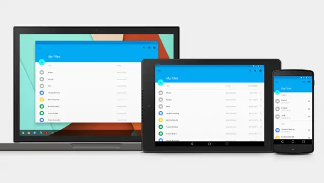
Google Drive
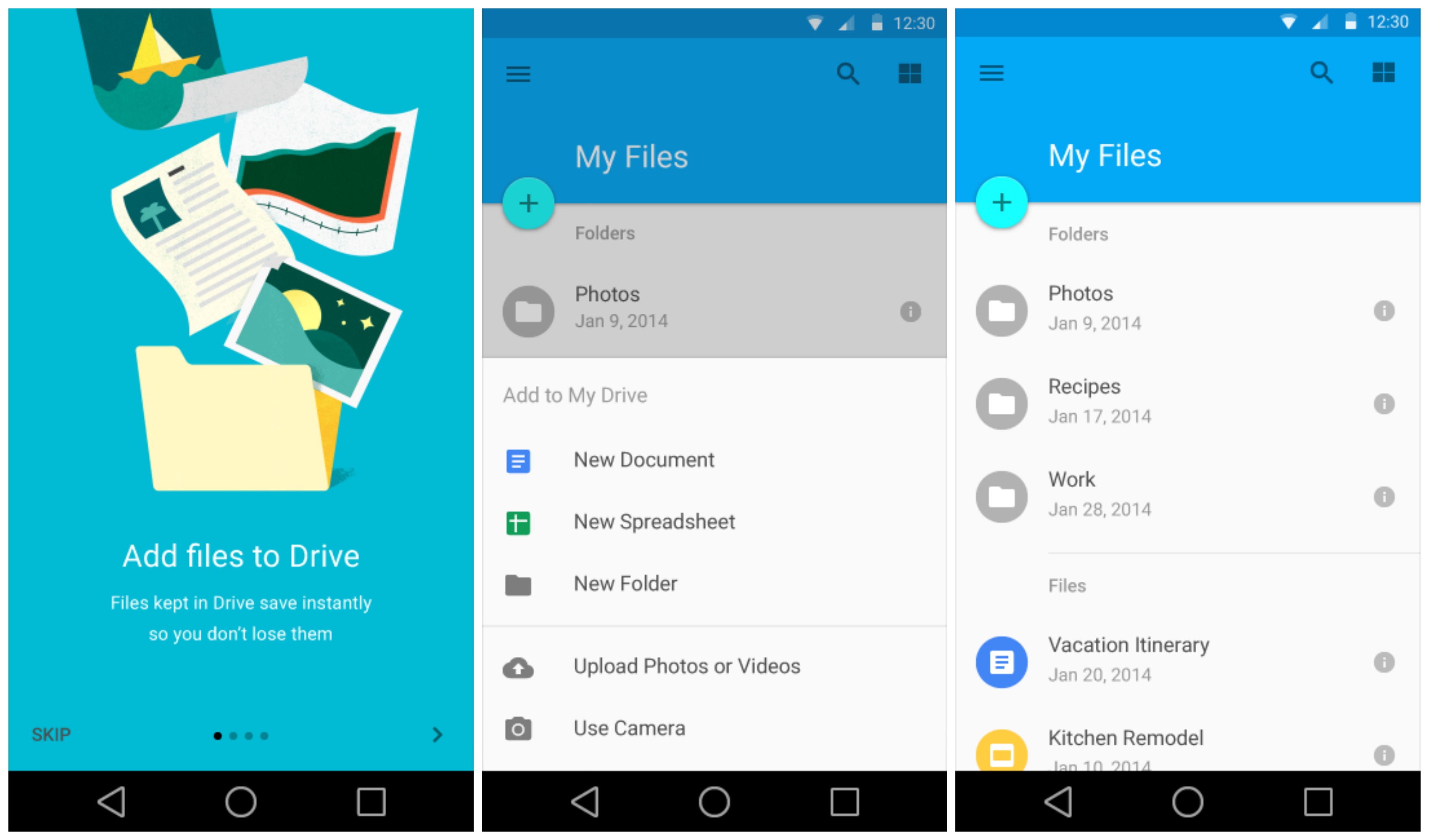
Google Drive was made many an appearance during the I/O keynote, but here we get a look at the introduction page and a few screenshots of the file system. Pretty standard affair and cleaner than the current version.
Google Play Store, Books
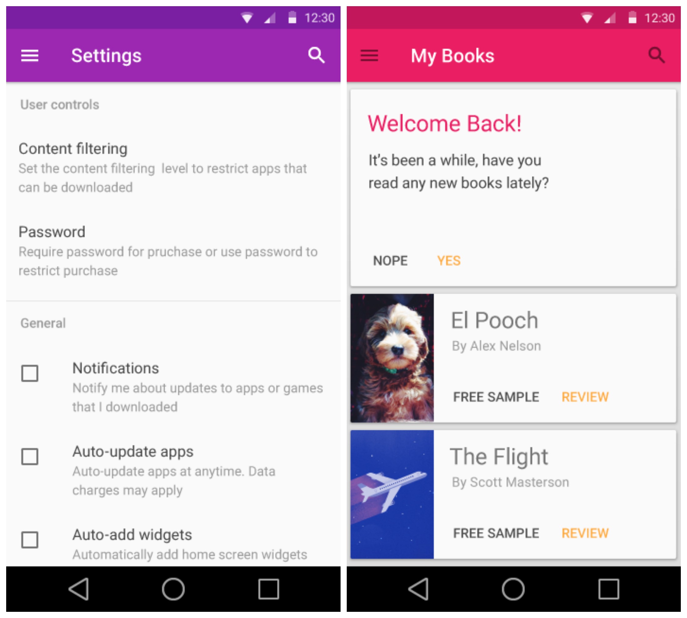
Screenshots of the Google Play Store and Play Books was buried deep within the style guidelines page. While they don’t reveal much, they do show us the overall color scheme Google could use for the Material version of these apps.
Chrome

To show off one of the new ways of loading images in Android L, a new version of Chrome was shown off in video form. While the static image doesn’t show much, the video has this awesome new loading animation that fades an image into view, instead of abruptly loading it.
Maps
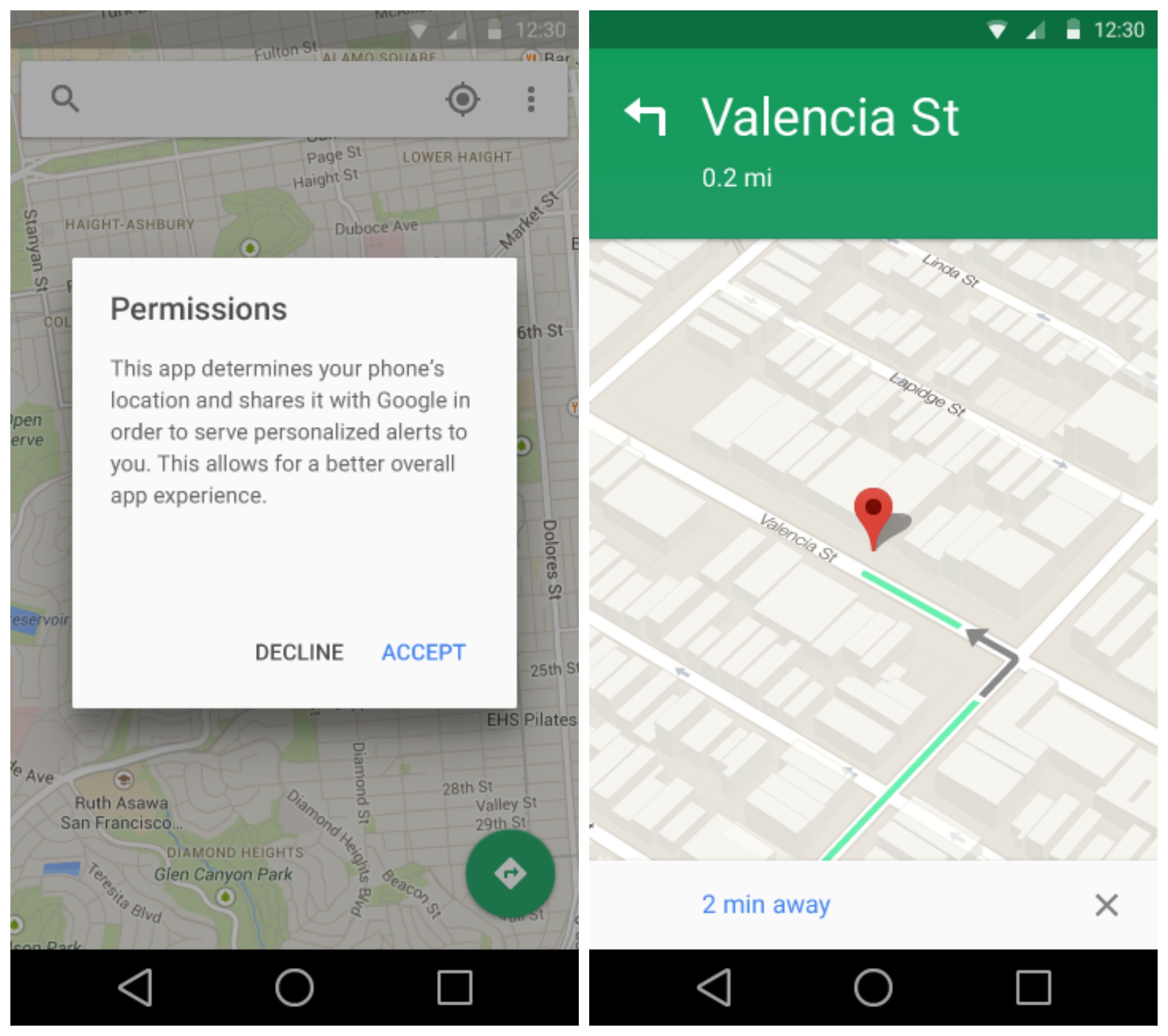
Google Maps is also getting the Material treatment and doesn’t look too different from the current version found on KitKat. You will note a new permissions popup asking for general location data from the app.
Google Play Music
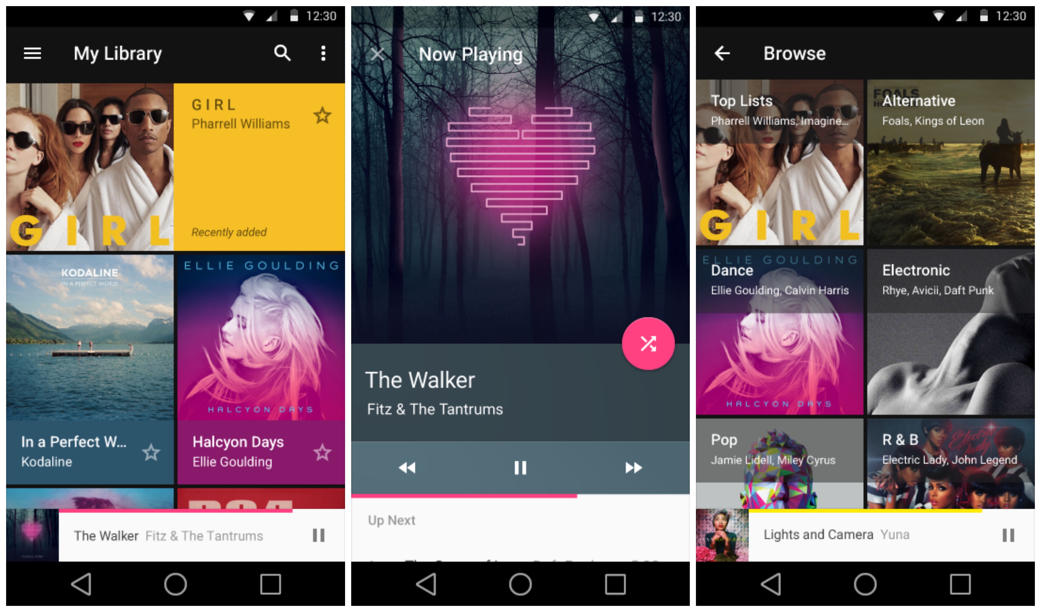
For Google Play Music, we’re seeing a much more simple interface from our current version. We don’t hate it, but we just started getting used to the redesign that feels like was barely introduced not too long ago.
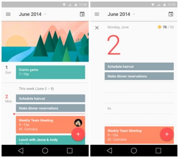
Google Calendar
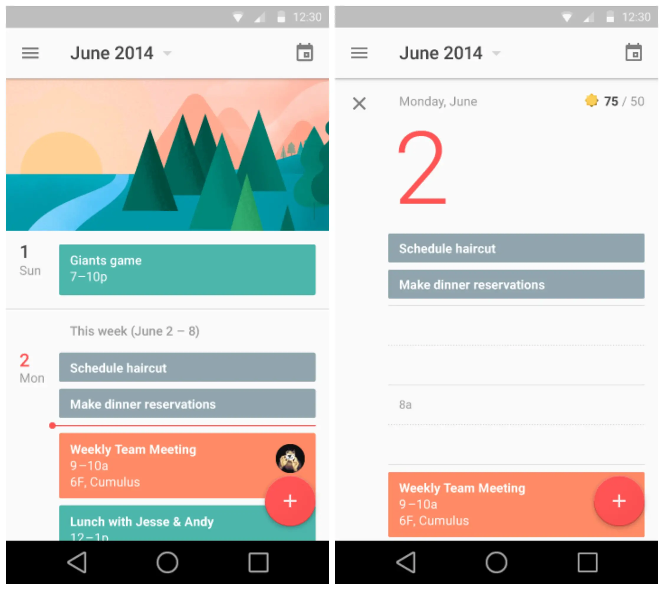
Lastly, Google Calendar was shown off in all its Material glory. The app is clean and really, the screenshots don’t do it justice. There are loads of animations for expanding calendar entries, scheduling events, and everything else the app offers. It’s a thing of beauty.