
Here are the 10 finalist designs for Motorola’s Moto 360 watch face contest

The Moto 360 is shaping up to be one beautiful smart watch and Motorola is sure to want beautiful watch faces to go along with them. In case you weren’t aware Motorola recently started a contest for people to submit custom watch face designs for a chance to win prize money and / or a Moto 360 smart watch.
Well, they’ve revealed the 10 finalist designs that will square off for first place. Many of these designs might be featured in the final roster for the smart watch’s launch, though only the winning design is guaranteed a spot. Let’s take a look at the full roster of finalists.
Watch #1 – Tyler Allicock

Another last minute one
Watch #2 – Paul Stringer
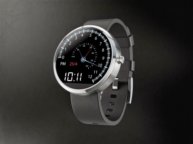

A car speedometer style watch face with the Hours on the outside and Minutes and Seconds on the inside. When the Second hand gets to the end it flys back to the beginning (very much like a tachometer). The Minute and Hour hands also do this when reach the end of their respective gauges. It also includes the AM/PM Indicator, Time in a digital format and then date.
Watch #3 – Jason Wang
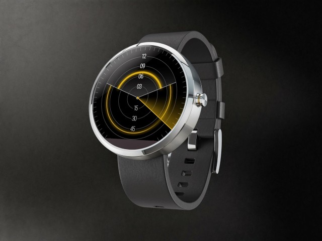

A last minute revision of my previous submission, because it’s just so much fun brainstorming! Same ideas as before: themed, but only subtlety so; analog fun, but still purely digital. Again, the face bears a passing resemblance to an old radar, but only in aesthetic, as functionally it’s very distinct. The smaller arc on top represents the hour, and the larger arc below represents the minute. As arcs, they can be read easily at a glance from any angle. A second hand sweeps over them.
Watch #4 – Jose Azua

ANGLES | 360 #Moto360 – (Compass & Timer app addition) – sorry guys added last minute compass face
Watch #5 – Pawel Hanusowski
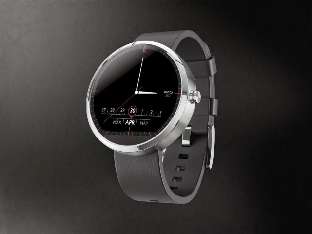
Radio like readout for the Month and Date accompanied by some red accents. #moto360 #moto #motorola #design #moto360designface-off
Watch #6 – Will Rodriguez
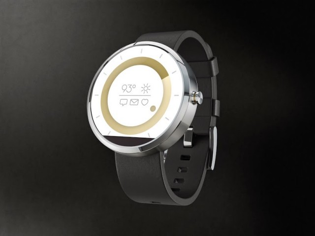
This disc design concept takes a modern approach to showing the time. Minutes are shown through the larger disc in the background (which can be color customized) and the hour is shown through the foreground disc. It also displays notification icons for sms, email and health alerts as well as a basic weather widget. #moto360
Watch #7 – Dave McCarthy
A scarcity nowdays, very few manufacturers have seemed to get the smart-watch design quite right. With the Moto360, Motorola decided to take a very classy, and minimalistic approach, so I decided to do the same. Keeping it feeling truly like a watch, the only things on it are the time, date, and a battery indicator. Hope you all like it! #Moto360
Watch #8 – David Pascual
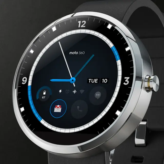

Displays calendar events, allows for user defined notification widgets, and provides status information for basic watch functions (charging, alarm, bluetooth, and wifi connection.)
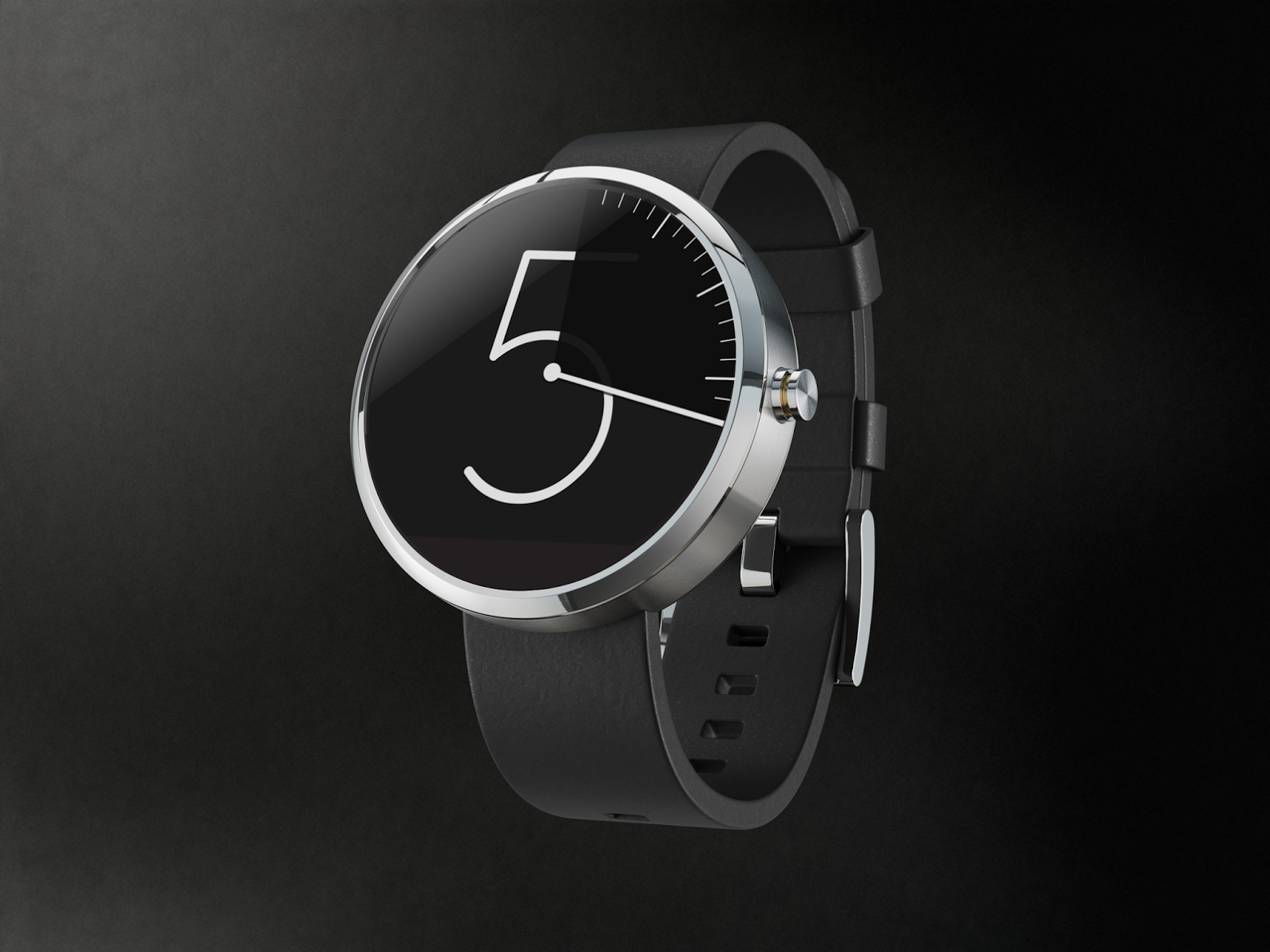
Watch #9 – Aramis Negron
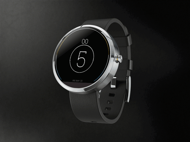
Simple, new and easy to read. Strongly believe that each widget should have the entire canvas to portray its information.
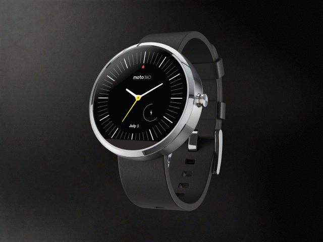
Watch #10 – Layton Diament
My “Vanishing Hour” watch face concept. As the minute hand makes its way around, the hour is dimmed while revealing the minute marks.
Want to vote on any of them yourself? Head to Google+ here and simply +1 the one you like the most. Don’t forget to circle back here and let us know which one caught your fancy by leaving a comment below.