Android is about to get a major redesign

Android design has been rapidly evolving ever since Ice Cream Sandwich was released almost three years ago. What used to be an ugly and unorganized OS is now much cleaner and more focused. Google is never done tinkering with things, and if a new rumor is true it could mean big changes for the way Android and Google apps look.
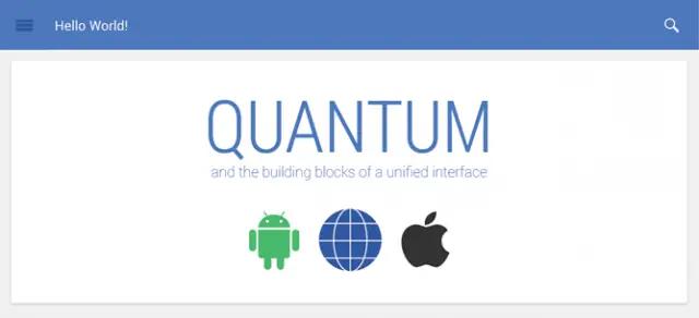
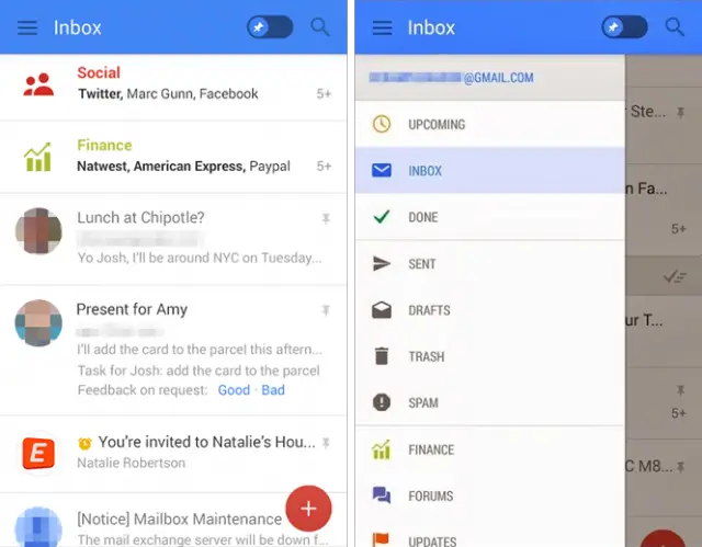
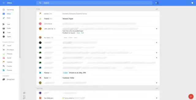
Sources familiar with the situation have revealed information about a new initiative at Google to unify design across its apps and platforms. They are calling it “Quantum Paper,” which sounds more like a Bond film than a software redesign. The goal is to make all Google apps have the same user interface and experience on the web, Android, iOS, and any other platform. This new design can be seen in leaked screenshots of a new Gmail app and the Gmail web version.


Quantum Paper is about more than just Google apps. The new design language will be available to developers, and Google will encourage them to integrate the new elements into their own apps. Simply put, Google is trying to unify applications across the internet. It’s a bold venture, but right up Google’s alley. Quantum Paper will start showing up in Google apps first. You can already see some elements in the most recent version of Google+ for Android.
What do you think of this new design? Yay or nay?
