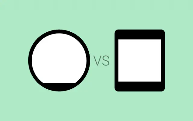
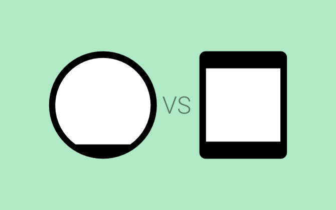
We’ve been talking a lot about smartwatches lately. Google I/O is just around the corner, and both the Moto 360 and LG G Watch are expected to be shown off. These are the first devices to run Android Wear. That is where most of the similarities end, because these two devices could not look any more different.
The LG G Watch looks like the typical 2013 smartwatch. It’s square, blocky, and not terribly attractive. Some people like the non-tradition square look. It screams “this is not a regular watch.” The Moto 360, on the other hand, is meant to blend in with the world. It has a more tradition round design that looks more like a regular watch. The 360 also seems to be made of more premium-looking materials.
These two devices will likely come out at around the same time, and they could be priced relatively close together as well. The big question for consumers will be “round or square?” What side of the fence are you on? Traditional or different? Sharp or soft? Which shape is the best for a smartwatch going forward? Do you want to see more round devices or square? Let us know in the poll and comments below!
[polldaddy poll=8117389]





Round without that terrible bezel on the bottom please
I like the round better, because it is a watch and thus should be aesthetically round… but that “chin” bezel that takes 10% away from a display which is already smaller than the square makes it look silly. It’s not aesthetically pleasing as it should be.
Which would have the bigger display?
Well I feel this article is a bit miss leading. Thought the question was what do you prefer round or square for a smart watch but the whole article seemed about the difference in what we’ve seen in the LG watch and motorolas.
It really depends on whether you prefer Digital or Analog time display. If you want something that spins around in a circle (i.e. Analog watch hands), of course a round face makes more sense. If you want to maximize the amount of information you can fit on the screen (i.e. Digital time display, or notifications, apps, etc) then a square screen wins. You simply can’t get as much usable data on a round screen.
(*Chris*)
wrong
In what way?
A round screen can get more usable data if it has a greater area
I disagree, it’s like trying to fit square furniture into a round room. Unless you’re going to used spiraling curved text (which would be exceedingly hard to read), fitting as much square data onto a round screen is impossible.
Except that you’re waaaaaaaay wrong. It depends upon the dimensions of each. Period. Or do you really believe that a square screen with an area of 1 square inch can fit more information than a round screen with an area of 20 square inches. Without knowing their dimensions, its impossible to say which can fit more information
Now you’re being ridiculous. You are more than welcome to wear your 20 square inch round watch. I’ll stick with my 1 square inch square watch and have a much more functional watch than yours.
I used those numbers to illustrate the point. The point is that without knowing the dimensions you can’t know which can fit more information. I don’t know what’s so hard to understand about that. Obviously there won’t be a watch that big, it just shows my point.
I was showing you the folly of purposefully misunderstanding someone. You obviously knew that I was comparing watches of comparable size, just as I knew you were not saying you wanted a 20 square inch round watch.
The bottom line is, a square watch will be able to display more textual information than a round watch of equivalent size.
Again, it depends on what you mean by equivalent size and what the dimensions are. If you do the math, if they both have the exact same perimeter(for example a square with 1 inch sides, and a circle with a 4 inch circumference) more data will fit on the circle. So like I keep saying, it depends on the dimensions.
I think you need to check your math. You’ll fit a lot less text in a circle with a 4″ perimeter than a 4″ perimeter square. The circle will cut into the corners of the square (which is usable space in the square) and will have arcs on the top, bottom and sides that are unusable for text display. It’s just the nature of the fact that text is a square medium (hence why HTML refers to it as a box model).
Well, given that the circle will have more than 25% greater area, and the square will actually fit inside of the circle in that example, what you’re saying is complete nonsense(I know, math is hard)
It understand math is hard for you, but just check out this image (http://www.velocite-bikes.com/images/circular_vs_square.jpg) it exactly describes what I was saying.
and links are hard for you. and my math is about 3% off but close enough to show that i’m still right
I guess we’ll have to agree to disagree.
I need that little emoticon of the guy eating popcorn right now. This is great.
That’s like saying red is blue and we will just have to agree to disagree. Round and rectangular of the same area can contain different amounts of data depending on the data itself, the way it is formatted, the length of words, whether some data are fixed length, on and on. Most photos are “normally” rectangular, Most analog dials are best formatted as circles or portions of circles.
And its a wearable interface, not a “watch” in a conventional sense, Its a thing on the wrist. The Moto360 is HUGE on my girly arms – 46 mm in diameter. My buddy made a fake one for me and I wore it on my wrist today… might change my mind about Moto 360, but not about roundness. I can’t vote – I have to see these on me.
Square trumps round when it comes to functionality. Round is more aesthetically pleasing. As a nerd I prefer square. But I primarily see a watch as a piece of jewelry and a time piece. So for my needs, round wins.
tetrahedron!
Idc for either… I more into the samsung gear fit design… Only problem is I won’t own a Samsung phone so I’m SOOL unless another OEM design a watch similar in design and open to android instead of being brand specific
I’d like a triangular watch to go with my Pyramid tablet
https://www.youtube.com/watch?v=o9L3YjyJ_IY
Half squared, Half Round. Problem solved.
The round looks classy, I like to pretend that I’m a classy geek.
A square watch could more easily double the sceen size by the incorporation of a hinge to something that equates to a 16:9 ratio.
Square is best. If i wanted my watch to look like every other watch, id just buy a watch.
I wouldn’t buy a square watch, don’t care if it’s “smart” or not.
I dont always wear watches, but when i do, i prefer round watches.
Square makes more sense in terms of viewing text and pics.
What about Rectangular with Rounded Corners?
Oh, wait. Nevermind.
Doesn’t Apple own that shape? We better ask Samsung
I think most people vote round because Moto’s looks more like a watch. If manufacturers could get the square to look more like real square watches then I think the poll would be closer, or even in squares favor because of screen real estate. I voted round.
I’ll answer this the second PHTL sends my Hot Watch…. -_-
If the square/rectangle weren’t so boxy and bulky it would win but ergonomically wins for now
Guess it depends on whether you like a square face watch or a round one. Seems completely subjective to me.
I wear watches as a fashion piece, so I don’t think I’d consider a square shape. Speaking of which, has anyone else checked out the Kairos Mechanical Smartwatch? Looks absolutely sick IMO!
Links?
https://kairoswatches.com/
These look awesome. Love the hybrid. But I would have to sell my left arm to buy one.
Right now prices range $500 – $1200 Preorder. After July 1 they more than DOUBLE.
Let me know when they finally make a round screen and then I can answer.
the Moto360 smartwatch has a round screen.
The original design we were shown did, yes… but it looks like the final product is more of an igloo with that flat bottom. Shame.
that’s not a flat bottom….. its a round screen which has a picture on it. and that picture includes a flat bottom… you can replace it with a watch theme without that flat bottom in the graphics.
You can’t. The screen itself has a flat bottom.
take a look at the screen by visiting this link http://www.droid-life.com/2014/06/12/uk-accessory-site-claims-it-knows-moto-360-pricing/ where is the flat bottom? look at the moto360 on he guys wrist… its a full circular screen… of course some of the apps on the thing might have a flat bottom, but the screen is circular.
lol its because the background is the same color as the bezel the screen isnt 100% circular it has a bezel on the bottom for sensors. Even in that picture you can tell because the 6 oclock line should extend all the way down but it doesnt
Should be a debate about the length of the diagonal on the square watch or the diameter on the round and will manufacturers just make them bigger with each release?
Well obviously a triangle.
I beat you by about… 16 hours ;)
Why is your comment at the bottom it’s by far the best comment.
Sort by… “best”
It’s no longer at the bottom.
Amazed by this smart watch –> https://kairoswatches.com/
You know what shape I like? Under $175. That’s the shape of the smart watch I like.
I think there should have been a 3rd choice of “Rectangular”. As in the Gear Fit, but certainly others could do it as well. I personally think that is a fantastic form factor for the wrist.
The square screen is more functional but the round screen looks a lot better.