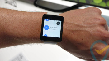
Leaked LG G Watch boot animation gives possible glimpse at redesigned Android logo
Android branding could soon be subject to a bit of a face lift if this purported LG G Watch boot animation is to be believed. The file — which was apparently pulled from a G Watch and is now flashable thanks to the handy souls at XDA — features a calming sunset that transforms into an eclipsed moon, and then eventually breaks down into a swirl of Google’s typical Blue, Green, Red and Yellow color scheme. Near the end of the animation the colors draw out the word “Android” in some rather stylish font.
We’re not sure if Google will make this the new permanent logo, but we sure are hoping so. It’s not that we don’t have a sentimental connection to the original that can currently be found on some recent handsets, it’s just that… well, it’s ugly. It’s dated. It looks like it was designed by logo company that missed the web 2.0 ship. It’s time to retire it, and dammit I wouldn’t be mad if this is what Google would use to do just that.
[via Reddit]